Nah you misunderstand that chart. That chart doesn't show you what REP the users were when they received the curie. It shows what % of authors in each REP range have received a Curie at some point in their history. Most of them received the Curie when lower REP. You could read it a few different ways - you could say that receiving the Curie upvote makes it more likely that an author will stick around and reach higher REP - you could say that Curie curators did a good job of finding engaged authors to reward int he first place - or a combination of the two :) In any case, I think it is a good reflection on Curie curators.
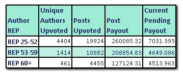
This one will be clearer - this is all Curie upvotes in 2018 to date (so we are talking recent upvotes), split up into broad REP bands. As you can see, the focus is definitely on the lower REP ranges but medium and higher REP do get some love as well :) The point is, Curie supports all authors who are creating quality content but not receiving significant reward for it lately. That is MOST likely to be the case when you are new, but even established authors with higher REP often are not receiving significant reward, and in that case Curie will step in :)

Oh shoot, I really have misunderstood stuff. Thanks for clarifying it Carl!
(@curie roxxxx 💯🔥👌)
Okay that new chart, that is impressive AF. Great stats!
Loving it you guys! 😱👌
Keep continue doing you then, no changes needed here. ;P
Also, I deeply appreciate the fact that you took time out of your busy schedule to post an elaborate reply to me, explaining what the chart was about. Thanks for that man. :)
Cya 'round~