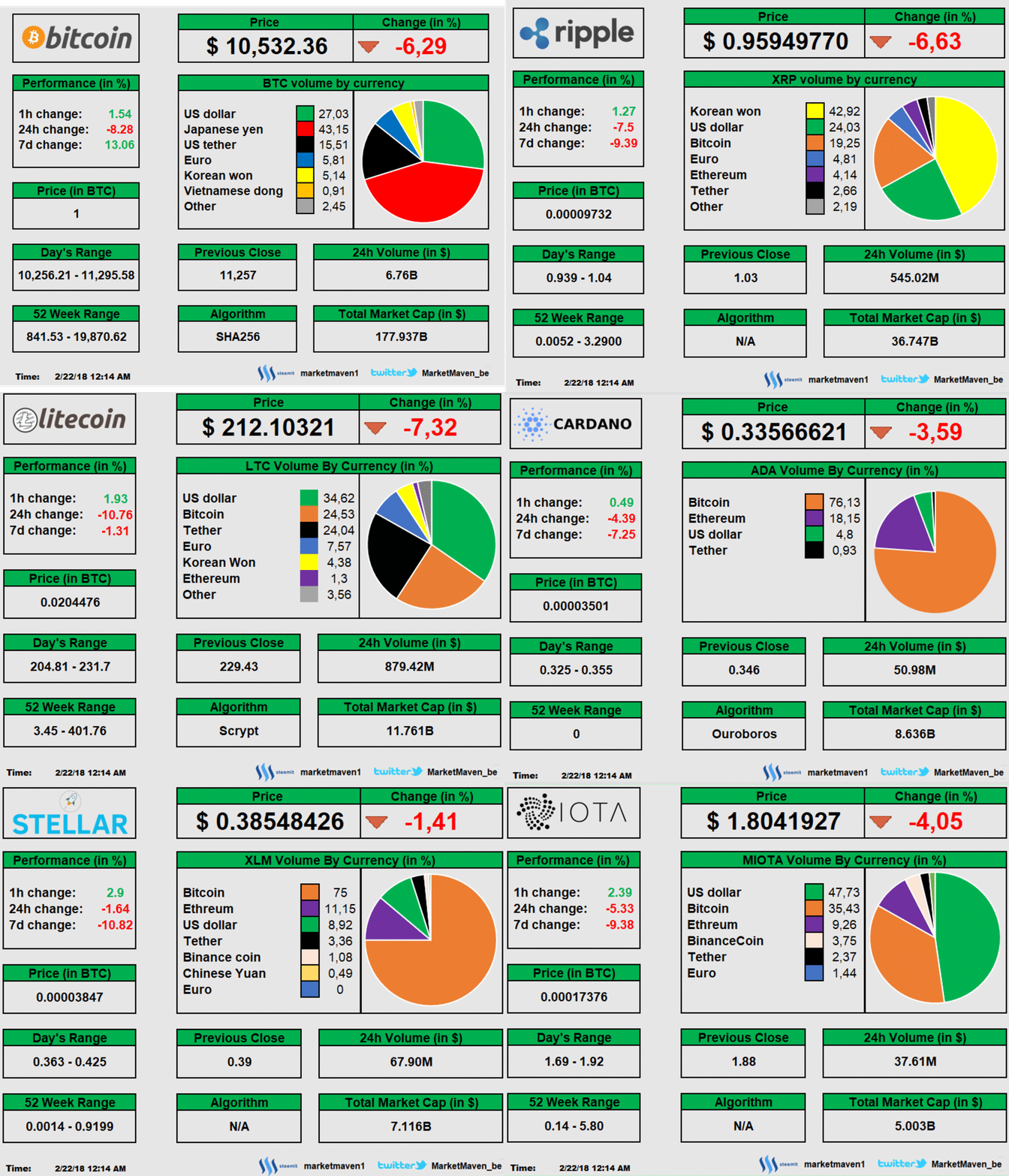
Just a quick market overview. Everything is red again...

What do you guys think? Do you like the GIF? Should I include this in my market reports?

Just a quick market overview. Everything is red again...

What do you guys think? Do you like the GIF? Should I include this in my market reports?

I don't think the gif is helpful. Hard to study and hard to compare.. might make a good desktop widget but less good for blog
I'd like to see the pie graphs in column form all the coins lined up next to eachother. I do like that the color sections have consistent meaning
Thank you for the great feedback! It was something to try. But I agree that it's hard to study the GIF. It has probably some value on twitter but not here.
The time between the flips is too short.
I can delay that further. Would that be helpfull? It's now 7 seconds. 10 seconds is the slowest that i can go. Presenting it that way would save me some time. I will try it today with 10 seconds
Give it 36 hours, we'll be green baby
For a short period? Possible. But I think that we can go down into mid March. Don't underestimate the correlation with stocks :p