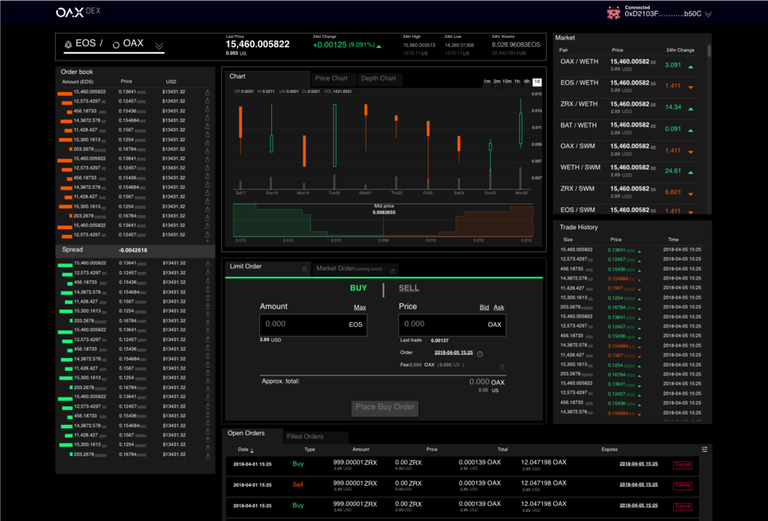
Large image:
https://imgur.com/a/rHn8S0z
Dev update #6
Hopefully you’ve been noticing the increased volume and variety of activities that we’ve been getting involved in over the last few months. These have been across areas including senior level appointments to drive key functions, raising our profile at industry events and educating the wider public about digital assets and what we do. But this doesn’t mean the technology has taken a back seat. Quite the opposite — in this latest development update we’re really excited to be able to give you a first look at the user interface for the OAX platform.
During the first phase of the development, the back end obviously took priority. But recently things reached a point where we could begin the design of the front end and connect it up to the back end. What we’ve got so far is the screen that people trading tokens over the OAX platform will see (the UI for Asset Gateway owners will come next). It’s designed to be user friendly and intuitive, fitting in with our philosophy of making digital asset trading as transparent as possible.
Of course, one of the reasons for getting the UI in place is that we are promoting the project much more. We aim to have a full demo ready for Consensus next month and are looking forward to giving delegates there a tour of the project!
Putting in place the UI is also allowing us to undertake testing. A fully functioning, safe platform is obviously our aim and we will be testing it thoroughly by bringing in some expert traders to put it through its paces. We’re also making sure that it’s robust and conforms to the high governance standards we’re committed to promoting at the OAX Foundation. To that end, we are examining all procedures on the platform so that transparent and proper use is stuck to by all potential users.
The full article on Medium:
https://medium.com/@OAX_Foundation/dev-update-6-a78de0b8c353
Official site: www.oax.org
Sort: Trending