Greetings hive people.
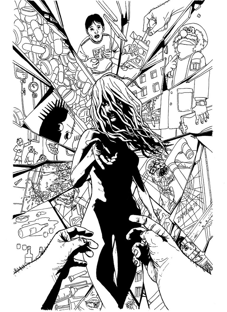
Wanted to share with you another one from the illustrations I've made for a horror book"Przesmyk" (I've written about it in previous posts).
This illustration is chronologically last in the book, so it's kind of a big spoiler ;) Warned you.
So you be the judge if i managed to capture the twisted vibe that's in the book :)
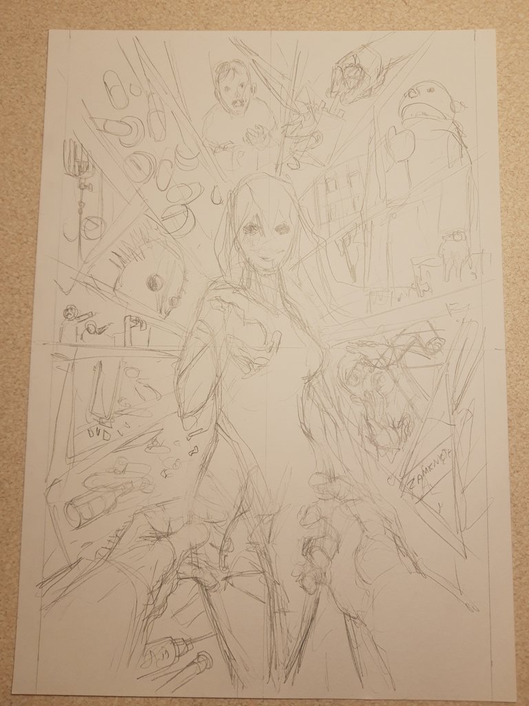
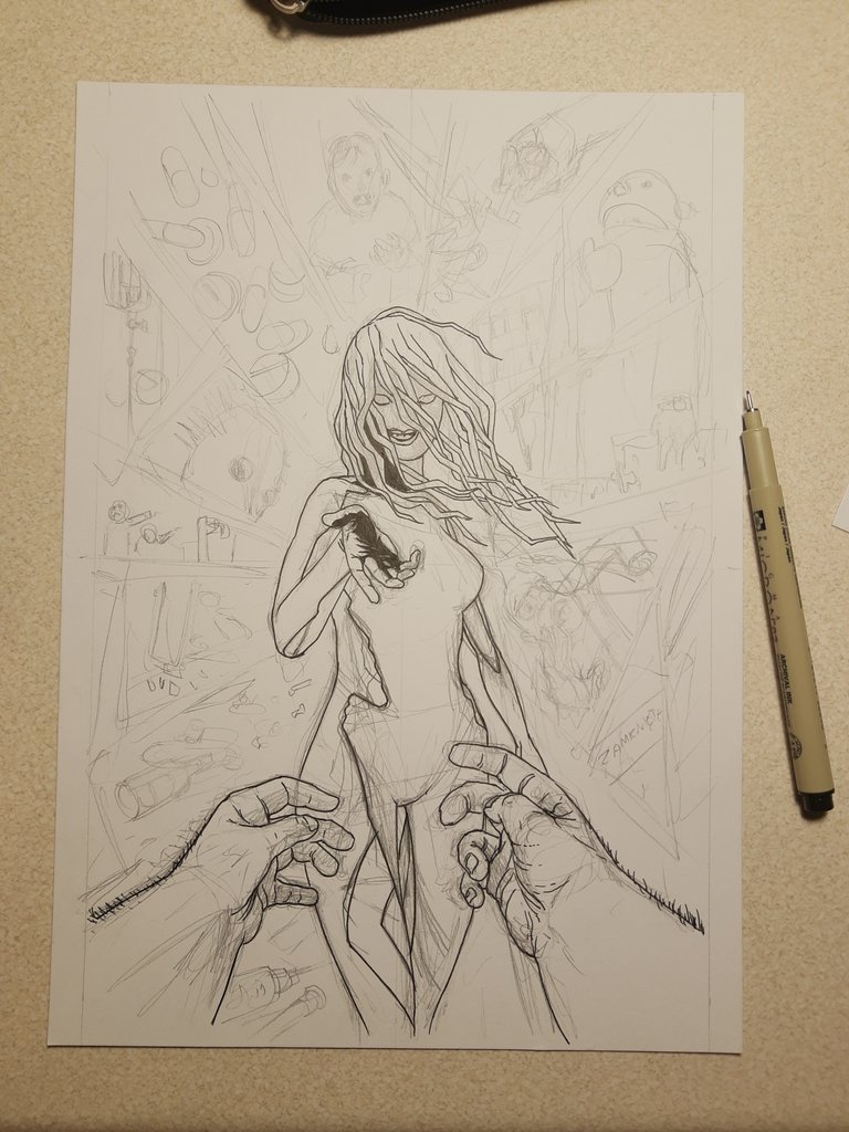
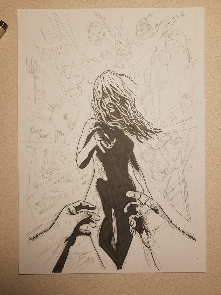
The process was my standard i guess. Pencil sketch and the ink pen finish with sakura microns.
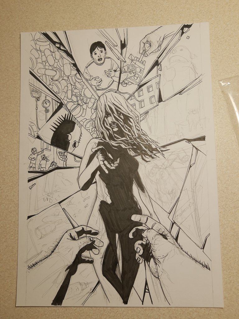

And finished.
I didn't want to do any shading on the background to keep the focus on woman.
You think it works or maybe the background should be more detailed?
So tell me what you think. Do you see any mistakes, maybe I should approach it differently. I'm open to critique so do t be afraid to speak up :)
Cheers
Congratulations @longer! You have completed the following achievement on the Hive blockchain and have been rewarded with new badge(s) :
You can view your badges on your board and compare yourself to others in the Ranking
If you no longer want to receive notifications, reply to this comment with the word
STOPDo not miss the last post from @hivebuzz:
Let's connect here