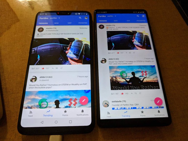
Which one do you like better?
6 years ago in #partiko by crypto.talk (58)
$0.25
- Past Payouts $0.25
- - Author $0.21
- - Curators $0.04
27 votes
- reformedexp: $0.09
- dancingapple: $0.03
- jasonbu: $0.03
- crypto.talk: $0.02
- veronicazhu: $0.02
- ironmanmatt: $0.02
- abcallen: $0.01
- partiko: $0.01
- culgin: $0.01
- happyphoenix: $0.00
- shenchensucc: $0.00
- javirid: $0.00
- hhusaini: $0.00
- wildtrader: $0.00
- lindalex: $0.00
- shine.wong: $0.00
- tydebbie: $0.00
- ghop: $0.00
- sunai: $0.00
- steem-oracle: $0.00
- and 7 more

Hey @crypto.talk,
I think the reason why the left one is so popular is an aesthetic break for the eye. It is easy to tell when a new post is starting due to the profile pic and name being visible under the post.
Having the left and right alignment on the right phone is not as apparent to the eye. Plus, the right phone makes your eye have to left-right-down, whereas the eye can focus on the downward motion while scrolling, less left to right.
Posted using Partiko iOS
Very well said!
Posted using Partiko Android
Left
Posted using Partiko Android
Left one is more pleasant to the eye, really. But I have to disagree on some opinions here. And, like the others, this is just my opinion, which could be wrong, but that's what I am thinking right now.
We have to remember that the picture doesn't need to be the important part of the post. Except some cases, like some DTube videos and SteepShot photos, the image is just a way to call for attention.
Instagram has popularized the full width layout. And that's ok, because in that website, the picture is the content, there is no way it couldn't be like that.
I would like Partiko to explore a different visual layout when presenting (=listing) posts.
For example, in the right side layout, there is some white space below the avatar of the post author. A possible way of trying a new layout, could be to move part of the actions (the upvoting, commenting information at the end of every post) to that white space area.
The problem would be that some posts doesn't include an image and then there wouldn't have enough space to show those actions, adding more unnecessary white space.
I still keep hopes that Partiko's team will improve their product design, as it is still just a copycat of the standard one. It needs more personality. And I am sure team will improve it.
Posted using Partiko Android
Very thoughtful. Although I would still like to argue that, no matter what you end up designing, there's a high chance that it will look similar to something else that already existed.
If you design something completely new, you are taking a risk where your users need to time to learn it and get used to it. There's definitely trade offs there.
That being said, we'll explore new options for sure.
Posted using Partiko Android
I would agree with the majority and say the left hand side. Full width is much more desirable.
Posted using Partiko Android
Left
Posted using Partiko iOS
Haha I'm not surprised!
Posted using Partiko Android
left
Posted using Partiko Android
👍
Posted using Partiko Android
Left
Posted using Partiko Android
Left
Posted using Partiko Android
新版看似是在图片显现方面改了一下,直接占满
是的,俗称edge to edge哈哈
Posted using Partiko Android
( • ̀ω•́ )✧ヾ(◍°∇°◍)ノ゙
😂
Posted using Partiko Android
哈哈哈哈
Left side look cleaner
Posted using Partiko Android
Left!
看起来很大气,坐等更新,目前还没看到~
马上
Posted using Partiko Android
It's cool you implemented this one :) I remember suggesting it after you released the first version :D
Posted using Partiko Android
I never forget amazing suggestions!
Posted using Partiko Android