here is my edit, I went for a cartoonish feel in terms of color to set a Scooby Doo - mystery kind of mood with the green tones so after that, I could come back at it with the warm skin tones to create color contrast.
So my view on this images Goes something like "the old man helped the lady solve a mystery " using national geographic magazines that advertise a Nikon camera from 1980
I love this photo, it's very "me". I love that old world charm feel... I had to laugh at the old phone comment though, I still have a phone like that! :D I was expecting it to be a lot older ; ) hehee
Thanks... :)
I did like a dozen different ones but this was my favorite!! I love all the "things" in the shot, all his life's treasures but I have a high respect for the older generation, they have a lot to teach us if we're willing to listen. I love the relationship shown between the 2 people in the shot so I really wanted to focus on that!
I liked this couple and wanted to focus the viewer's attention on them. So I dimmed the light around them a little bit and cropped the image tighter. Also, I made the photo warmer and softer.
Here's my entry. Am I the first one to rotate the image that single degree it needed? Anyway, here's my "take" - making it a real portrait of the generations. It's awesome in sepia too.
Great shot @gabyoraa. I decided to process it without cropping because it's a great shot for a reportage as it is. Just applied a slight different look on the image. I considered ging b&w on this one, but I didn't like the idea of loosing the natural colors of the image.
My post with all the edits for this Friday is here
here is my edit, I went for a cartoonish feel in terms of color to set a Scooby Doo - mystery kind of mood with the green tones so after that, I could come back at it with the warm skin tones to create color contrast.
So my view on this images Goes something like "the old man helped the lady solve a mystery "
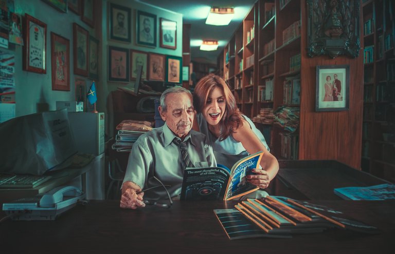
using national geographic magazines that advertise a Nikon camera from 1980
And for those interested to see how I did it, you can watch
the recording of my stream on here: https://dlive.io/video/vmoldo/6f405781-1ece-11e8-8d9c-0242ac110002
Oh my God!!! I did not see this coming! This really made my day.
Well you made the comment about Playboy covers but I needed to keep safe for work. Otherwise it would have had different pictures on the wall.
Happy you got a laugh from it.
I love this photo, it's very "me". I love that old world charm feel... I had to laugh at the old phone comment though, I still have a phone like that! :D I was expecting it to be a lot older ; ) hehee
Anyway, here's my entry.
"old style" edit. Nicely done @jayclar30
Thanks... :)
I did like a dozen different ones but this was my favorite!! I love all the "things" in the shot, all his life's treasures but I have a high respect for the older generation, they have a lot to teach us if we're willing to listen. I love the relationship shown between the 2 people in the shot so I really wanted to focus on that!
Nice cropping! Does bring all the attention to them.
All my edits
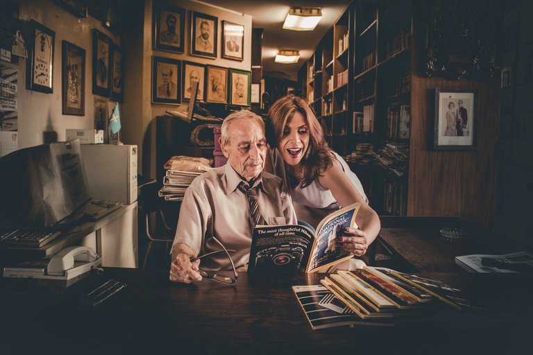
Loving the warm tones in this.
when i started to upload them i thought it could be warmer but it was 4 AM so :) wood could be more warm.
Well, congratulations @bil.prag . Your edit was my favorite!!!!!
did not expect to win :) thanks
I liked this couple and wanted to focus the viewer's attention on them. So I dimmed the light around them a little bit and cropped the image tighter. Also, I made the photo warmer and softer.
Click image to view in full screen
Really like how it brought out all the wrinkles on him. Loving the tones
I am glad you like it!
Cool picture.
Thanks! Nice edit
Here's my entry. Am I the first one to rotate the image that single degree it needed? Anyway, here's my "take" - making it a real portrait of the generations. It's awesome in sepia too.
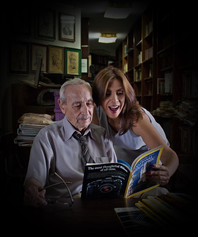
Thanks for the single degree rotation. Does make them stand out as the main subjects. Great edit!
Thank you!
I tried to achieve a "National Geographic" feel. I don't really know what that is, but this seemed to be it for me. Thanks for the delightful picture!
The "national geographic" feel. That really made me laugh. Thanks for the delightful editing. Glad you enjoyed it.
Here is my edit:
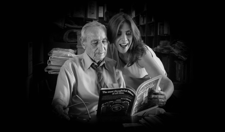
I love it @gabyoraa! Here's my edit. I went black and white with it. Hope you like it!
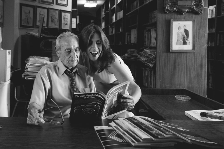
This is my take: an instagramish square, with a heavy vignette to get the focus on the faces.
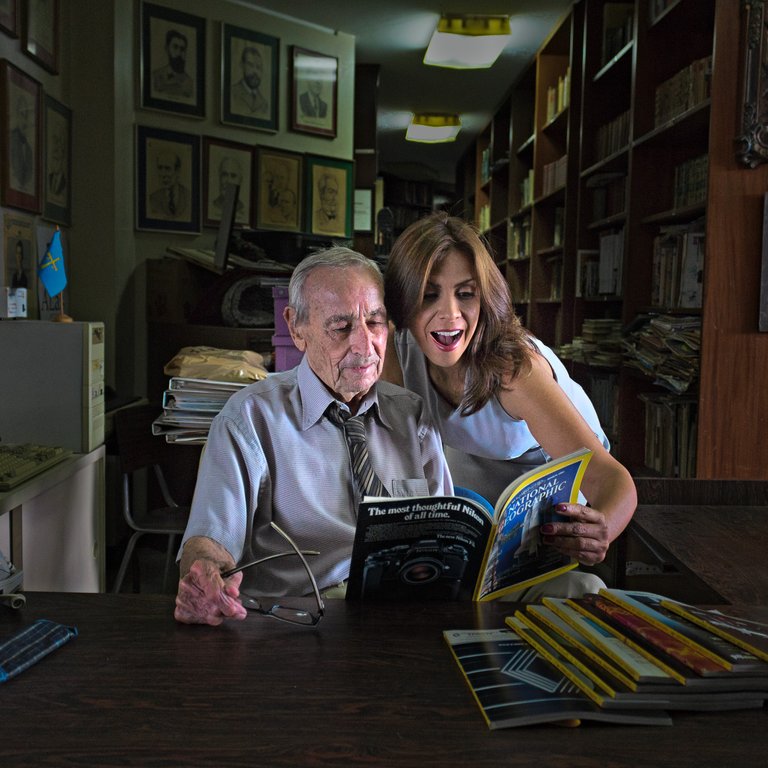
;)
P.S. be sure to view it large.
Aha, I see it. Very sneaky 😊
Saw it ha ha ha ha.
Great shot @gabyoraa. I decided to process it without cropping because it's a great shot for a reportage as it is. Just applied a slight different look on the image. I considered ging b&w on this one, but I didn't like the idea of loosing the natural colors of the image.
My post with all the edits for this Friday is here
Here's my edit.
My edit of this photo!
I did a live editing video to go along with my submissions.
https://steemit.com/photogames/@jarvie/geajwfsz