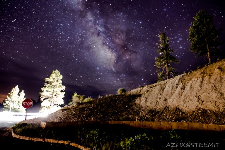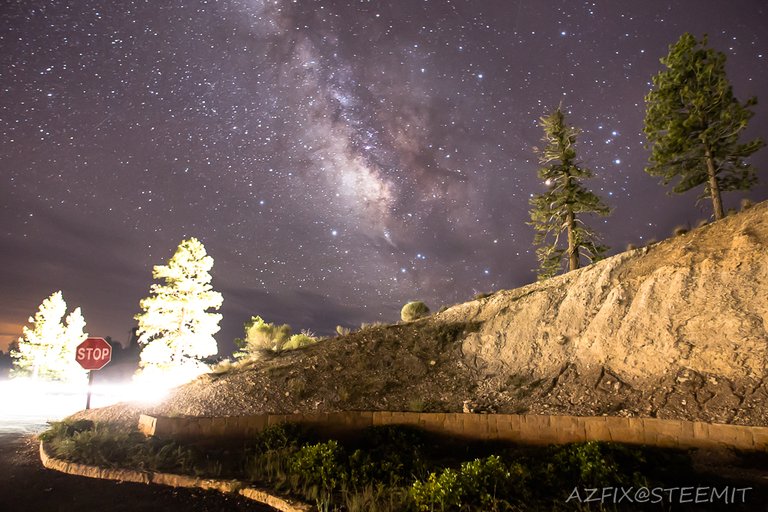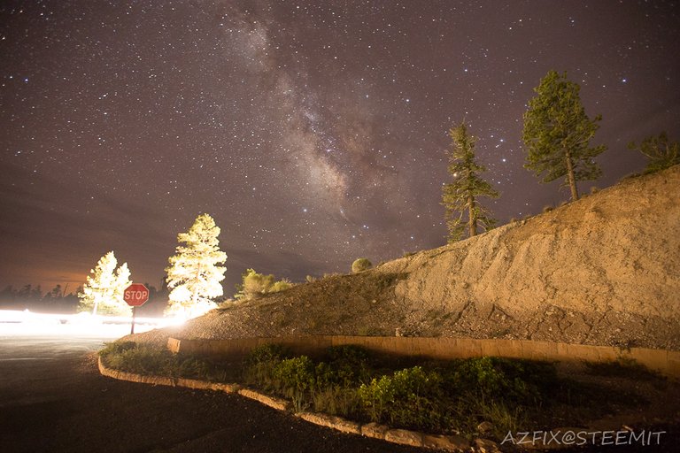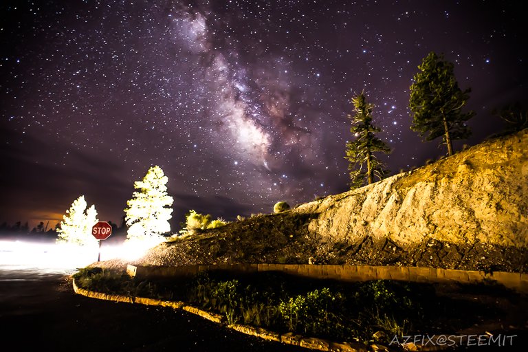
I shared a different edited version of this photo in the past and wanted to share a couple more to help me decide which version I should share on my facebook page.

This one is very lightly edited and I originally thought the car driving by ruined the shot, but now I feel like it adds some perspective.

Here is the original that is kind of dull and to me wont stand out much in a photo feed on facebook.

Here is a more brilliant version of the first edit that pops from a photo preview but looks less realistic as you enlarge it.
My Facebook photography page has hit a tipping point pushing past 7000 fans recently, so I want to try and find the most shareable photos to promote photo content and Steemit as well.
Let me know which photo you like the best.
Amazing sky with various versions! I like them all.... Each photo has its own style! I cannot choose which photo I like the best.... Great works! ;)
Thanks @tangmo I have not seen you posting as often these days
You're welcome! Please accept my sincere thanks for your kind concern about me! I'll try my best to post more often..... ;)
The Milky Way looks the best on the last photo, but those two trees with car lights looks much better in the first photo. I feel that on the last photo they take too much attention from the "star" of the photo - The Milky Way.
I would pick last photo with trees from the first one :D
That would probably be the ideal way to go if I could find a decent way to pull it off.
Great shots. I love Utah! Especially Arches , Zion was pretty insane as well.
I loved my time in Zion as well and plan to visit again this year. I have not visited Arches yet but it is high on my list because of all the cool formations that would make for some epic dark sky photos.
I love Bryce Canyon. I went out at 2AM to stare at the skies. They were spectacular.
I prefer the first photo. It was a toss up. I prefer the sky in the fourth photo, but I find the embankment looks a little too unrealistic with the enhancements.
Bryce Canyon is one of the best locations I have visited for photographing the Milky Way at night, with the least amount of light pollution from communities in the area. I agree with your assessment about the photos and am still leaning more towards the first photo as well.
I have to go with the last one! Nice job trying to share Steemit too.
Another vote for the last photo, this will make the decision hard.
The last one it looks realistic and perfect....btw nice edit....
Thank you, and thanks for letting me know which one you like best.
I like all the pictures are good edits. if I have to choose one then I select the last picture, I think it's a great picture.
Thanks, so far everyone seems to like the last one
Picture 1 is better, but still too much light in all the photos; overall, I felt uneasiness when looked at the photos; strange feelings; can't describe.
The light from the car is not ideal, but I made it work. Sorry you felt weird seeing these photos
Good post @azfix