Don't overprocess you photography, just to stand out on social media!
This is a blog post I wrote for https://luminous-landscape.com which is a paid site with millions of views every month. Some of the best landscape photographers, such as Alain Briot, writes for Lula so it was very exciting to be invited to write for them. This was now quite some time ago and naturally my post has made its way into the lower depths of the archives there so I feel quite fine about posting it again here on Steemit. The subject is more valid than ever.
The Contrast War
In music production circles there is a concept called ”the loudness war”. The phenomenon that we perceive music that is louder as better has led engineers into a contest of increasing the perceived loudness of the material to a point where its dynamic range is getting compromised and effectively reducing
the quality of music overall.
If we translate volume in music to contrast & saturation in the visual arts, we could argue that a similar war is taking place in photography.
We have all, at some time, fallen in love with those sliders that increase the “volume” of an image. I’m talking about contrast, saturation, vibrance, sharpness, clarity etc. Experimenting with those sliders is a lot of fun and can quickly turn any boring photo into a more exciting and energetic one. Early on I too loved such editing techniques and used it to impress friends and family with my out-of-this-world type images. I quickly discovered that I could go even further with RAW, HDR and tonemapping. The clarity slider simply wasn’t enough anymore so I started searching for the next level with specialized plugins for adding artificial texture, increasing local contrast, and HDR. I wasn’t the first however and I sure wasn’t alone. A quick look at my social network feeds reveal a complete flood of over processed, saturated and overly contrasty images. Black clouds and neon blue skies are the norm now it seems. A contest in contrast!

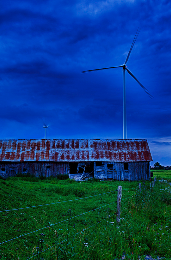
Image: New Era
Early work. This is the first picture that I ever sold. I used to love making this type of heavily processed images.
A couple of years ago I got tired of the over processed look and went in the complete opposite direction. I wanted to create a quiet, slightly faded and not too attention grabbing look that would look great when printed large. I experimented with ways of reducing the contrast and the saturation without loosing the image itself. I found that keeping a lot of punch in the mid tones was essential while blacks and highlights were less crucial. I became more careful of not treating the entire image uniformly. Some images just did not stand well on their own when the special effects were removed. I think you have to ask yourself what it is that truly matters in the image. If the answer is; the special effects – maybe you should reconsider that one. The low contrast look also demanded certain qualities from the image, such as simplicity and subtlety, so I began actively searching for images that would fit that style. Images I had previously rejected was seen in a new light. To further complement the idea I experimented with printing on papers I had not previously considered, such as thick textured papers with lower DMAX.

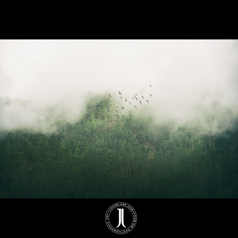
- Image: Into the mist
The first thing we learn as photographers is to contrast optimize. This image has no black point and no pure white point. I don’t think it needs it. This has a different feel.*
I’m still experimenting but my images started to look different. I think they became more painterly and more serene. Possibly a new personal style and preference was emerging with an added benefit of continuity.

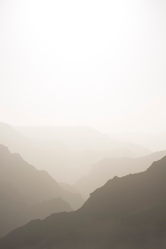
Image: Mountains of Calima
Almost a study in simplicity! Very little contrast. Not very exciting, but sometimes that’s exactly what you need. I have always loved the layered effect of distant mountains and wanted to capture only that.
What I’m trying to get across is not that heavily processed images are bad. When the image asks for it and its done right it can be great and I love that too. But sometimes it’s just a good idea to do things in completely different way from how you’ve always done it!

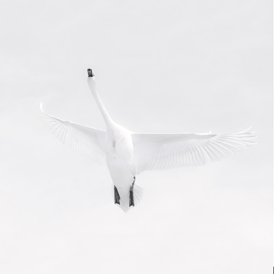
- Image: Keen Swan
I’m sure this would have looked great as a perfectly optimized color image. But it would just have been another photograph. Now it looks like a piece of art.*
Hi! I am a robot. I just upvoted you! I found similar content that readers might be interested in:
https://luminous-landscape.com/the-contrast-war/
Curious?
introduction post
Check out the great posts I already resteemed.Resteemed by @resteembot! Good Luck! The @resteembot's Get more from @resteembot with the #resteembotsentme initiative
Nature photograph
This post has received a 71.94 % upvote from @moneymatchgaming thanks to: @colicoid. Upvote this Post to Support the MMG Community on Steemit! :)
For more information, click here!!!!
Send minimum 0.100 SBD to bid for votes.
This post has received a 0.59% upvote from
Do you know, you can also earn daily passive income simply by delegating10SP, 100SP, 500SP, 1000SP or Another amount your Steem Power to @minnowhelper by clicking following links:
This post has received a 6.67 % upvote from @voterunner thanks to: @colicoid.
I have seen many overly processed photgraphs here on Steemit and I absolutely hate it. I find what coud have been a great shot a huge disappointment. Glad to see it finally addressed by someone.
Resteemed to over 10300 followers and 100% upvoted. Thank you for using my service!
Send 0.100 Steem or 0.100 Steem Dollar and the URL in the memo to use the bot.
Read here how the bot from Berlin works.
We are happy to be part of the APPICS bounty program. APPICS is a new social community based on Steem. The presale was sold in 26 minutes. The ICO will start soon. You can get a account over our invite link: https://ico.appics.com/login?referral=1fRdrJIW
@resteem.bot