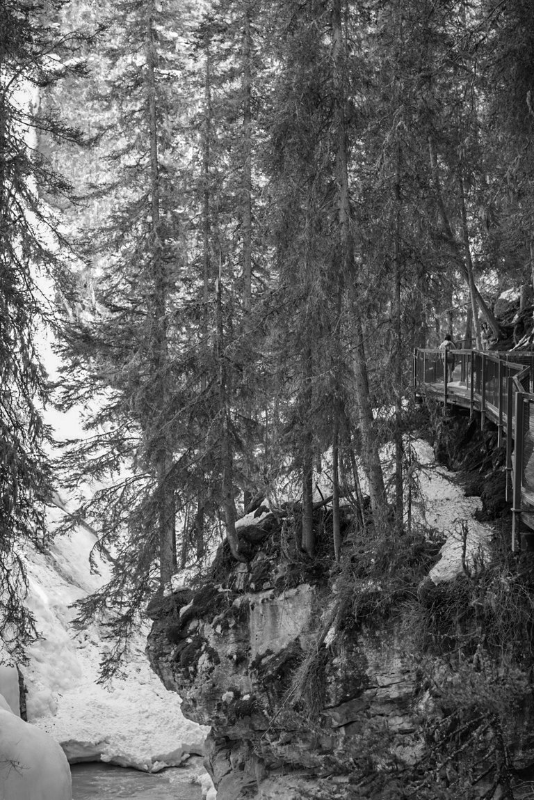
This shot was captured inside Johnston Canyon, Banff National Park, last April. It was actually quite warm that day, and the trail was also a bit icey. On this, definitely, I’m going with the colour version. How about you?
===
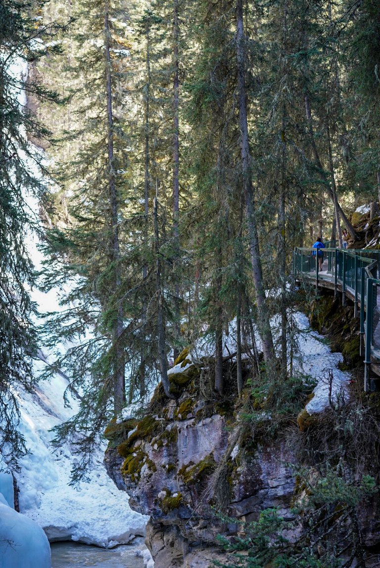
ISO 160 ~ f/4 ~ 1/60 sec
===
Camera: Sony A7R III
Lens: Zeiss 55mm
===
===


For nature shots, i usually prefer color. It's more natural.
I agree to with this opinion.... B&W good for some street shot or for particular landscape with high contrast, or for old architecture.
I get that, thanks for your opinion!
Like the color to see the contrast of snow and the greenery. Thanks for sharing @daveks.
Thanks @robertandrew I really appreciate it!
@daveks beautiful photography.loved it.keep sharing.
Thanks buddy!
The jury is in on this one...it's the color version. I think @sina-adventure and @cesmak make a good point.
Yeah they do.
Often, a great way to "fix" an image it to convert it to black and white, but I think color works best here. In the b&w version, the trees just look like a mass of gray stuff, but the color version gives a little more information. But anyway. My two cents. ;)
Totally agree with you. The more I looked the more I liked the colour and felt the black and white didn’t work nearly as well. Thanks bud!
i'm for the colour on this one buddy. it looks really steep that banking I wouldn't want to be on that little bridge, but saying that I have a fear of heights so that my be the reason :D
I’m not the best with heights either. Cheers buddy!