I’m working on a new set of images I shot the day before yesterday but I’m having trouble deciding on what way to go with them. I originally wanted these to be black and white, and already made one set like that which works really nicely, you will see that later. I did post a preview of it already if you wanna have a peek.
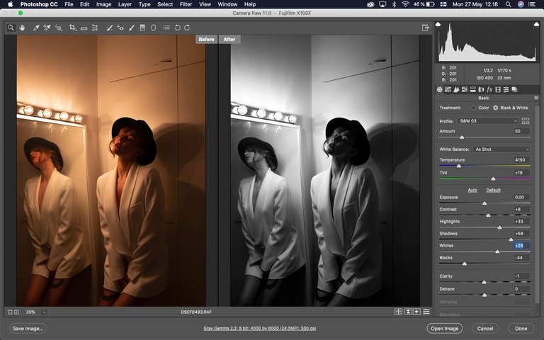
Then I started to work on this next set and I am not sure if I am feeling the black and white. On the left is the original raw image, right is an ongoing process of photoshopping it black and white. The original has me thinking that these might work in colour too, but black and white is a classic.
B&w with a bit softer highlights I would think 🤔
Posted using Partiko iOS
Definitely b&w. And you already published these in b&w.
I like the warm white tone on the mirror and your skin, but not on the closet doors. How about colors in the mirror and the mirror itself, but everything else b&w? Perhaps red lips also. I know you normally don't do gimmicks like that but I'm just curious how that would look. :)
You are right about that, I don’t do gimmicks. Though if I could do a Sin City, neo-noir, type of image, that could work, but guess what, I’m lazy! I might try that for one image at some point just for fun, but I won’t do this whole set like that.
Wait, I just realised you are @jokinmenipieleen also!
Joo, kun tykkään kirjoittaa toisinaan myös suomeksi ja ajattelin että haluan erotella ne eri blogeiksi. :) Sitten iskee se kuuluisa laiskuus täälläkin päässä ja toisinaan muuttuu hyvinkin satunnaiseksi. Mutta vastoin yleistä luuloa, laiskuus on hyvästä.
I would probably do a set with both styles if there was enough material and decide picture by picture if it's better in b&w or in color.
Posted using Partiko Android
I love the bw but something about the raw tells me you’ll be surprised with the color too. I’d say develop both. better safe than sorry, right?
I'm kinda on the same page with you, which is surprising as this is usually a very easy decision, already made while shooting.
Rooting for the raw images ❤️ Something about the warm hues and the red of your lipstick + the white overcoat combined with the shadowplay all compliment each other.
Posted using Partiko iOS
I never post raw images, they are not meant to be used like that, they are undone. But I could work in colour and warm tones, trying it now actually and it's proving to be quite hard to find a good balance.
I'm a little bit more inclined to the b&w one, but with that setting the colour one works like a charm too!
Posted using Partiko Android
I'm trying out both now and this particular image works with both, but others taken from different angles are proving very hard to do in colour! We'll see where it takes me eventually, might take a while.
No rush; will be keeping an eye on your posts! ;)
The real you works well in BW. But I think the mirror image comes out better in colour. I went back and forth for a bit. I'd put out both. Comparing the difference is interesting. You can't do that with out both. I'd put out the B&W in the first post because that was your artistic intention. Then the colour version in a second post for the difference in what stands out in colour. I think the fact that the focus changed was amazing! I found that I focused on the real you in BW and the mirror you in colour. I don't know why.
That is a very interesting thing to note, the difference in focus between the same image, just by changing between colour and black and white. I need to keep that in mind!
I hate to say it ... but ... both.
Visually, they will present differently. That may be the interesting part. A representation of two moods with the same photo.
B&W is legit.
Posted using Partiko Android
It's a safe bet.
A classic look.
Posted using Partiko Android
BW is a;ways cool especially for your Noir styling pics but the warmth of the colour version is more inviting as a viewer. I would probably try and make that shadow on the right more punchy and crop the dead space above. Crushing the blacks a bit in the colour version would maybe give the best of both worlds.
Inviting, me, no no no, then I won't do it 😝 I agree with you on that blacks as black in the bw and in the colour version a bit softer, I've found that to work quite well on other images.
I don't mean inviting in that! , just visually inviting into the image.
If you're willing to have both, I say both, since they're both great. IF you must choose, colour - there's something very alluring about the colour ones ;)