This year, Bulgaria took over rotating EU presidency, so I thought that it'd be a great time to share a winter shot of the building (The National Palace of Culture, or NDK) where the most important meetings will take place. I took the picture on the 6th of January last year when the temperatures were well below freezing, and the snow drifts were so deep that you could jump in them without hurting yourself. It was snowing heavily on that day, which further contributed to the feeling of desolation.
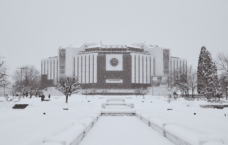
Fujifilm X-T1 & Fujinon 35mm f/1.4 ~ f/5.6, 1/125 sec., ISO-500
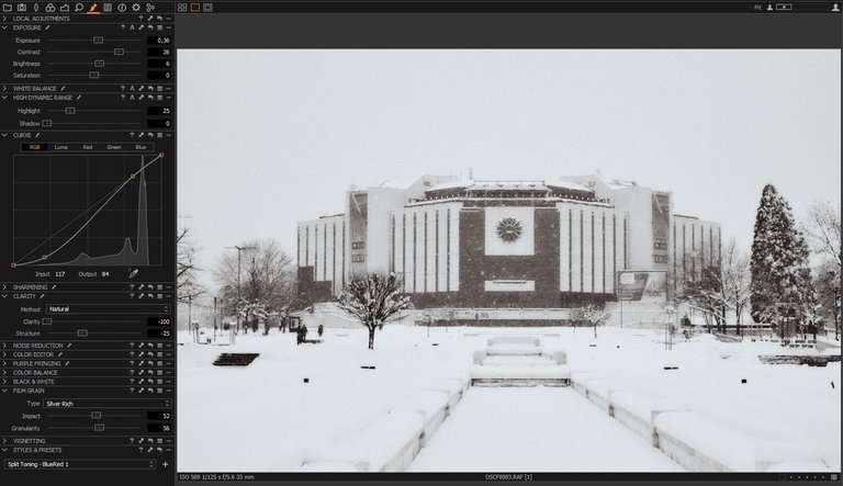
This is a screenshot of my Local Adjustments tab in Capture One 10. The first thing I did was to desaturate the image and increase the contrast; I also decided to increase the exposure, as the whole photo looked a bit darker. Then, I applied a curve, which darkened the building, thus making it stand out. Another thing I did was to move the clarity and structure sliders down to -100 and -25 respectively. Now, you may find this strange, as most of us want sharper images, but I think reducing the clarity gave the photo an eerier look. Last but not least, I added film grain and a Blue-red split toning.
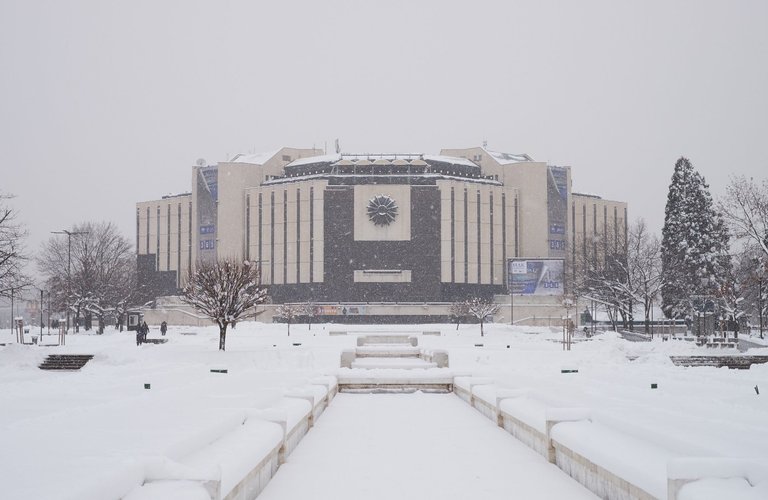
This is the original image
Do you like it better in color or B&W? How would you edit this shot? Let me know in the comments.
Thank you for reading,
Dan
I'd try adding a little warmth to the B&W. Just a touch.
BTW, love the new "bio".
Ah, the bio... thanks :) It looked warm enough at home, aargh!
🤗😄
I like what you did and B&W works well. I played a bit with your image in windows photo editor. How do you like that?
Your photo
I really like the crop - all unnecessary elements are gone. Maybe it's a tad too contrasty and saturated for my taste :) Thanks for the edit, @lakshmi.
What's your name, by the way? 😊
Yes, I made it very contrasty but thought it was fun to do it very different from you.
My best friend calls me Lakshmi :)
I'll call you Lakshmi, too then :) I find it awkward to write @ in front of the nickname all the time.
I agree, what should I call you?
Dan or Daniel, it's up to you :)
Dan it will be :)
I like them both. When I first went back and forth with which I liked, I got confused and thot the first shot was the original and that you'd added color. And I was going to make a joke about seeing yellow this time and not pink.
It definitely does look more desolate in the colorless shot. The color one added a softness.
I just read the other comments and a few of those people sure know their editing .... I learned a couple of things. :)
Haha, I actually thought about the pinkish tint before choosing the right filter 😁 It's good that you learned something, and thanks for your feedback @countrygirl :)
This is a tough one, I would normally say monochrome, but the snow makes it's difficult, I would like the building itself to be darker and maybe more contrast in total, but then the steps on the left would be distractingly dark, so maybe some spot editing on that....and that's how you disappear down a psot production rabbit hole.
You have a very good point there. I trying to add more contrast by using the curve but that made the trees and the steps significantly darker. So, yes - spot editing :) Thanks for your suggestion, Harvey!
I like the desaturated one more. I'd pull up the value of the snow a bit, eg make the light parts lighter but leave the dark parts as they are
Hey Daniel, welcome to Steemit and thanks a lot for your input! :-)
Simple photos are hardest to edit. All depends on where you want to add accent point/ point of interest. Atm to me it looks a little bit dull, maybe pull up exposure just a tad, use fog or smoke brush on corners to accent wintery feeling, selective brush to accent those benches or wall that lead our eyes to building, and just a bit of selective contrast to that “rose” on the wall...but of course that’s me, everyone have their vision 😊
You are right abot the simple photos, I probably spent half an hour trying to edit this one. I made it dull on purpose, as I didn't want the trees and benches to take draw the viewer's attention. As for the brushes, I will need Photoshop. Anyway, on my monitor at home it looked fine. However, it doens't look nearly as good on the other monitor at work. Maybe I have to recalibrate the one at home :) Thanks for your suggestions, Di, I may give it another try tonight 😊
I actually like it in colour, mainly because it is almost a sepia image in colour
The one color is an exact copy of the raw file, which means that the colors are a bit flat. I should have also added a color edit :) Thanks for your comment @nikv!
Very simple kind of architecture!
First of all, you didn't upvote my post and then you decide to upvote your own comment that doesn't contribute at all? I am downvoting it.