HELP HIVERS!! ZOMBIES ATE MY NEIGHBOURS!
Behind the scenes
Apologies for being a bit vacant I can’t seem to get the app to work on my phone and even having 20 spare minutes at the mo seems to be avoiding me. But any way here is another behind the scenes from my retro games project.

I've been doing the elements as a theme and this one was the last one for earth! I wanted to try get the effect of a zombies hand coming out of the ground holding something and this is how it was engineered. So first job was to head to the woods.
Set up
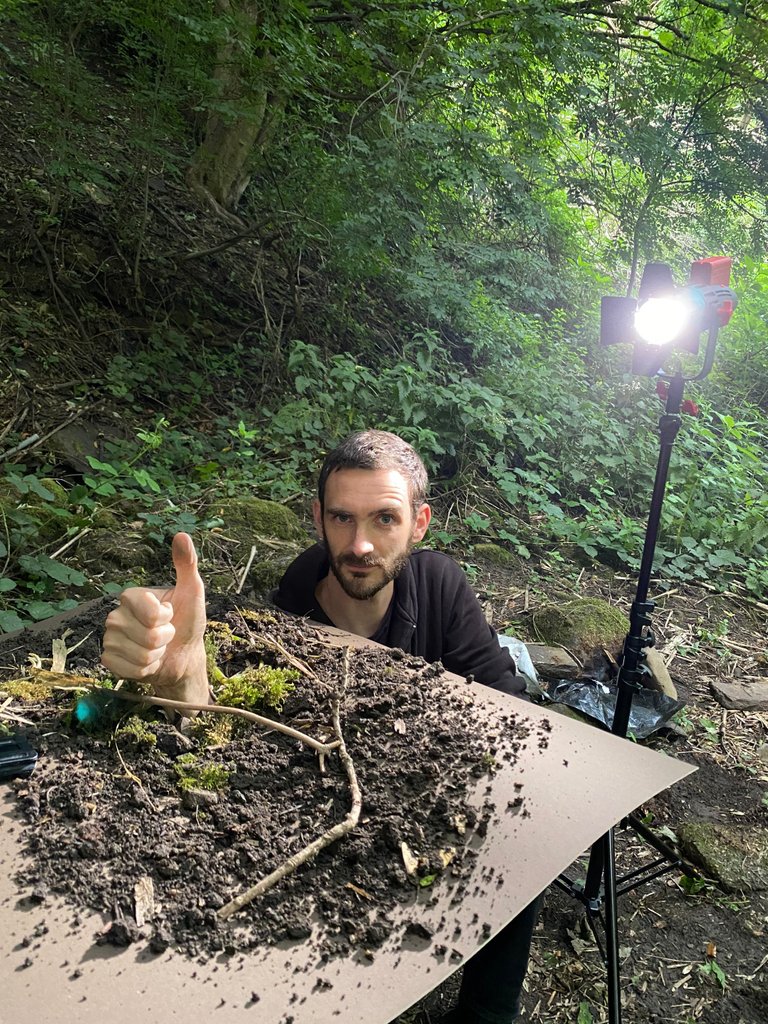
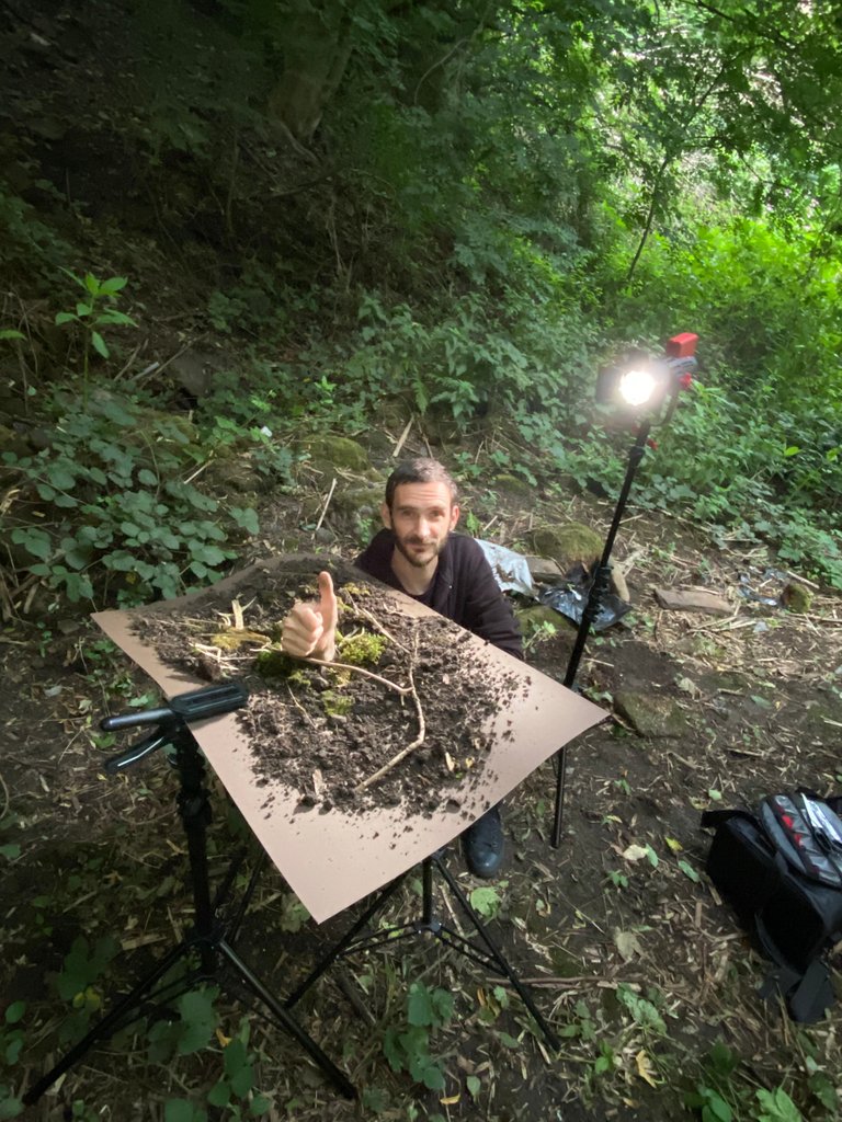
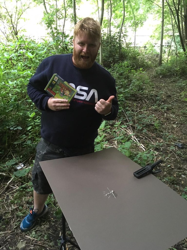
So step one was to cut a hole in a piece of brown card. I cut a star shape into it similar to that trap in saw, ooof gory! The idea was to cover it in mud and moss from the ground of the woods to recreate a new floor. (So we didn't have to actually bury the talent) I went with brown mount board card as it was pretty neutral and mud coloured. If you do want to try this make sure the hand fits through the whole before. Once again @ashtv was the hand model.
Lighting
I wanted to recreate the look of moonlight. Although it was still bright outside I used that to my advantage and used a 30W portable daylight spot light to add some shape to the hand. This was positioned about 90degrees to the camera. A lot of this is trial and error, sometimes it's worth moving the light around until you find the correct look.
In this instance kept the light a little lower as I use atmosphere aerosol quite often to create a haze. By having the light more horizontal the haze catches the light better.
click here for the timelapse of the set up...Zombie Timelape
Now onto post production
So I had a look though all the shots in lightroom and picked out what thought was the best one. The haze and lighting looked good but I felt i just needed to be a bit more zombie like. So I jumped into photoshop.
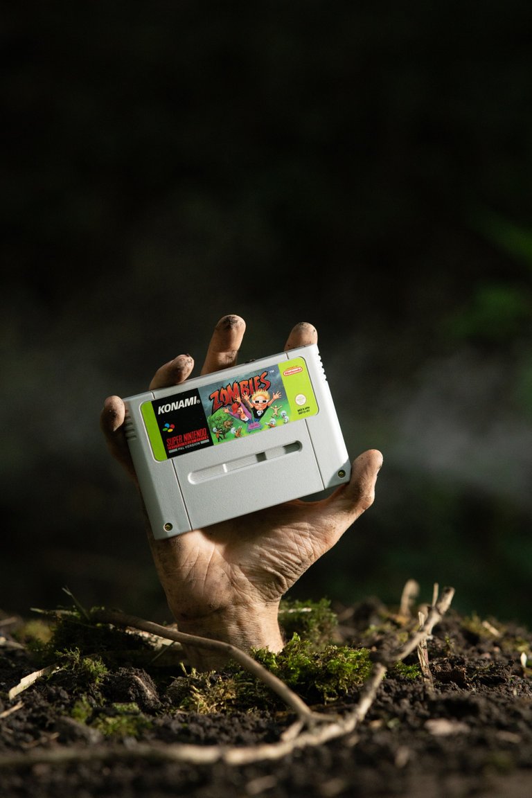
The first thing I played with was the background. With the exposure being set for the hand I brought up the background to see a bit of the green bokeh from the leaves in the background. But even with that I felt the hand needed scuzzing up a bit. I've been playing with blood effects from previous edits and found a great tutorial on creating realistic scars.
Here is the link if you're interested. Scar tutorial
Without going into to much detail, the scars are a combination of multiple red brushes and a texture. These are then finally embeded into the hand using the emboss effect.
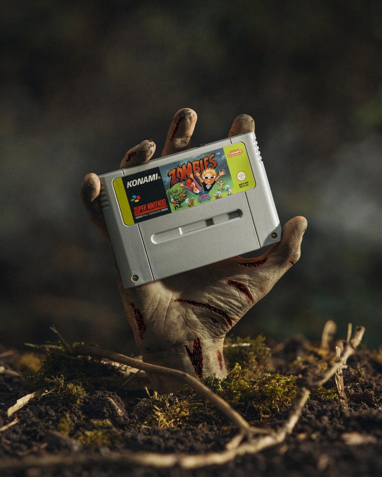
So out of photoshop this is looking pretty good. But I want the had to look a bit more green and to add a little bit more contrast to the image.
Using the brush tool with the white balance set to green and a little lift in the exposure I firstly coloured in the hand. I then added a boost in contrast. This seemed to eliminate some of the background bokeh but I think it drew your attention to the foreground more and really made the haze pop. Finally I made the white balance cooler on the overall image and added a vignette.
And here is the final image.
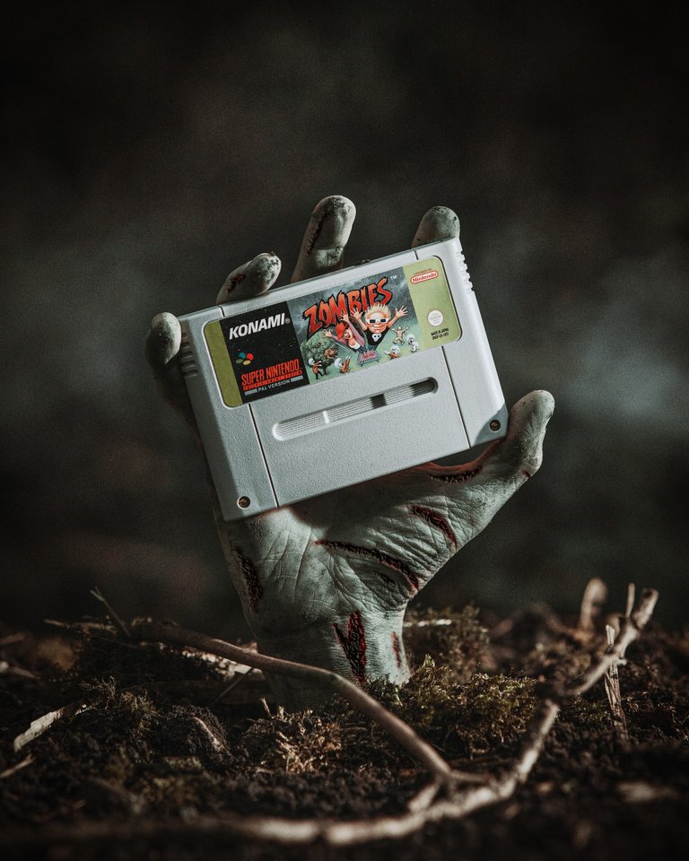
Need a hand model. ashtv is usually always available and at a decent rate. Check out his portfolio.
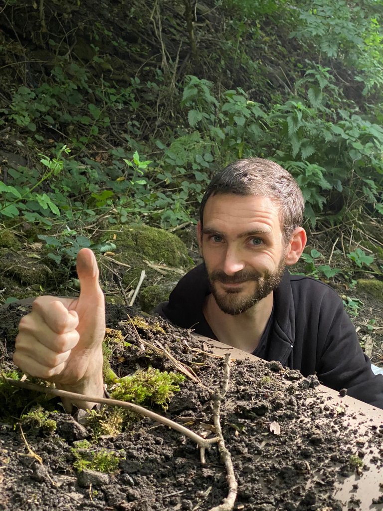
i thought it was a fake hand :) great hand model
Great process man, final image is super striking!
Happy to help where I can.
Hand or no hand.
Congratulations @jackshootsstuff! You have completed the following achievement on the Hive blockchain and have been rewarded with new badge(s) :
You can view your badges on your board And compare to others on the Ranking
If you no longer want to receive notifications, reply to this comment with the word
STOPTo support your work, I also upvoted your post!
Do not miss the last post from @hivebuzz:
Support the HiveBuzz project. Vote for our proposal!
Awesome work guys! The result is so awesome! I am sure you had a ton of fun while working on this project!