I used to hate the living day lights out of colour grading video before i got my BMC URSA of course. Mainly because everything would always just looked so crushed whenever i would try and play with colour. I remember being able to push the contrast slider only micro fractions to avoid ruining the whole image or not being able to even touch the highlights slider as all it did was make everything grey rather than actually bring down highlights.
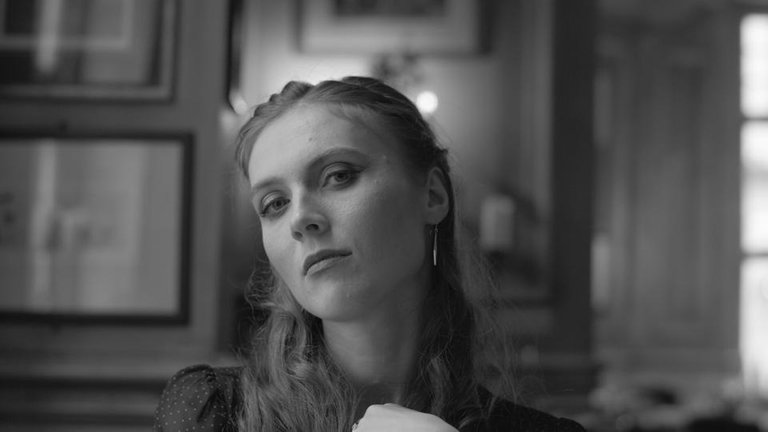
Here are a few different grades i've been playing with recently, the image is a frame from a video i shot recently for a jewellery advert. It's amazing how much detail ProRes 444 actually holds when colour grading. I was having trouble choosing but i ended up choosing a warm toned grade for the final film.
What do you all think of these grades and which one do you prefer, if this wasn't a jewellery advert i would of probably gone for a Matrix green :)
This is the original straight out of camera look
1
2
3
4
5
6
7
8
9
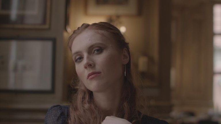


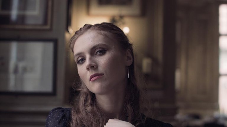

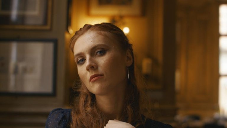

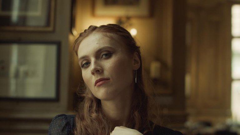
Number 1 for me. Really nice warm look without feeling too processed. Great shot btw.
That is the one I ended up using for the final film, love warm tones and Cheers dude
No. 1 ✌🏼😊
Congratulations @jchauhan! You received a personal award!
Click here to view your Board
Do not miss the last post from @steemitboard:
Congratulations @jchauhan! You received a personal award!
You can view your badges on your Steem Board and compare to others on the Steem Ranking
Vote for @Steemitboard as a witness to get one more award and increased upvotes!