Hey you all design lovers out there,
I'm back with another post, this time showcasing some of my recent works and experimentation with texture.
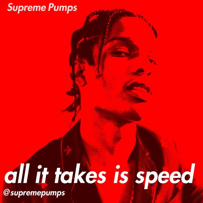
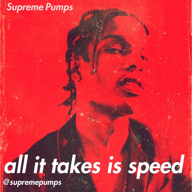
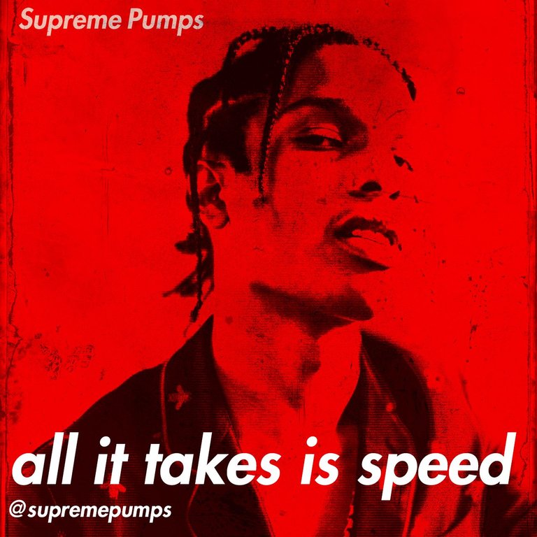
As you can see I picked A$AP Rocky as the face of this week's Supreme Pumps post. (This hasn't been out on Telegram yet btw, so you're seeing this exclusively)
To blend the red into the face can be tricky sometimes, as it may turn out that the image has way too much red in it and it keeps your eyes restless, and is uncomfortable to look at. I think with this design I almost reached a point of annoying red, but at least I think I slid by it, I think it's still okay to look at. What do you think?
The 1st is a clean version with a bit of a television texture on the dark parts, 2nd has a stock texture, and 3rd is the same stock texture, just in different mode.
Which one's your favorite?
1

2

3


ETH: 0x368C24Aceb5eA6ade6b4199a38FceB7B741c18dC
LTC: LUnoR7QivarfBfbQNxQEVc5rA7gBzy7xBo
BTC: 1NjKBk449fiJqkGgqZnzde2KUGNHDHUw97Thanks for viewing this post! Let's grow the #graphicdesign together!
Support #graphicdesign to make Steemit look dope!
K
Well done, this is just awesome you left a letter on my post, and upvoted your own comment. You do this for a living?
awesome mate!
Thanks bro!