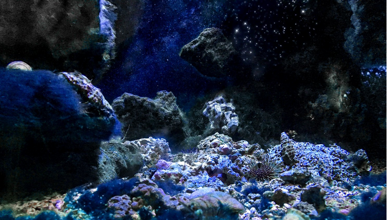
Great idea, just tried that and changed the greens into blue tones:
I think it looks much more space-like now. I also increased brightness and contrast of the star-field as suggested by @astrophoto.kevin.
I'll try to remember to vote your comment in a few days, when my VP has recovered from the HF20 wipe-out.
Cheers!
The background gives it now more depth and the stars are popping out more, well done :-)
In my opinion, this makes it look more "spacy".Really great @shaka The blue color fits very nicely, that was a good suggestion of @roused
Thanks to both of you for the input :)
You're welcome :-)
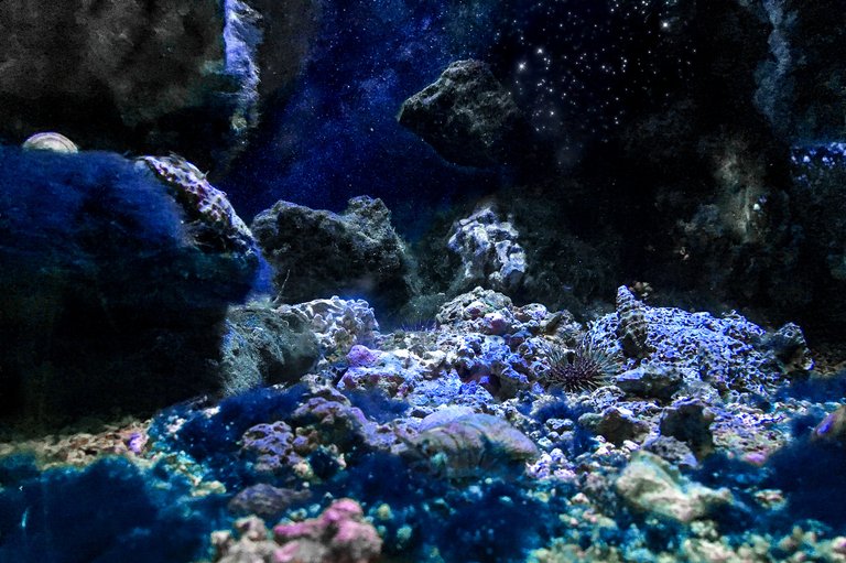
Wow, that looks pretty amazing now -- very "otherworldly." Very cool idea.
Cropping it a bit can also brings out the star-field.