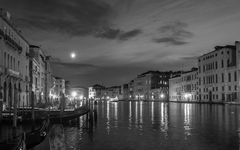
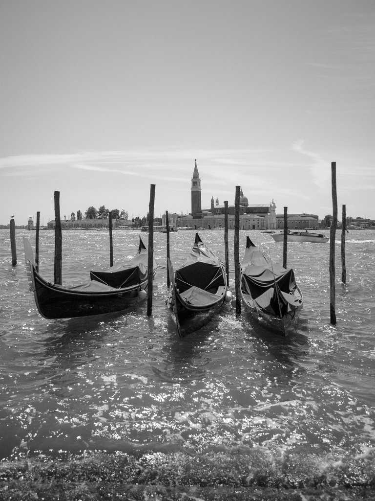
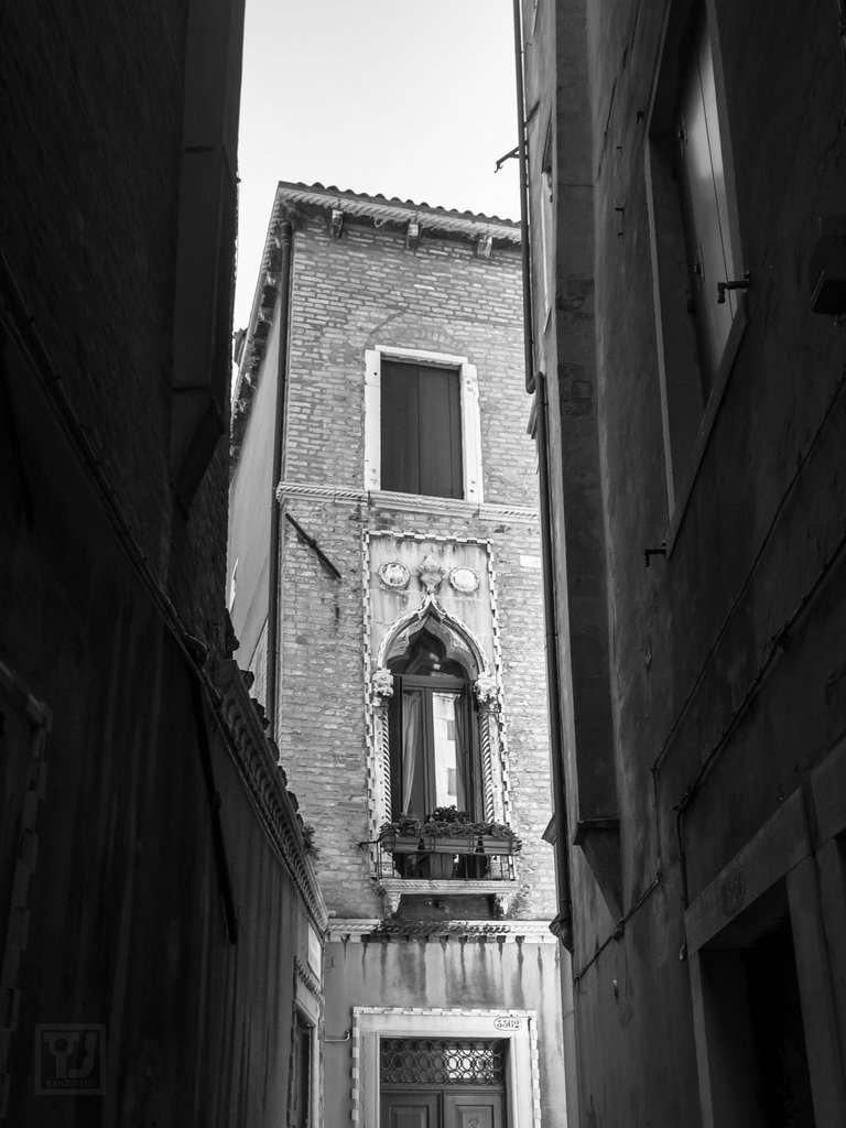
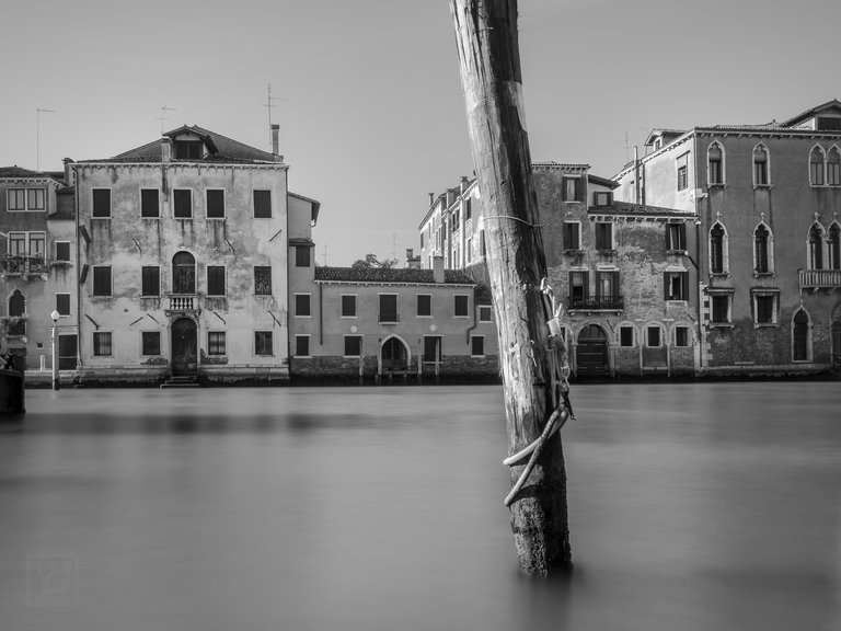
When I was looking a bit deeper into my collection of photos from Venice I found a selection that I discarded for one reason or another. Space is always limited in my album (this is more a metaphorical statement) so I try to find a selection of shots that represent a trip rather than each shot I really like. These are some that didn't make the cut.
One or two of them I can identify why they were diced straight away but, others I am unsure how they got clipped. It is not a bad thing of course to be brutal with editing. As the saying goes: murder your darlings.
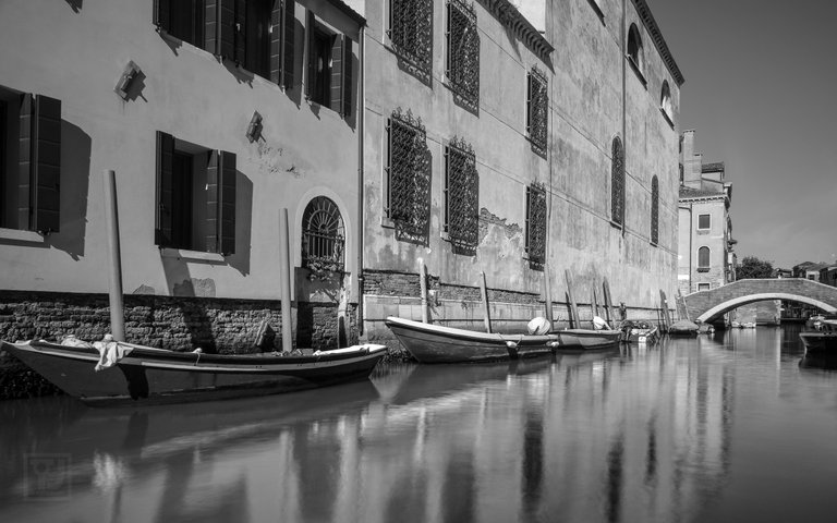
These are all in black and white. It is not always the case, but if an image doesn't hold up monochrome, it is lacking something I think. Of course, sunsets for example, colour is a necessary addition. I also like B&W because of the old time charm it offers. A mood that colour can't reach and a depth colour glosses over.
Can you see why they were cut or was I too hasty in my preliminary evaluation?
Taraz
[ a Steemit original ]
cool photos! i like them!
Thanks @vintageblossom I still wonder why some didn't make it...
You know how it's done 😊
Point and click, right? 😉
What an excellent post and shots! You sir, have gotten yourself a new follower. :) All the best!
Thank you @creutzy it is graciously received.
Master Taraz,
If these photos had titles, I could give individual feedback. In general, I appreciated the opening photo and the final group photo the most. All were good! Find more space for your photo library please.
I also liked the three gondolas. Lots of space and straight lines.Ah @doctorjohn, it is always a pleasure to hear from you. I will do my best to increase storage capacity.