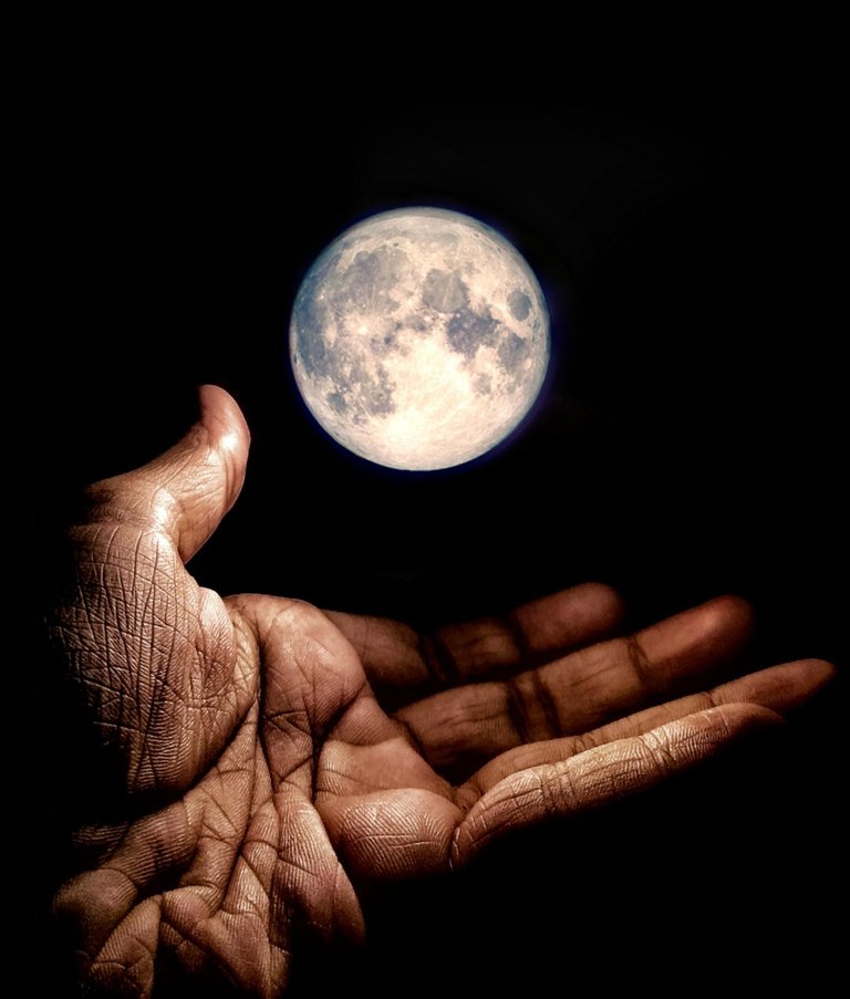
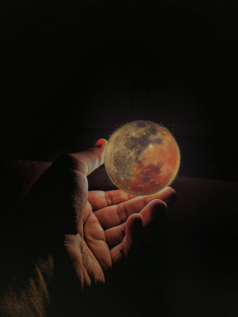
I recently watched tutorials on editing a photo through the use of masking several layers in a photo.
I have tried two holding moon pictures.
The first

The second

There are some errors in above pictures, but as a beginner i think i did well.
Tools used :-
PicsArt
Snapseed
Adobe Lightroom
The hand in the photos above is mine. Please share your thoughts on above photos and say which one is better.
wow beautiful editing my friend. i like your art it is awesome. good work my friend.
Thank you @tussar11
You need to stake more BEER (6 staked BEER allows you to call BEER one time per day)
Your post was mentioned in the Steem Hit Parade for newcomers in the following category:Congratulations @uzairk!
Thanks for using eSteem!
Your post has been voted as a part of eSteem encouragement program. Keep up the good work! Install Android, iOS Mobile app or Windows, Mac, Linux Surfer app, if you haven't already!
Learn more: https://esteem.app Join our discord: https://discord.gg/8eHupPq
You did a great job, both look wonderful.
!BEERThank you @joelai
Welcome.
Sorry, you don't have enough staked BEER in your account. You need 6 BEER in your virtual fridge to give some of your BEER to others. To view or trade BEER go to steem-engine.com
Congratulations @uzairk! You have completed the following achievement on the Steem blockchain and have been rewarded with new badge(s) :
You can view your badges on your Steem Board and compare to others on the Steem Ranking
If you no longer want to receive notifications, reply to this comment with the word
STOPTo support your work, I also upvoted your post!
Do not miss the last post from @steemitboard:
Vote for @Steemitboard as a witness to get one more award and increased upvotes!
i think, the 2nd one is far superior than #1
it is more intresting generally,
and more specifically, it gives impression of one object, being lightened altogether. unless #1 which (to me) looks like two different objects, just put together into one frame, .... each inherited its own lighting, which gives a less cool impression of impercet work.
anyway --job done, great! congratulations.
!BEER for you.Thank you @qwerrie for your honest reply☺️.
View or trade
BEER.BEERfor you. Enjoy it! Hey @qwerrie, here is a little bit of