I'll start this article by saying that I used adobe products daily for years. They have been part of my daily routine for around 10-12 years now and I always had this love-hate relationship with them but lately, it's been getting worst with every release. This article is a rant but that is aiming to put the spotlight on all the problems I encounter as a professional using adobe products.
For years, my professional workflow consisted of starting in Lightroom Classic for file management and raw file processing, then I will take my file to PS for more complex edits and then back to LR for long-term storage and cataloging, but lately, it seems that these two seem to step on each other's toes and mess up things. I'm not the kind of person who is resistant to change but Photoshop was supposed to be the more powerful software and I don't know if it is anymore.
Masking discrepancy
Now the thing that pushed me to start writing about my frustrations. Masking! It's not the only annoyance I have but it's the biggest one. With the recent addition to Lightroom, we basically got procedural luminosity masking. Luminosity masking in photoshop has been around for a long time now but most of us use actions to generate them and they don't update in real-time. For example, if you clone stamps something on the base layer the mask that you generated based on it won't update. Masks in photoshop are a core functionality, yet they are worst implemented than in Lightroom right now. I get it that photoshop started out as a digital version of the pen, paper, and exacto knife but it's 2022, we should be able to generate masks procedurally based on other layers and have them update in real-time while maintaining a certain editability to it.
This entire masking fiasco puts the user into an odd spot where you either want a better workflow in terms of masking or you want a bigger toolbox when it comes to what you do with the area that you masked. And my answer is simple: I want both of them.
User interface
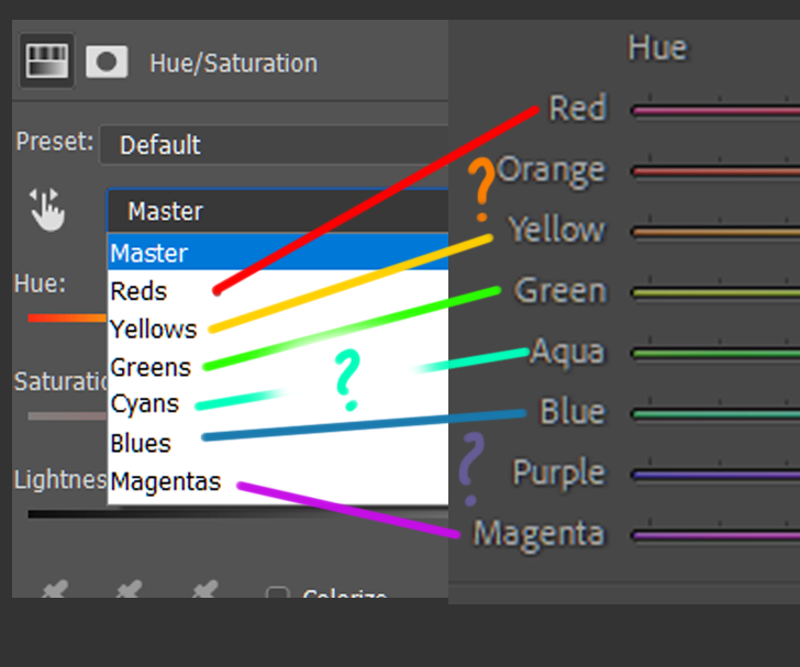
One other thing that bothers me is inconsistency. First of all, Can we decide on how many colors we split the spectrum into? It has been like this forever now, but it doesn't have to be. Is it just a legacy thing? I strongly believe that we can fix the mistakes we made in the past and harmonize things? We have this pie called the wheel of color do we want it cut into 6 or 8 slices more? less?

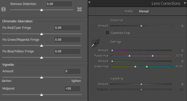
We can spot the same thing in the lens correction feature of the two programs. Inconsistency.

And since we are on the topic of sliders. In Lightroom, double-clicking any slider resets it to default, the same in the Camera Raw plugin. But guess what!?! This doesn't work like this in Photoshop!! And it should & any other adobe product for that matter. I don't want to go from +30 to like -2 and then to +1 and finally nail it back to 0. I would be nice to get the default position fast.
The common theme that for me, is easy to spot. There seem to be at least 2 different teams developing the 2 pieces of software that don't talk to each other enough. There seems to be no higher power keeping them consistent and this reflects poorly on the user interface and workflow of the end-user, slowing us down, creating confusion, and making the software appear much more complicated than it needs to be.
Congratulations @vmoldo! You have completed the following achievement on the Hive blockchain and have been rewarded with new badge(s):
Your next target is to reach 17000 upvotes.
You can view your badges on your board and compare yourself to others in the Ranking
If you no longer want to receive notifications, reply to this comment with the word
STOPSupport the HiveBuzz project. Vote for our proposal!