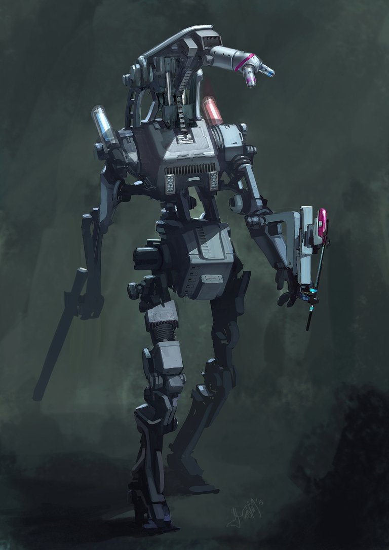
Photoshop tutorial: How to create a robot painting in Photoshop
For this photoshop tutorial, freelancers and graphic designers should be interactive we photoshop already
Art By
Takumer Homma
Intro
Here freelance concept artist Takumer Homma takes you on a journey in creating a robot painting in Photoshop – though the techniques he demonstrates would work just as well in Corel Painter or even physical paints.
Takumer has focussed on art fundamentals such as gesture, lighting, tonal value, and composition. We will approach the painting using traditional art principles – using a series of the abstract shapes to establish the lights and the darks.
This is an approach that can be used in concept paintings for quick ideas and mood sketches to save time – while still allowing you to efficiently build on thwse to creating a convincing final artwork.
Takumer says that before jumping into painting, always start with some research to give yourself a head start and a direction – and a lot of reference images. Try not to rush this step, relax and be open to what you see.
While there are a great many Photoshop brushes he could have used for this tutorial – including many available for free online, Takumer found that he got best results using the default hard and soft round brushes for all except for the background.
Time to complete
4 hours
Software needed
Photoshop CS5 or later
1x1 pixel
STEP 1
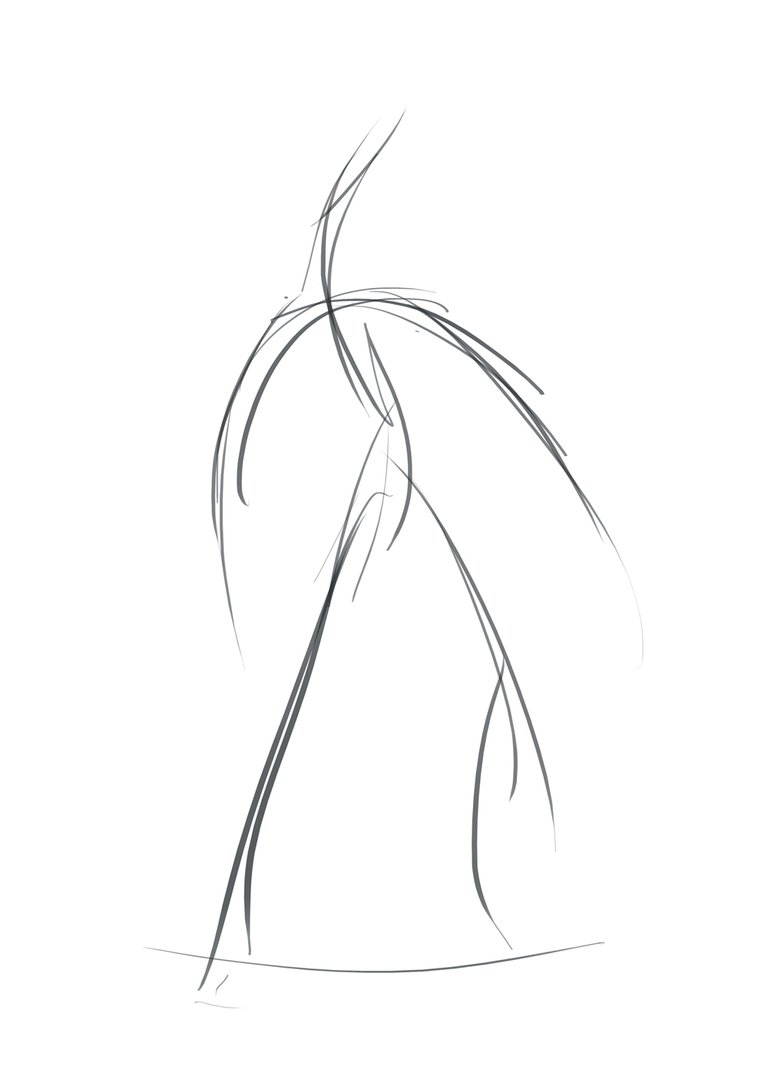
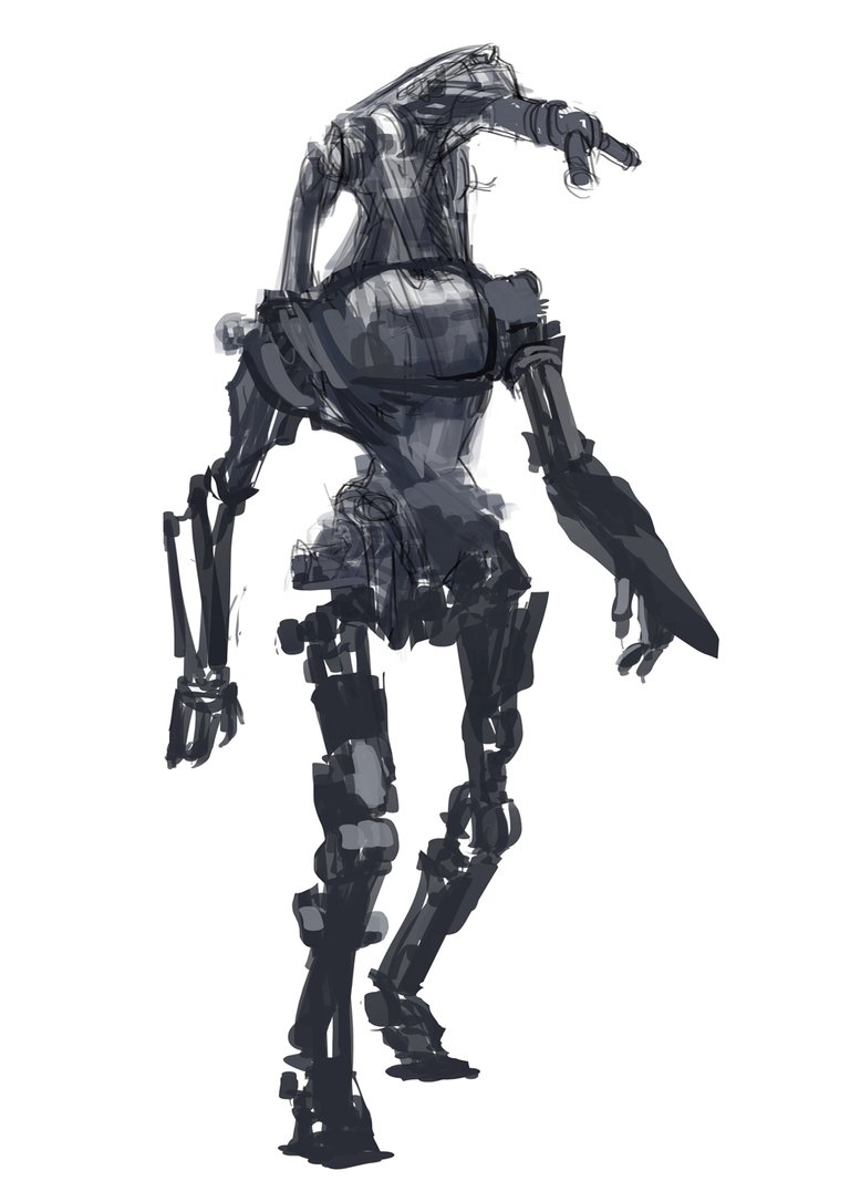
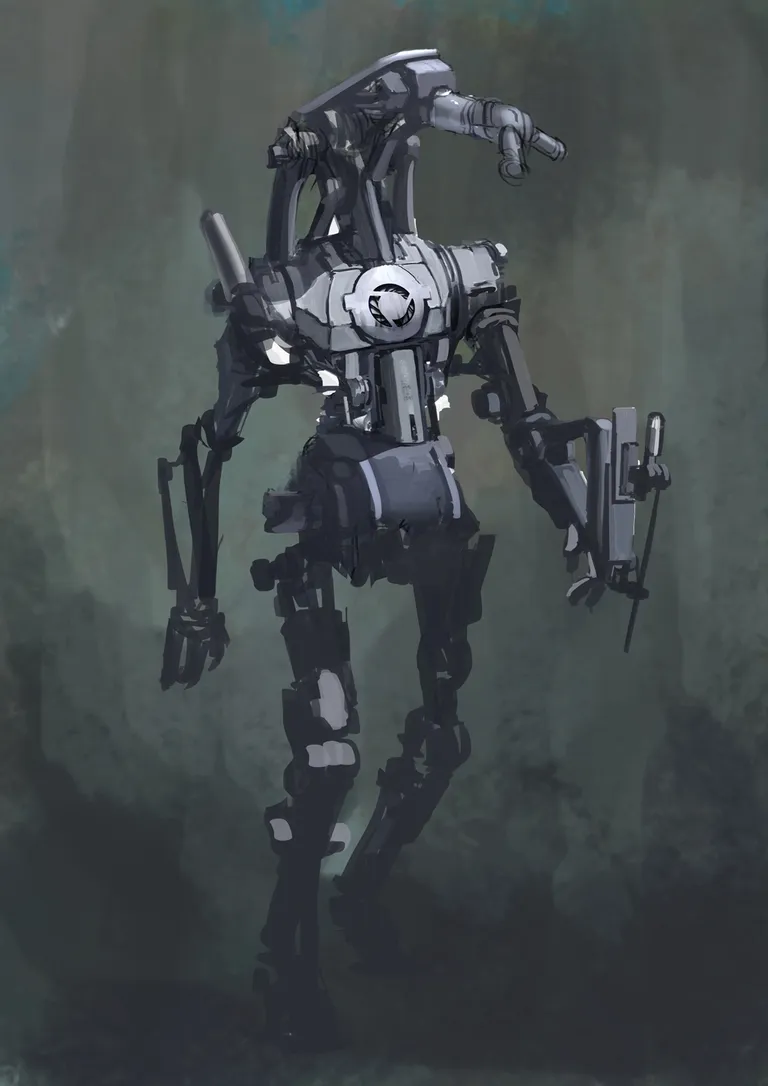
After doing a good amount of research, we can now start thinking about the design of our mech. It is important to begin establishing a pose and start thinking about how the weight is distributed through the body. Create this – along with everything else in this tutorial – on new empty layers above the background so we can add elements behind it later.
Here I wanted to give the sense of that the mech is strolling through a forest, with as languid a gait as a clanking metal robot can manage.
These quick sketches can save time in the long run and will set the mood for the rest of the painting.
STEP 2
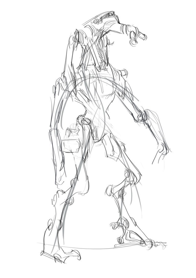
The next step is to create quick line drawings. This should be a very rough design pass – but spend some time thinking about interesting shapes and focal points.
Keep in mind the relative size and positions of your masses (the initial blocks of colour that you’ll add detail to later). You will want to establish at least three major masses with different sizes to create a hierarchy for your composition.
STEP 3
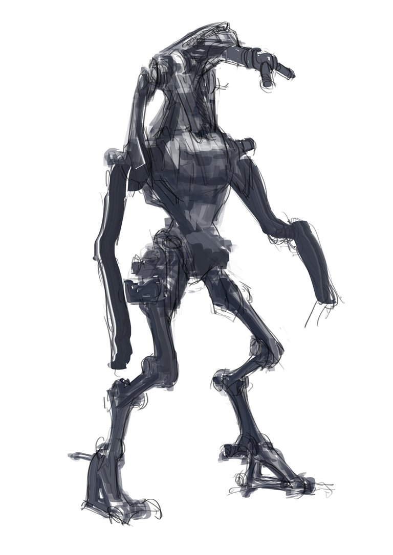
Block-in some colour and pay attention to the silhouette of the mech. We want to have clarity to its shape to allow its form to be quickly read by the viewer.
Constantly check the Navigator to make sure the silhouette is clear. You can also hint some lighting to help bring out the core form.
Step 4
We’re still in early stages of creating our artwork, so we can easily make some quite dramatic adjustments.
Here I have adjusted the pose adding the twist and tilt to make the pose more natural – despite this being a painting you should always think in three dimensions, adjusting along all of the X, Y, Z axes. This also creates depth and life to the action.
Step 5
Flip your canvas once in a while to get a fresh look on the image. Flaws become more obvious this way, which will allow you to make any adjustments before making too many commitments.
The head area is the focal point here so I also needed to start thinking about the lighting that will complement it.
Step 6
By experimenting with the shapes of internal elements, you can break up the big masses with contrasting tonal values so that the viewer’s eyes to rest on and lead them to the focal point – which for this piece is the mech’s head.
Step 7
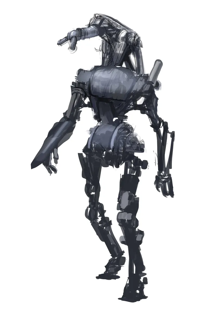
Once the overall design and mood is decided, let’s cast a shadow and really define the separation between the light and the dark. Keep it simple – it’s about grouping the areas of light and shadow, and creating the abstract shapes that show how they fall on the mech’s body.
This also determines where we will be adding details (in the highlights).
Step 8
You could have started by painting the background, but I wanted to focus on the design process for the robot.
The tones of the background are designed to merge into the colours of the robot’s feet and contrast with its head and chest, with a gradual progression from one to the other between.
Step 9
Here I added some colour accents by adding a warm colour to the cool image that will leap out. Colour contrast can also be used as a composition tool to lead the eyes.
Step 10
Next, add some subtle details. It ‘s important to pay attention to the how your mech might actually move – especially in the joints area – so keep referring back to your reference images for inspiration. Remember, form follows function.
Step 11
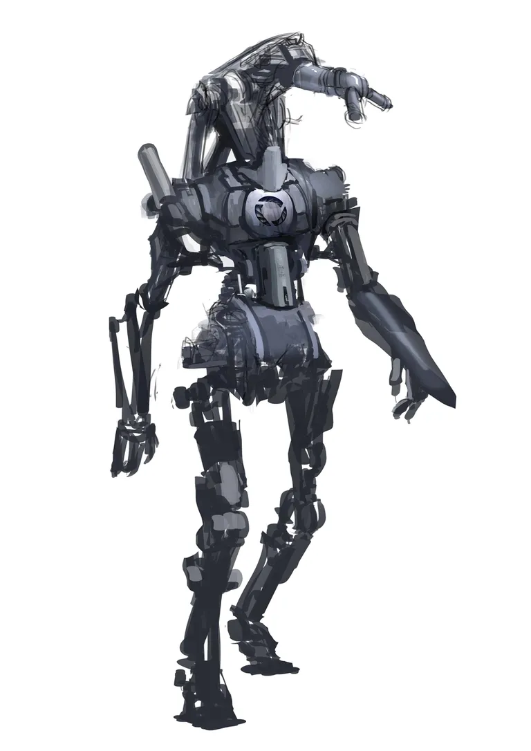
Here I made a slight adjustment to the pose and simplified the design – which was relatively simple as they’re on separate layers.
I moved the torso back so it leans more towards the weight-bearing leg for stability. The chest design was drawing too much attention, so I decided to revisit the design and strip it back to the essentials.
Step 12
After stripping back the design, I was time to work up the details again. If you need to do this on your artwork, as before look at your references and then add some design elements that make sense and does not distract from the main focal points.
This is more for creating a visual language for your painting that influences how to viewer responds to it. For this piece, I used roughen, near-symmetrical feel for a ‘used’, retro-industrial feel.
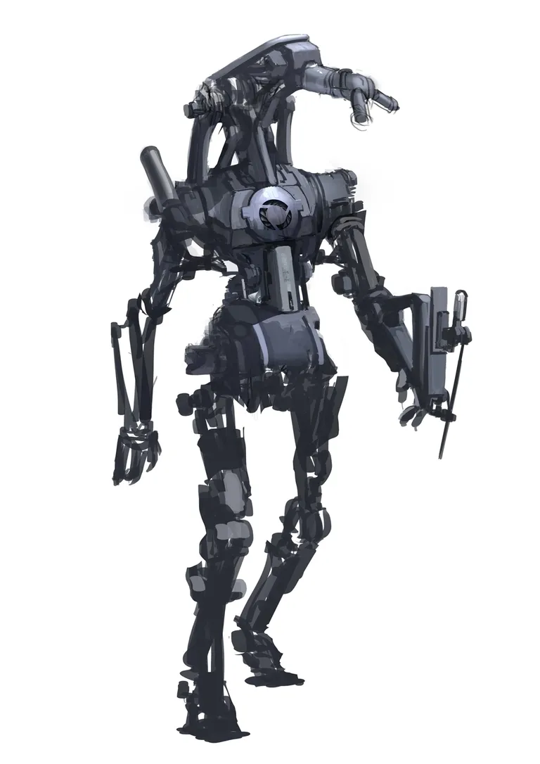
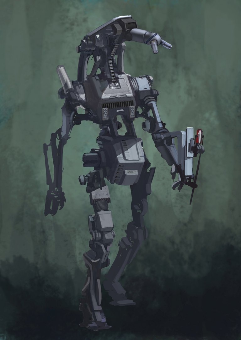
Step 13
It’s often best to work on the focal point last as this allows you to ensure it does its job effectively. Contrast is your most powerful composition tool here – if it doesn’t stand out it’s not really a focal point, is it.
I also used this point to fine to add a few areas of reflected light, and darkened the background to bring out the central character.
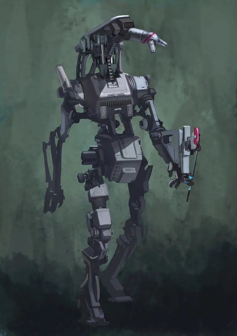
Step 14
Further refinement was needed at this point, adding more colour accents and working on the details around the focal point.
I limited the amount of details in the darker areas, keeping them more suggestive than details. This lets the viewer’s gaze focus more on the lighter area.
When doing this, I suggest paying some attention to the edges, using softer edges for suggestive areas and hard edges for more detailed parts of the artwork.
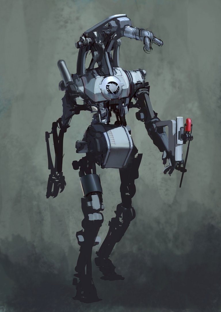
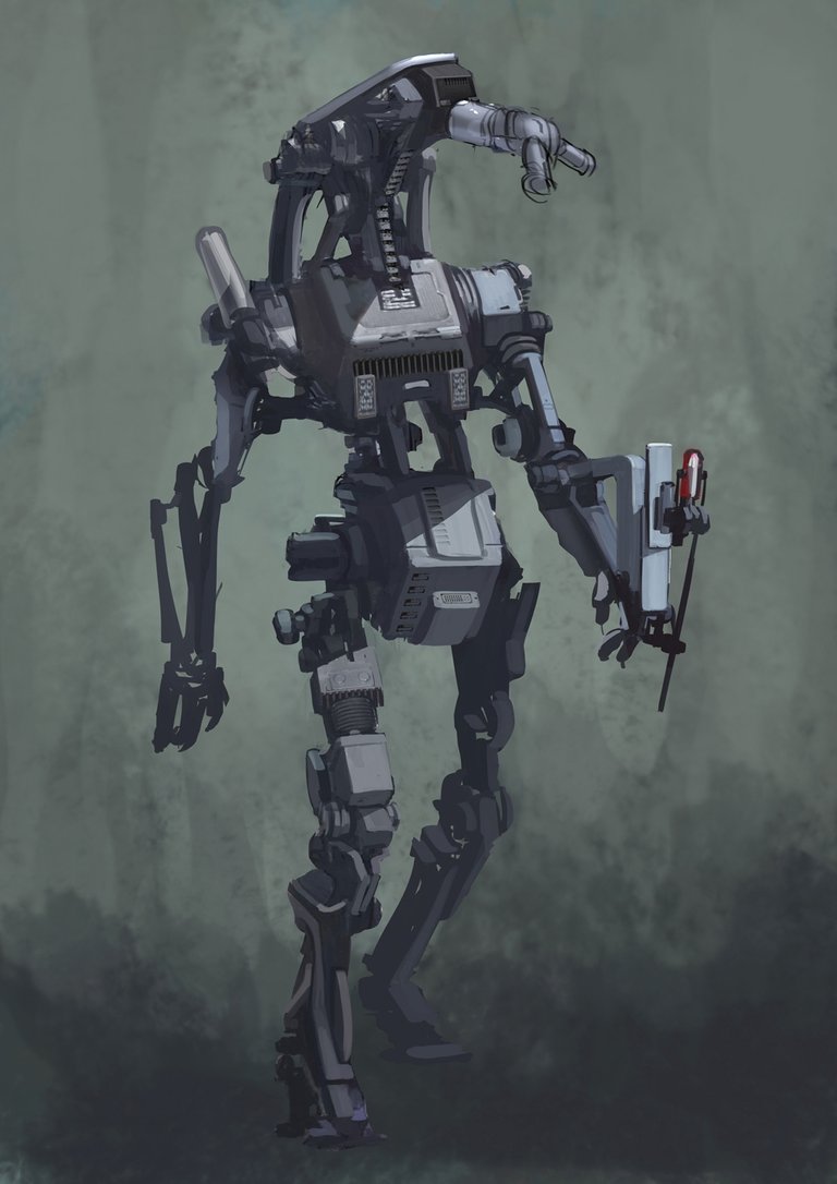
Step 15
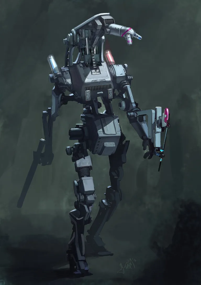
Finish off with some final adjustments to the brightness and contrast – and colour adjustments – to really bring out your mech from the background. For example, I upped the contrast and added in the effect of another light source above and behind it.
Be careful not to overdo these effects though.
1x1 pixel
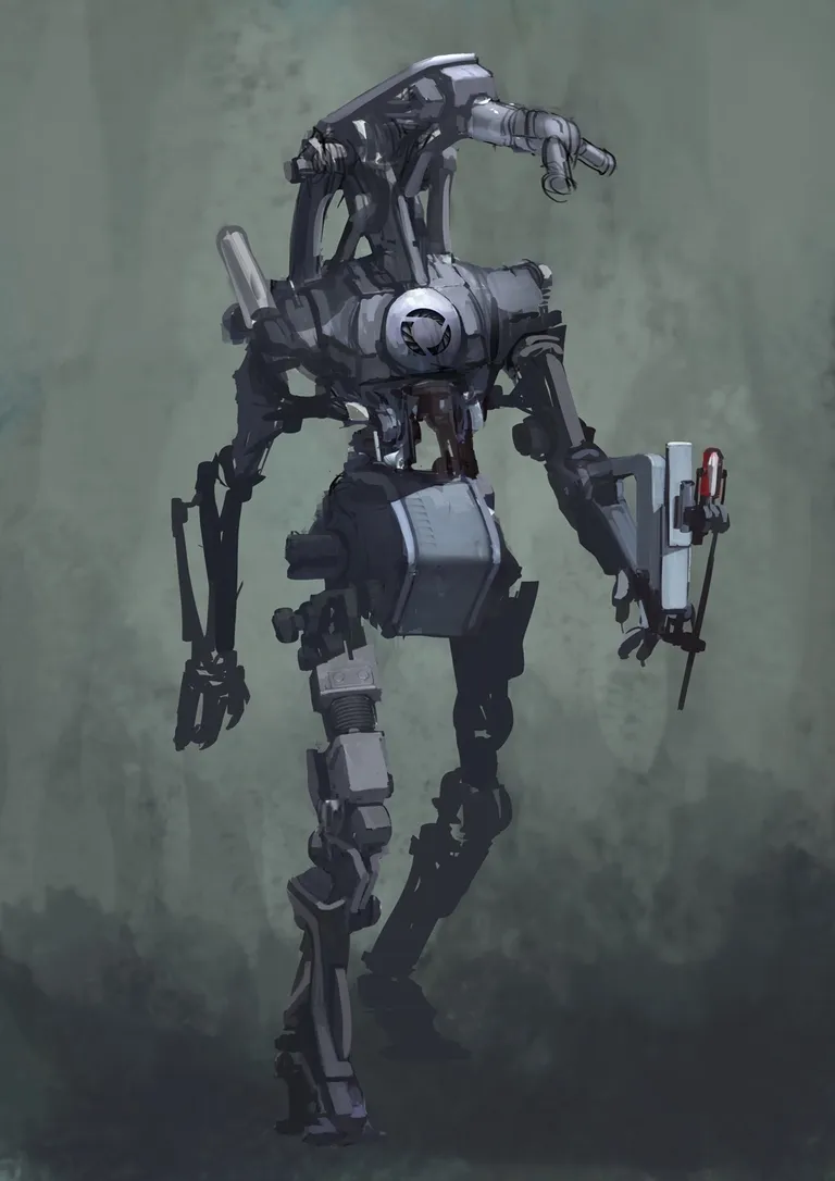
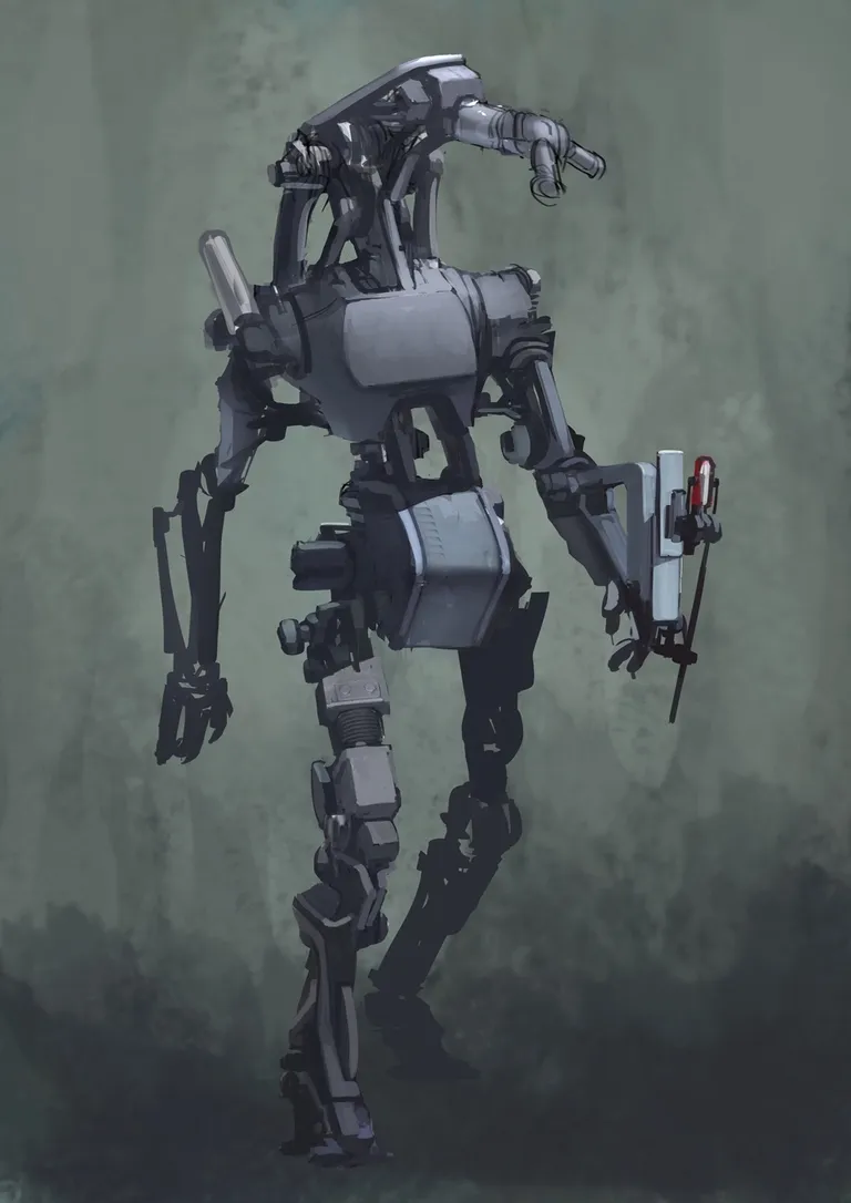
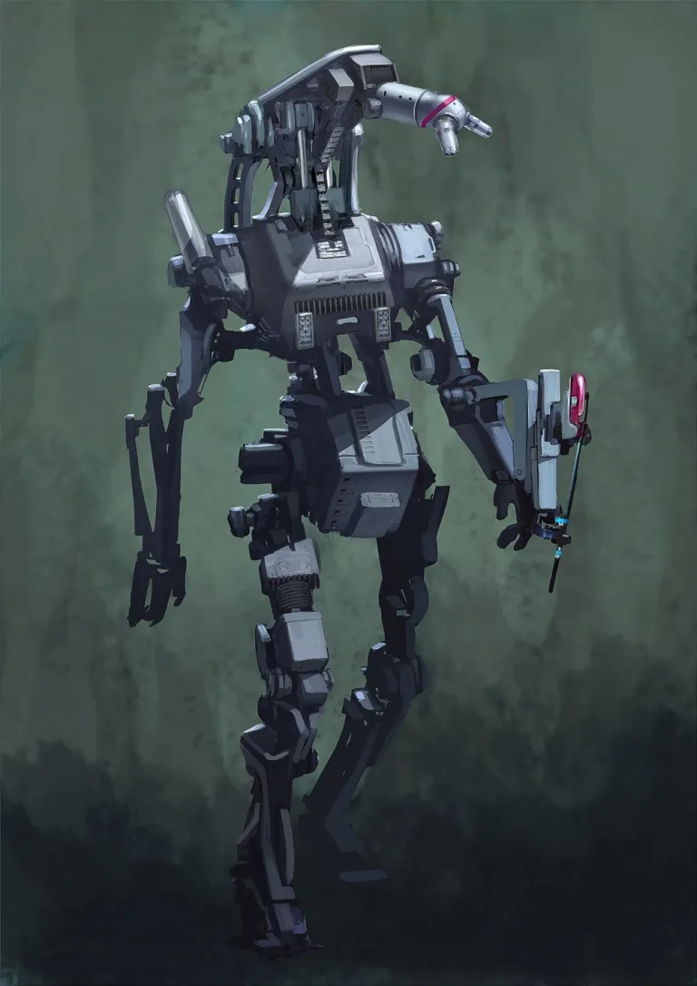
Step 16
There’s always a few last-minute design changes. I added more contrast to the head area by darkening the background.
I find it best to keep the background simple for these kind of portraits, but for a final touch, I suggest introducing the appearance of a cast shadow – so the character is grounded.
I Hope this article helps graphic designers in familiar with photoshop and in search of inspiration.
.