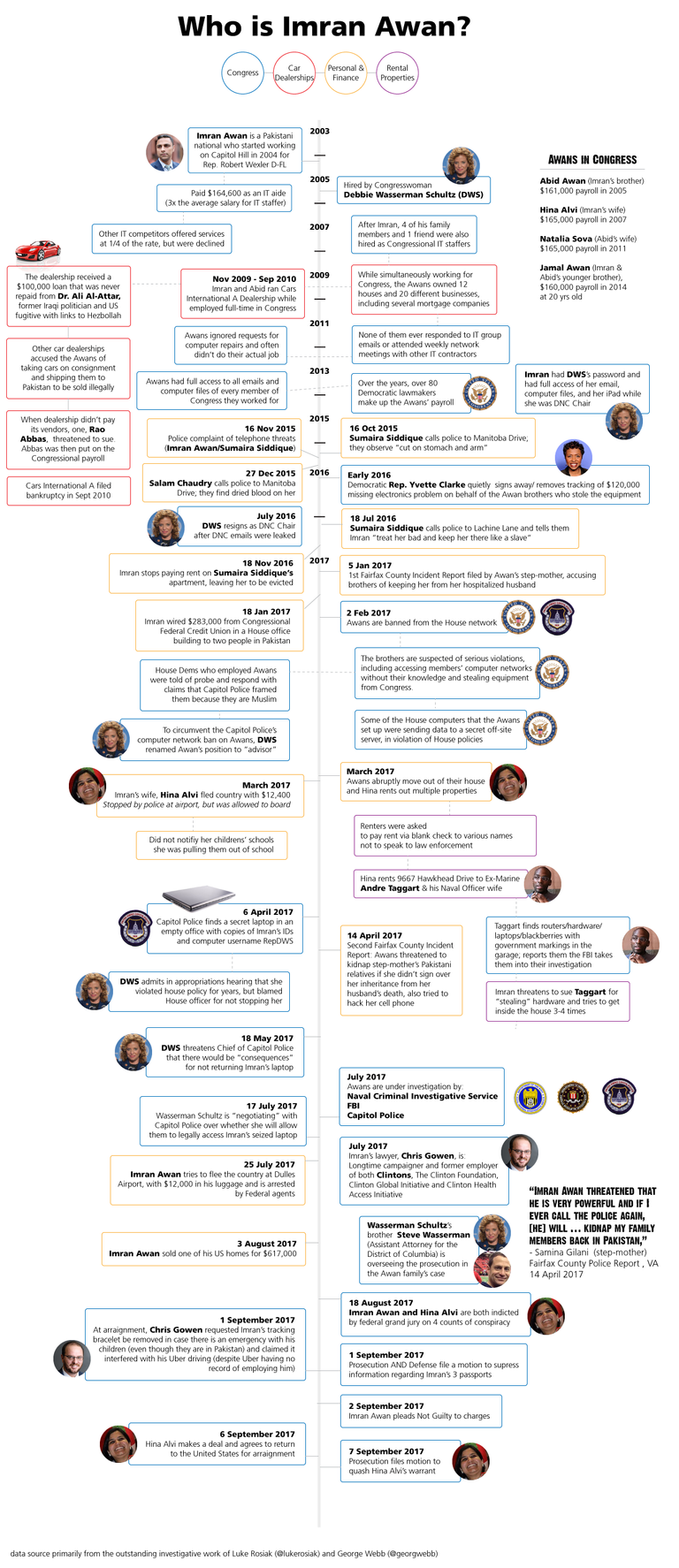
I have been working on this for over a month, details on that below. Now, I don't want to wait any longer for this to get out there. I want this to be an iterative process and I am anxious to get feedback, and help with condensing data, and filling in blanks.
I have been listening to George Webb intermittently for the last year, and have followed Luke Rosiak's coverage of the Awans closely.
 ,
,
As a designer, I can't help but visualize most information, and I have a vision to process news through an infographic format. I want to strip news reports down to the facts, strip away, merge the half truths of biased publications, or partisan writing styles, to collage together the entire story, in context. I want the visual to be so striking in showing connections between data points that would be dismissed as circumstantial or irrelevant when standing on their own.
I felt I had to plug away at this first subject myself to demostrate the kind of content I am talking about, but I hope to make this a very collaborative process. I've been exposed to a lot of great training at my day job that has my interest peaked in crowdsourced prototyping to create impactful, professional looking visuals that can be shared on multiple social media platforms in an effort to educate and wake others to the things going on in under the radar like this story.
I'd really, really love to tackle a "Russia Conspiracy" infographic/relationship map, once I get this one finished.
Please share feedback on if the information was easy to follow, suggestions on condensing info - recategorizing. Still need to boost the design factor - that's what I am good at but so far I've been too focused on assembling the content.
I want to shout out to some you that people that I follow, people that I appreciate for curating independent news and that I hope will take the time to check this out and share if they like it!
@v4vapid , @ura-soul , @clarityofsignal , @dwinblood , @ozmaga , @pizzagategear , @policyofliberty , @tftproject , @thehoneybee , @theouterlight , @titusfrost , @zer0hedge
Wow, really well done. 100% upvote and re-steem earned for sure. I will likely cover this in my next video because it is such a great breakdown of who this guy is which is hard to keep track of because it is like information overload.
Wow, thank you so much!! I'll keep plugging away at this behemoth of a graphic.
Great infograph, i also like to visualize things and for this network it's probably the best way to communicate the information.
Lots of new information about Imran's sisters and their employment coming out - lots of relatives working in the US gov. , US contractors and credit unions! Shocking the amount of evidence and still authorities are trying to ignore the elephant in the room.
Edit: I'm very interested in what software/app you used to create the infograph? I've used a few free apps for building mind-maps and timelines and found them quite cumbersome.
Thanks! I just used Adobe Illustrator- I am a graphic designer so I'm in that software every day, but I was just a few days ago starting to research other tools to build this kind of thing that could open the process up to collaboration. Would love to build this online and be able to embed it, but I still need to search around to see if the right tool exists. It would be hard for me to give up the free design reign and flexibility I have with Adobe.
Lots of insiders are trying to cover this up. Bill Still had a report last week where it was shown that some FBI officials were blocking the investigation. This is just like former FBI Director James Comey.
There are still lots of Hillary crooks inside the FBI and the Department of Justice.
On a brighter note, Matthew Whitaker is a new appointment, and finally it looks like the swamp draining might start for real!
Agreed! Where have you been all my life? ; )
Your skills of Visualizing the mountains of Info is well needed right now.
Thank you for being part of the investigation.
Upvoted, followed and Highly rEsteemed!
I can't wait until this blows up in their faces! Lock them all up!
These infographics are really helpful for maintaining a broader picture of the various pieces of the insidious Deep State. If you make an infographic big enough, you would probably find half of Washington under their control.
Great article followed and resteemed!
Thank you! Can't wait to find the time to keep beefing it up. As enormous as it is, there is so much more to add!!!
Nice post the information @ectodoobie
Thank you!
Good post thank you for sharing
nicely done! I'm too braindead to comment much atm, but I have resteemed this to curate from #informationwar tomorrow
the #fakenews attempt to bury this story will not succeed
Your post was mentioned in the hit parade in the following category:Congratulations @ectodoobie!
Great infographic! Manually curated and resteemed for
@informationwar
Congratulations @ectodoobie! You have completed some achievement on Steemit and have been rewarded with new badge(s) :
Click on any badge to view your own Board of Honor on SteemitBoard.
For more information about SteemitBoard, click here
If you no longer want to receive notifications, reply to this comment with the word
STOPVery well put together collection of information, with so many news media that misdirects the real truth, this is again very well put together.
Thank you!! I have this constant picture in my head of a pile of information with a spotlight shining on it, focusing on just one small portion. In my opinion that is what MSM does. Lies by omission, focusing on only a few specifics to change the context and narrative. It's my goal to show that as well. I might need to find a way to show what little part of this timeline was actually reported on by WaPo, etc.
Will look foward to future post!
also, you should look at Maltego's CE (free) version. it will allow you to map out up to 12 entities and their relationships
Thanks for the tip!