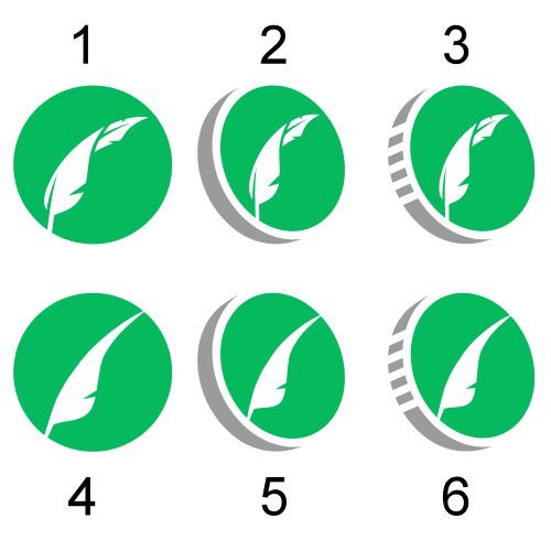
Because fuck it... Vote. Polls close at 5pm EST.
Option 1 (The original art and winner):

Option 2 (The challenger art 1/2):

Option 3 (The challenger art 2/2):

Because fuck it... Vote. Polls close at 5pm EST.
Option 1 (The original art and winner):

Option 2 (The challenger art 1/2):

Option 3 (The challenger art 2/2):

OPTION 3!
Nice attemp at tightening up the first option. Of those I’m leaning towards option 5. Smooth out the feather and make it sleek. However option 3 challenger might have something to it. If you’re willing to work it and make it sleek you might have a badass logo in the works. Nice job!
i like 1
Oh man, that Option 2 is slick, I vote 2.
I’m totally down with option 3!
Option 2 with vigor.
3rd! The best of all!

#HailSatan!
Have to go with option 3 the challenger art 2/2
2
I say Option 1-4. PPI_Dolpheen thinks Option 2 is more elegant. He also thinks there isn't enough fish in the fridge and that we should use spectrogram art like a real fake computer tv show. Everybody knows real hackers and dolpheen prefer spectrogram art. Hang in there everybody!
3
3 for me!
I love option 2