Do you know the difference between the biggest and most profitable companies and the ones that belong to the same domain but aren’t as successful despite their numerous efforts? The answer lies in two words - User Experience.
The success of companies like Google, Apple, Amazon is fuelled with user experience design, something their competitors must incorporate in order to walk down the same path.
“Good design, when it’s done well becomes invisible. It’s only when it’s poorly done is that we notice it”. So let’s take a look at some of the obviously bad designs, learn how to improve them and distill some lessons from them.
3 websites with evident bad user experience
1. Times of India: Auto Play

Where do I even start with auto play? So I’ve come to read a story, possibly in an environment where I want to remain quiet (I’m not the only one who reads them in bed, right?) and these guys think, “No, I think what she really wants is to hear an ad for the debate”. Sometimes, they even play auto play news videos, which are equally embarrassing. I came here to read! This is not YouTube; if I want to listen to a video, I can click play on the optional play button.
One of the greatest benefits of being online is that there is no one else to interfere or bother you. Why not keep the experience intact?
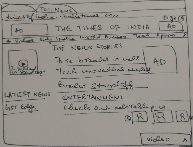
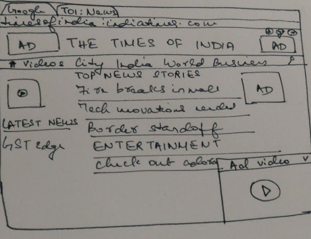
The wireframe shows an arrow to bring the advertisement video on the front page. On clicking the arrow, a video pops up, which does not play either. Instead, there is an option to press the play button to watch the video. Everyone wins - you display your ad and the user controls when to watch it.
2. Forbes: Quote of the Day
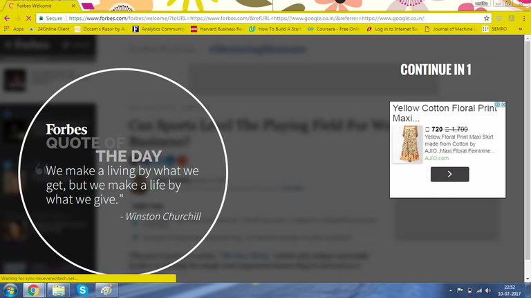
I specifically typed “ www.forbes.com ”, which suggests I want to visit forbes.com! Instead, these guys say, “No, let us redirect you to show a quote of the day and an ad and make you wait!” Guys, come on! This is just awful and nobody ever sees this. It also reflects on how much better off they are, as a result.
So, instead, when I type “ www.forbes.com ”, redirect me to the actual site and show an advertisement on the site with a quote if you insist on showing me a quote of the day.

3. Ajio.com: Unstructured Information Overload
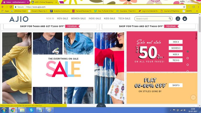
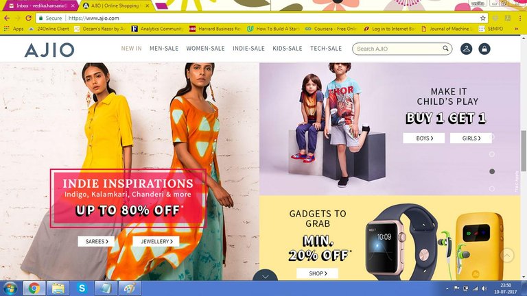
While it’s absolutely a steal to buy stuff on sale, how confusing are these templates? Imagine you want to purchase a smart watch. You’d be happy to see smart watches on sale but you’d also wish for a similar category, say, fitbits, placed next to it.
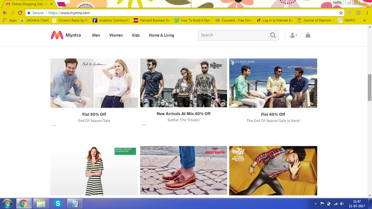
Myntra has perfected the structured template. Categories on sale are placed next to each other, not necessarily with a correlation. However, since every category is boxed separately, it appears neat to the user and doesn’t really overwhelm the user on where to browse.
A few (Dis)honorary mentions
1. Myntra search
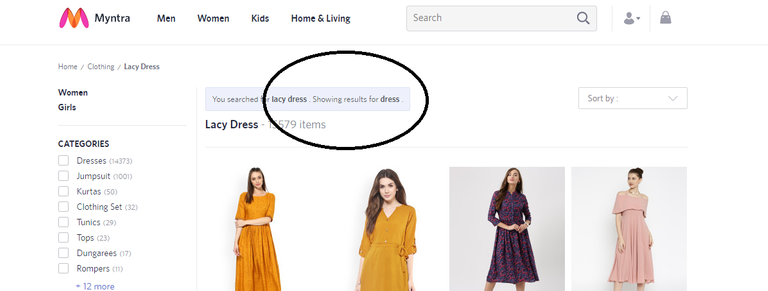
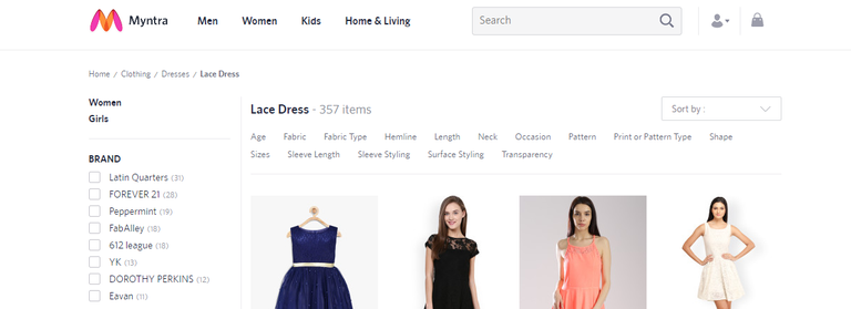
While "lace dress" is searchable, "lacy dress" isn't! Come on, guys! Stemming? Adjectives to noun? The first form? Enough said.
2. LinkedIn Notification Panel

If I want to check my notifications, I’d like to check them in a drop down box and click on the relevant one in the same tab or different. However, redirecting me to a different page where all my notifications are listed, is no less than annoying.
Congratulations @thelady! You have completed some achievement on Steemit and have been rewarded with new badge(s) :
Click on any badge to view your own Board of Honor on SteemitBoard.
For more information about SteemitBoard, click here
If you no longer want to receive notifications, reply to this comment with the word
STOPAdd the tag "india" to it, since most of the examples are India, and they can relate.
Okay, thanks
Agreed. We have many such websites with bad and even annoying user experience. Visit EPFO website, if you want to get annoyed. Banking sites have made progress but still they must focus on UX. Retail/eCommerce websites can not compromise on UX, it is essential for success of their business.
I guess it's about priority and concern.
Congratulations @thelady! You have received a personal award!
Click on the badge to view your Board of Honor.
Congratulations @thelady! You received a personal award!
You can view your badges on your Steem Board and compare to others on the Steem Ranking
Do not miss the last post from @steemitboard:
Vote for @Steemitboard as a witness to get one more award and increased upvotes!