@starkerz @annamorrish @stephenkendal @crypto-curt @coinkingz @elderfinancial @captaincanary @drakos @arckrai @jassy.nuu @malicered @discordiant @davidthelad @andrejcibik @jassennassaj
Hi Guys
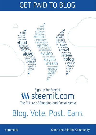
From my last count and from a few votes on discord I think we are close to a chosen design. I have spoken with @stephenkendal as he has experience using these flyers on the field so I have made some alterations to ensure it matches the steemit brand and the other merchandise already being used. We have altered the wording based on feedback and made the main logo/topic text more prominent.
I welcome any thoughts and feedback.

@starkerz @annamorrish @crypto-curt @coinkingz @elderfinancial @captaincanary @drakos @arckrai @jassy.nuu @malicered @discordiant @davidthelad @andrejcibik @jassennassaj
Hi all, any more thoughts on the updated flyer design? Just wanting to get final feedback before continuing to work on it.
Hi Adam. Thank you for looking into this. I am still struggling with this proposal as I feel it waters down the message we are trying to get across. Over the last few months I must have spoken to well over +700 students and did this to get firsthand knowledge of what the market is telling us. This redesign sadly does not reflect what the market is telling us. We need a flyer that is in essence an "eye catching" promotional tool and at the same time an "instruction manual". It is not an easy job throwing yourself into a crowd of +500 students sat around having their lunch and try and tell them that you have a piece of paper in your hand that will change their lives. You get about 20 seconds to breakdown the barrier and unless you have their attention they are simply bothered about who has just posted the latest picture on Facebook. I have probably spent well over +100 hours talking to our market and feel that this flyer will be like going backwards. I am happy for you to arrange a batch of these flyers to be distributed and let me know how you get on. Keep up the great work. Stephen
thanks for your input stephen.
Maybe this way we can have an eye catching design like the new design to catch attention with more detail on the back if people are interested in knowing more.