Or with Vue for that matter.

One codebase, any platform!
tl;dr;#1— If you already understand the basics of composing a UI in Quasar or Vue and just want to see some of it in action with Quasar’s QBtn component, drop down to “Reasons for Change — SRP in components?”
tl;dr;#2 — If you don’t know about backend templating engines or don’t care about inheritance of template code compared to composition, drop down to “An example of component building with QBtn”.
tl;dr;#3 — If you just want to play with some code from this tutorial, check out the Sandbox demo (give the sandbox time to fire up). 😃
Repo: https://github.com/quasarframework/quasar
Before we begin, this article is going to assume you have some basic knowledge about how Vue works. If not, you might get a bit confused. If you are feeling confused after reading this article, you need to learn more about Vue. And please don’t be frustrated. If you don’t know React or reactive UI technologies, take a step back and learn what they are about. Then come back. You won’t be disappointed!
Ok. A long lead in that was… let’s get going.
The whole concept of Vue is the composition (as opposed to inheritance) of components. If you’ve come from a backend language, where you’ve used some sort of templating engine like Smarty, Twig, Blade, erubis, hero, Velocity (and the list goes on and on), then you probably already feel at home with Vue’s <template> syntax and Single File Components. However, we need to understand this is still a different system compared to backend templating engines and their “way of thinking”.
Those back-end templating engines all have a top-down methodology with the capability to inherit template code. You build a page and try to think about what needs to be extracted to reduce code duplication and you try to use inheritance to extend those smaller templates, but only where their features differ slightly.
With Vue, the goal is to think of components first, i.e. the smallest reusable parts of an application, and build up from there.
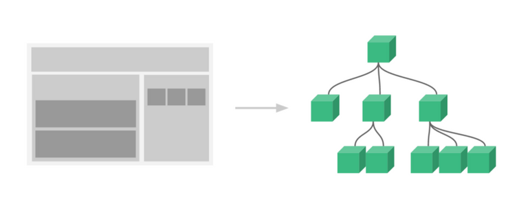
From the VueJS website: “It’s common for an app to be organized into a tree of nested components.”
Also with Vue, and this point is the most important one, we are building the model inside these components. Whereas, in the world of server-side templating engines, we inject the model, which we built in some other part of the program. With server-side templating engines, we’re usually using an MVC architecture.
In Vue, the architecture is not MVC but rather MVVM architecture. We are building the model within each component, but only for that component.
If we start to make a complicated component in Vue or Quasar, our model gets complicated too. With composition, we can and should avoid that complication.
I’m going to put something out there that might be controversial. Any Vue component template should not be verbose! If you have more than 40 to 50 lines of template code, then your template or rather your component, is doing too much. This might expand to 100 lines or so, if you are using render functions. At any rate, if you’ve heard it before with MVC architecture, “thin controllers, thick models”, then I say something similar goes for the MVVM and SFC architecture.
It’s…
You should have thin structures and thick models.
Theoretically, with thin structures, i.e. small templates, we don’t need the inheritance of template code between components. Still, inheritance of template code between components makes for a heated topic of discussion in Vue circles. It’s been suggested more than a couple of times to get template extension through inheritance in Vue, like in this issue. And every time a suggestion like that comes up Evan You, the creator of Vue, doesn’t bite. He says an additional extension system for just the template syntax would make Vue’s current system unnecessarily harder to reason about. I agree.
Composition for the win! 😏
Code reuse with Vue’s composition techniques (i.e. the slot system, mixins, component elements/objects, etc.) do seem a just bit laborious at times. And some of it, like slots, is so different to what was previously known, it catches beginners to Vue a bit off guard. I was in this boat too.
Nonetheless, if you think about what you want to get accomplished and then “build out” or compose your version of components, understanding the DOM hierarchy rules (Parent / Child relationships) and keeping SRP and “thin structure/ thick models” in mind, that is all you really need to achieve code reuse (which is the goal of inheritance too). The DRY principle of programming, i.e. “code smartly once and reuse it often”, can be relatively easily achieved with Vue’s composition facilities.
The aim of this tutorial is to get you thinking (more) along those lines.
An example of component building with QBtn
I’m repeating this again, because it is vital to understanding how to work with both Quasar and Vue. Vue’s core premise is built on_composition_, which means the action of putting things together. These “things” in Vue are components. Check out the meaning of the word “component”.
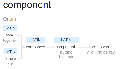
It’s Latin for “Putting together” 😁
This may be a no-brainer but, it is easy to start building components that aren’t components. They are more like in the world of OOP, god components, doing a lot of stuff and breaking easily. It can happen quickly and why I keep mentioning SRP. Take advantage of Vue’s composition facilities and remember SRP……always!
As you know, Vue takes your components, your compositions and smartly puts them in a virtual DOM hierarchy, then renders that to your users and makes it all reactive. It’s why we can’t “unthink” hierarchies with components, because the DOM is a hierarchy. And this hierarchy doesn’t matter for interactivity with the user, because when components are done right, the data manipulations, the bindings, are directly visible within the DOM, at the right place at the right time. This “reactive” system is what makes reactive UI libraries like Vue world’s better than you having to find the data in the DOM to then manipulate it (ehem, like in jQuery).
Remember the other core concept of Vue and reactive programming is…
“Let your data do the walking!”
😏 Ok. I made that up……. But, it’s true! 😄
Reasons for Change — SRP in Single File Components?
There are five possible “responsibilities” or reasons why we may be touching a component to change it. Now you might be saying, um, but the “S” in SRP is for “Single”. Yup, and theoretically, we can separate these 5 responsibilities into their own modules/ files for change. More importantly, a Vue component can hold them all. These reasons for change or responsibilities are also the sources as to why we would want to “compose” them differently. They are:
- Styling/ Design (CSS)
- Structure (HTML)
- Behavior (JavaScript)
- the all important — Data Model or Model
- and the (hopefully)single goal of the component
If you are going, “um, say what?” right now. Now worries. Hopefully, you’ll get an understanding of what is meant above, as we go through the tutorial.
The Plan
Like with any type of creation, there needs to be a plan in place for our new button to end up as we intend it to be. You may think, “Hey, it’s just a little ol’ button.” Well. This tutorial will show you a custom button component in Quasar (or Vue) can be quite powerful and intricate. So, having a plan - an idea of what you want the button to do or be - is really important.
There are so many possibilities with just this one component that composing it to be something more with other Q-components or logic/ behavior, and even only using it as a stock button without having a plan, will most likely end up in a crazy, maybe even frustrating, mess.
The power of Vue lies in your easily keeping a mental model of what you want a component to do. However, that mental model also needs to be formulated before you begin “composing”.
So, this is what our button should do, when it is finished (noting the top 4 “reasons for change” mentioned above in parenthesis). The plan itself is the 5th reason. It’s our final objective. And yes, this example is a bit contrived, but let’s just have some fun with making new button components. 😄
This is the plan for our button(s):
- The button should be able to have an image (styling/design).
- If there is no image, it will return to being a “normal” Quasar button automatically (behavior, styling/design).
- It should have a tooltip option, no matter what form it is in (regular or with an image) (structure, behavior).
- The tooltip will be controlled via data input only (data model). That means, if a tooltip text is in the data, a tooltip will show up, automatically.
- The tooltip will either be at the top of the button or at the bottom (styling/ design).
- We’ll also offset the tooltip with 5 pixels above or below the button as standard and fixed, simply because we think it looks better (styling/ design).
- From the Quasar Btn component, our button should have a (styling/design):
- Label — for text in the button.
- Color — for coloring the button.
- Icon — to add an icon.
- Size — to control the size of the button ,when it is a normal button. We’ll only use the pixel values for now for the image type button.
- Flat — for a flat button.
- Round — for round buttons (think about avatars, where you need a link to a profile, etc.).
- Outline — for adding an outline.
With the QBtn props, we could go on and on. There are 29! However, we’ll stop here. Your decisions for your new component will determine the props to take over.
- Additionally to the Quasar Btn props, our button will have:
- Outline Color — since the Quasar Btn has only one color and we are using that currently for our background, we need a different prop for the image button’s border color.
- Image URL — for optionally adding an image for our image button (structure).
- Tooltip Text — if our button should have a tooltip (behavior, data model).
- Tooltip Location — either “top” or “bottom”. “Top” is the default. Yeah, we are reducing the feature set of QTooltip, but for our use case with buttons, we only want this behavior.
- Visibility Control — to show only when it should be shown (behavior , see point 10).
- We know our image buttons will always be flat and should be outlined in the color selected in the color prop(styling/design). The text is the same color too (styling/design). This is simply how QBtn works.
- The button should have a visibility prop. If it is true, the button is visible. If false, it is not there (data model, behavior).
- As a last objective and not part of our button composition, we’ll put together a “button bar” demonstrating the compositional ability of the “slot” in Vue.
You must admit, that is a lot of things to consider. We are making a “super duper power button”. 😁 And, maybe we will want to have button components that only do some of these things, right? Or, well, maybe not. No matter. We’ll build out the different buttons for the sake of demonstrating composition.
So, with that in mind, let’s compose 4 different buttons and our button bar.
Button #1 — Styling/ Design with an Image
Please note that the /components directory is our own component code and our /pages directory is where the components are consumed and demonstrated in this example.
Ok. That said….
Although we can argue about this, adding an image to a button is a design / styling decision. Think of the places we would like to make an image “button-like” in a website. How about those avatar buttons you see so often in chats or forums, which link to a profile page, or even offer a context menu? I’m sure your imagination is filling up with ideas, right?
Have a look at thebtn-image.vuecomponent in the components section of our sandbox(give the sandbox some time to fire up). This is a button element with an image.
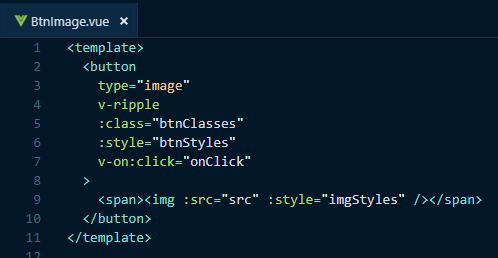
Our btn-image template.
If you look into the model of the component, you’ll notice we’re high-jacking some q-btn functionality. Note: this component is NOT finished!
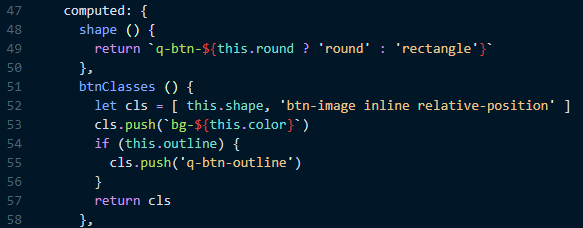
Some familiar CSS from Quasar.
If you also look at the model (the code in the <script> tags), you can see where we’ve added our props.
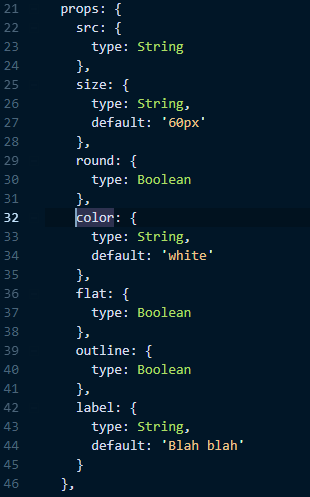
There are naturally a ton of other considerations we could build into this button, like linking to external pages, and there are even some bugs. If you feel adventurous, you can take the code and improve it. For this little tutorial, it’s current condition does the job.
A remark on the side. I’m a lousy front-end developer, which this component shows. As I was testing, I found issues with my original button. And, I knew the “reasons for change” and they brought me right smack back to this one component. In other words, my reasons to change it (remember there are up to 5 per component) caused me to go straight to this component’s code. This is SRP for web components in action!
Button #2 — Behavior #1 - With no Image, it will be a Normal Button
Let’s build on what we just built with button #1. If there is no image, we want to show a normal Quasar button.
Have a look at the second button example, BtnOrBtnImage, in our sandbox.
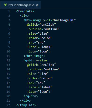
The BtnOrBtnImage template code.
You will probably say, the purpose of this button is sort of nonsense, but humor me for composition’s sake. 😄 And notice, we’re only adding one feature. The button swapping. Remember SRP?
Using our first Mixin
For the creation of this button and the reuse of btn-image we’ve also created a mixin called btn-image-mixin . Have a look at that mixin.
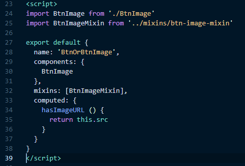
The new model of our “composed” image or no image button.
We’re importing the first component we made, and the mixin for it’s properties (which includes props and a methods, but can also contain lifecycle hooks, data, basically anything defining a component). You’ll notice too that the model section is now much cleaner. In fact, this component is rather small, which is a good thing!
Also important to note, now that we have the mixin, we could refactor our btn-image component to use it. But, we’ll keep it as is for now.
Button #3 — Structure — adding Tooltip Functionality
By structure, we mean adding something to the component’s HTML syntax, in order to change what is going to be rendered to the user.
We simply can’t avoid HTML, as it’s what the browser requires to build the DOM. In Vue, we have the <template> (or the render function) sections of the component to hold the structure. It helps "separate" the responsibility of structure from the rest of the component code. Once again, we need to remember that there are no facilities in Vue to extend template syntax.
Currently, QBtn already does a whole lot for us. We can make a button link to other parts of our app (which could be seen as adding structure and/ or behavior). We can add different icons (which could be seen as styling). We can control the text showing in the button (which could be seen as model changes), color (styling), and a whole lot more.
QBtn is basically giving us multiple possibilities to manipulate the button, according to our usage needs (and according to the data/ state we give it).
But, let’s just say for our example’s sake, we also want to add a tool tip on a button as a standard “accessory” or feature.
For this, we want to create a new component called btn-tooltip , which stands for “Button with Tooltip”, of course. 😄
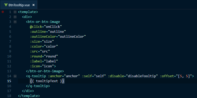
The btn-tooltip template code.
As you can see, we’ve simply added the tool tip to our btn-or-btn-image component. We also have the disable feature from QTooltip in use, in order to show or hide the tooltip according to the data given, i.e. a tooltip text, which is our added prop.
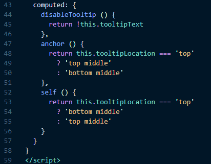
Our computed properties for the tooltip.
Notice we are using computed properties, in order to control the disable prop and to control the location of the tooltip. The computed properties give our data (or the lack thereof) the power to show or hide the tooltip or put the tooltip at the top or the bottom of the button. Also notice the new mixin. I’ll leave the rest for you to investigate. 😉
And lastly with the consumption of this button in the button3 page, we’ve brought in the v-bind directive. This is a powerful little directive, which allows you to define all your props in your data, saving time by only writing (or automating) the props for your template once.
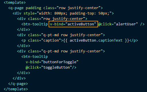
Or Button #3 page is using v-bind!
v-bind also allows for a easy and dynamic manipulation of prop data. It’s a win-win directive. 😃
Button #4 — Behavior #2— adding a Visibility Control
Another feature of our button, and the last one, is going to be a visibility control. When this control is on or true, the button shows itself. When it is off, the button goes away. Think about the UX, where certain users, like admins or owners of a record, get more functionality on a record than do guests or normal users. Because they are more privileged, they get extra buttons to do more with the data. Think of how often that is needed everywhere in an application, especially when Create, Update or Delete activity is available for some users, but not others.
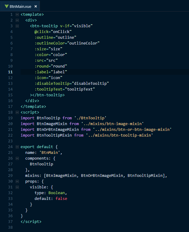
Out “main” button.
Notice we’ve called the button “BtnMain”. All the naming might be questionable throughout this tutorial and as you hopefully also know, proper naming is hard to do in programming. The intention with the name “BtnMain” is to indicate it is the “top” of the button hierarchy and functionality. It means it is the most feature packed button. And theoretically, our set of new buttons could be in its own directory. The “main” name would lead you to that button as the top one to get all features at once (if you need them).
To allow for this control of visibility, we simply added “v-if” to make this feature work, along with a new prop visible. That’s it. But now, when we consume this button in our higher components, all we need to do is define a Boolean data property, or create a computed property or watcher, to “signal” the button to show or not.
That’s it for the features we wanted to add. If you’ve also noticed, we’ve done only one feature per iteration of new button. It may seem a bit repetitive, but it allows for SRP. In other words, say you only want a button with an image, then you only use that one button.
A Button Bar — bringing it all together with slots.
Now we’re going to bring in the other and most powerful component building tool we have at our disposal in Vue and of course, in Quasar.
The "Slot".
If you’ve worked with Quasar some, you’ll notice that slots are “given to you” in a lot of places. I say “given to you”, because the whole idea of the slot is for you to be able to “inject” your own template code, as you’d like it, into the component’s slot.
Another way to look at a slot is like an API for a component, which helps us avoid that pesky want to extend template code. Yes, we must build out the slot template (which can be an HTML element too, not necessarily a template element or even a component) to make it work, and yes, that might mean extra components or HTML code, depending on what we want. But remember, we only need to build them once AND we can use our compositional methods we practiced earlier to simplify that building (or even automate it with our data! Oh yeah! 👍).
Am I confusing you? Sorry. It took me some time to grasp the magnificent power, yet simplicity of Vue too. I hope this last demonstration will open your eyes (if they aren’t already. 😄)
For our final exercise, we are going to create a “Button Bar”. Think about how often you see where there are a set of buttons within your application. You might have a set of buttons at the top right of your application. You might have a set of buttons at the bottom of dialogs. You might have a set of buttons in the footer of a record page to do data manipulation. The list can go on and on. We’ll have a look at the use case of the usual application buttons at the top right of a community application page, like in a forum or chat. Here is our btn-bar component code.
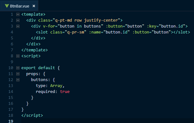
The full btn-bar component.
As you can see, we simply have a <div>, which holds a loop to go through the button prop, which will be an array of buttons. We also have a slot for the button. Simple.
In our page to demonstrate the btn-bar component, we have our btn-main to fill that button slot. Notice we are also creating the buttons, with the inner template.

The btn-bar component and a template to fill in the slot with our btn-main component.
Amazingly simple, right? Ok. From a conceptual perspective, you might still be going “WTF?”. Slots are tricky to understand, but once you do, they are really powerful and solve a bunch of use cases. Have a good look at this usage of slots. It’s actually a simple use case.
We can also consume the buttons singularly and as different components by using a “general” component tag and using :is to call the right button component, instead of using the btn-main component. The :is feature on the general component tag is another fantastic tool for logically selecting component types. Below is what the component could look like, if we wanted to use different button components, defined through our data.

Using component :is for dynamic components.
I hope that didn’t confuse you more. If it did, try to work with slots yourself. Here is also a fiddle to help to understand them. It is a simple composition of “question components” for a survey.
The Data —Controlling your Vue, ehem View!
Jup. I’m often incorrectly writing “vue” for “view” these days. 😁
If you’ve been following closely up till now, you’ve noticed that our toggling actions were only changing the data. That is the power of reactive systems / UIs.
Take a look at the data models and what we are toggling through. Each toggle changes the data model, which controls our button variations or how they are presented to the user. This is getting into the realm of meta programming, where data models form our UI experience and not necessarily the code we are writing. It is quite powerful, if done right, because it can give our users the power to make decisions on our application’s UI and how it works (if you are into SaaS and multi-tenancy, you know what I am getting at). Our example button with added features are somewhat a bit contrived, as mentioned earlier too. However, we were demonstrate composition.
As a last note, notice how our final btn-main component actually doesn’t need much markup. This is important with Vue and Quasar and why you should avoid a lot of markup on your templates. KISS them and remember….
Thin Structure, Thick Models! 😉
Last, but not least.
There are other tools within Vue that need mentioning for compositional work.
The “Filter”
Filters are ways to manipulate text output. They were used much more extensively in v1 of Vue, with that version having a good number of built in filters. For v2, filters were reduced a lot, simply because computed properties achieves the same thing, but with better performance. An example of a filter would be to always capitalize the first letter of a text.

How a capitalize filter would look in a component.
And this is how it would be used.

Using a filter.
Notice the “|” (pipe) character between the text variable and the capitalize filter. That’s how you use filters. You can also use them in v-model attributes too.
The “extend” method of the Vue object.
This method, in essence, is the same as a mixin. It takes the component object model and merges it into the calling component. Its name is a bit misleading. Please do not think in terms of inheritance, when using extend. I think this “misnaming” is also why the “extend” method/ feature isn’t at all documented in the Vue User’s Guide. I’ve also heard Vue core devs say, just avoid using “extend” and use mixins, simply because the mixin methodology is easier to reason about. So, just do that please. 😃
The “provide/ inject” options.
I won’t get into this part of Vue much at all, because it is not meant for normal application code. The Vue docs mention this as a clear warning. I’ll just quote that warning.
provideandinjectare primarily provided for advanced plugin / component library use cases. It is NOT recommended to use them in generic application code.
“provide” and “inject” offer the plug-in author a means to share data or props among components deeper in the component hierarchy. Again, it’s mainly only for plugin usage. So, unless you are going to be writing a plug-in for Vue (or Quasar), don’t worry too much about “provide” and “inject” for normal application programming.
The directive.
The directive is also a code reduction tool and helper, when it comes to component composition.
In this tutorial, we were mainly concerned with the composition of “whole components”, so we didn’t cover directives in any depth. Quasar solves a lot of directive concerns for you, and I mean a lot of them. Not only are there a number of awesome pre-defined directives, but there are also a lot of standard behaviours built into the components themselves. Think about all the “on” events given to you out of the box in each component. They aren’t directives per se in Quasar, but they could be.
In fact, we used one of the directives in our image button example. The “ripple effect”.
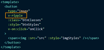
The v-ripple directive in our btn-image component.
Directives offer a means to build global effects or behaviors, which can be used on any component, like the ripple in Quasar.
So in the future, if you have a common behavior among components, which Quasar doesn’t offer out of the box, you can single out that behavior and code it as a directive and just add it as an attribute to your template elements, where needed. If you want to learn more about creating directives, have a look at this video:
Fin!
There you have it. With just a couple of compositional tools, you have a lot of power to “build up” your UI. Again, think smallest thing to biggest “thing”, when creating components. And remember Vue and Quasar follow the DOM hierarchy in “building up” those components. Don’t start with a page, when thinking about your application. Start with the smallest elements of the page and think hard to see if even those elements can be broken down further. Build the components for them and either slot them in or compose them as they would be in the DOM hierarchy. That is all you need to do.
Oh and, don’t forget.
Let your data do the walking! 😄
Authored for Quasar by
Developer, writer, teacher and student. Believes teaching to fish is better than giving a fish.
Scott Molinari (aka @smolinari)
If you need more information about Quasar itself, here are a few links for your consideration:
CLI: https://github.com/quasarframework/quasar-cli
COMPONENTS: https://github.com/quasarframework/quasar
THE DOCS: https://quasar-framework.org/
DISCORD: http://chat.quasar-framework.org/
FORUM: https://forum.quasar-framework.org/
TWITTER: https://twitter.com/quasarframework
STEEM: http://steemit.com/@quasarframework
Loved going through every bit.
The explanation, background, buildup, walk through, process all constitute a piece of great work, thank you for that.
I'm not too Vue-savvy, but I enjoyed getting to read about all the component-building potential using Quasar.That is a fantastic tutorial ! (more so than a blog, so i would pick #tutorials tag instead for upcoming posts)
Your contribution has been evaluated according to Utopian policies and guidelines, as well as a predefined set of questions pertaining to the category.
To view those questions and the relevant answers related to your post, click here.
Chat with us on Discord.
[utopian-moderator]Need help? Write a ticket on https://support.utopian.io/.
Thanks @mcfarhat! I appreciate the accolades and the review.
Scott
Thank you for your review, @mcfarhat! Keep up the good work!
Wow, this is truly a great tutorial.
Vue is like the cake with quasar being the icing. 😀
Hi @quasarframework!
Feel free to join our @steem-ua Discord serverYour post was upvoted by @steem-ua, new Steem dApp, using UserAuthority for algorithmic post curation! Your post is eligible for our upvote, thanks to our collaboration with @utopian-io!
Hey, @quasarframework!
Thanks for contributing on Utopian.
Congratulations! Your contribution was Staff Picked to receive a maximum vote for the tutorials category on Utopian for being of significant value to the project and the open source community.
We’re already looking forward to your next contribution!
Get higher incentives and support Utopian.io!
SteemPlus or Steeditor). Simply set @utopian.pay as a 5% (or higher) payout beneficiary on your contribution post (via
Want to chat? Join us on Discord https://discord.gg/h52nFrV.
Vote for Utopian Witness!