My entry for the Ragnarok logo contest.
Hello everyone! This is my entry for the #ragnaroklogo contest hosted by @ragnarok.game, an upcoming game on the Hive blockchain im really excited for! Ill be writing more about my references and the whole process to get to this result after the presentation, so make sure to read the whole article.
Presentation

Research and references.
To begin with i first started doing a research over norse culture and symbolism. In nordic mythology, the Ragnarok is a series of events that ends up in a final war of the norse gods with their enemies, resulting in the death of most known gods such as Odin,Thor,Loki,Týr and Freyr followed by the destruction of the world by flames and the submersion of it in water, after that the world will be reborn fertile again and be populated by the surviving gods and two human survivors. Its a really good history and it made me feel like doing more research over nordic culture.
My reference board on PureRef.

Some of my drafts.
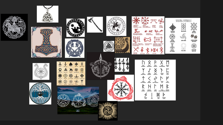
After my research i started looking for references over nordic symbolism in google and gathering them all using the PureRef software.

Drafting and coloring
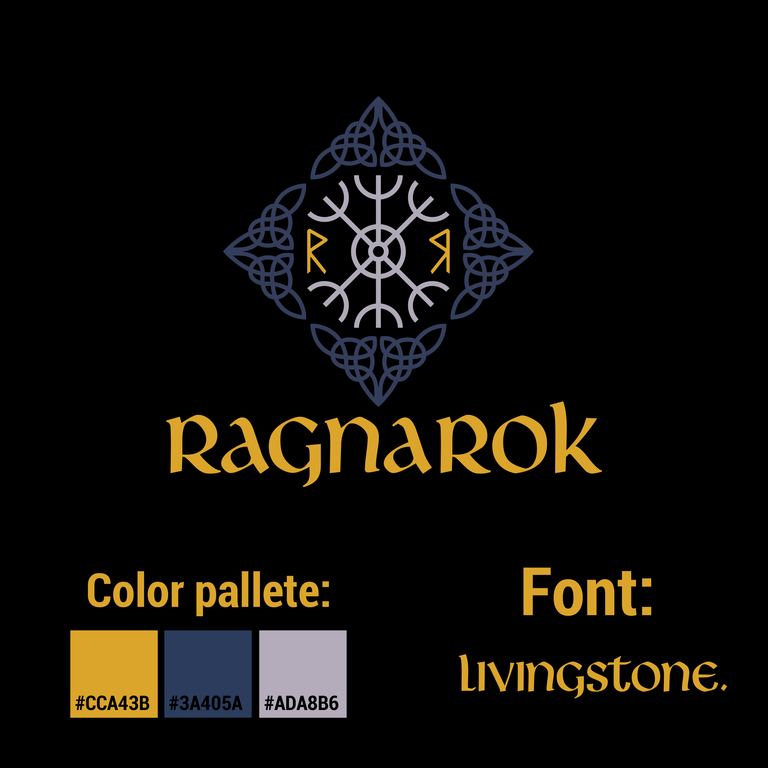
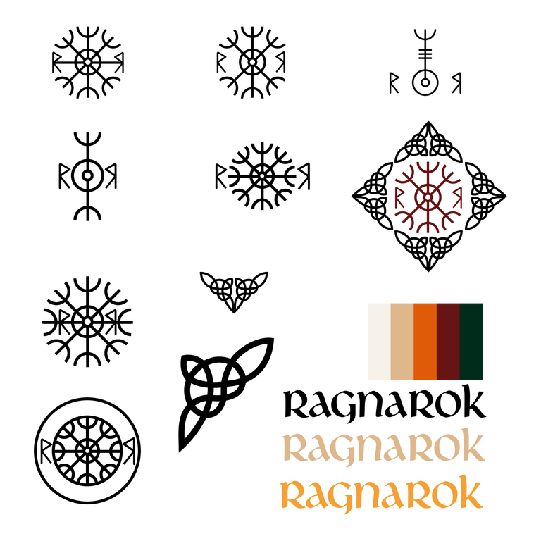
After i gathered enough references i started doing some drafts directly in Adobe illustrator. It wasnt really hard to come up with the idea after my research, i kinda already knew what i wanted to do so i was just playing around with forms and shapes to find something i like, after getting the shapes right i started playing with colors. If you're familiar with color psychology you'll know that different color carries different meanings, connotations and feelings and this is really important for a brand identity, For the game logo i chose the following colors:
Blue: The light blue color is usually related to peace and gentleness meanwhile darker shades can represent power, strenght and spirit;
Yellow: The yellow color usually resembles to joy, happiness, and energy, but can also indicate honor, agression and loyalty;
Gray: The gray color is a mix of white and black carrying a balance of both worlds. While the black color resembles power, death, evil, and mystery, the white color is the complete opposite being related to light, goodness, innocence, and purity. Being in the mid term makes the gray color a mix of both neutrality and mysteriousness.


Symbolism
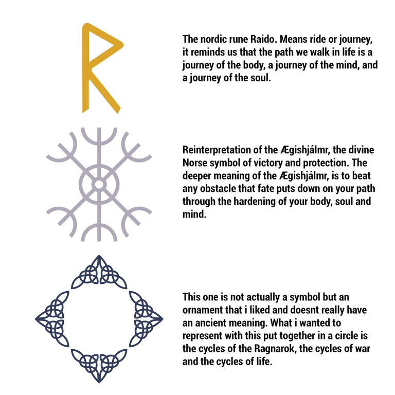
I didnt really wanted to just make a cool looking logo but to also add a meaning to it, every element on the logo have meanings that complements each other.
Thats it! Hope you guys liked checking out my whole process and the results, if any of you got any questions or comments feel free to leave a comment and ill answer, im currently working on a 3D version for the logo too but ill leave that for another post.
Much love to all!
Fantastic writeup, design looks great!
Thanks man! I Really appreciate it!
The rewards earned on this comment will go directly to the person sharing the post on Twitter as long as they are registered with @poshtoken. Sign up at https://hiveposh.com.
Based on what I've seen, it's one of the best so far. Good luck and I really hope you'll get the prize.
Have a !LOLZ btw
lolztoken.com
they’re so full of themselves.
Credit: marshmellowman
$LOLZ
Use the !LOL or !LOLZ command to share a joke and an $LOLZ. (1/1)@that1skter, I sent you an on behalf of @mann0000
Thanks a lot mann, lets hope so hahaha. Thanks for the lolz btw!
Looks fantastic good luck pal hope you win 🏆