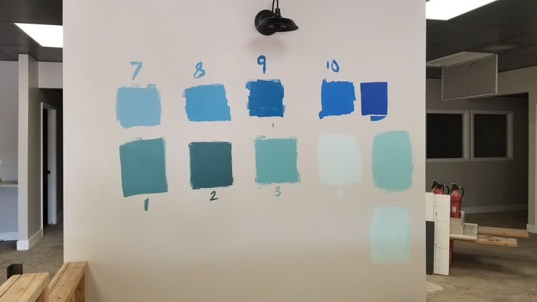
I have been designing and building my real estate brokerage and the space we are moving into for months. It has been fun, exciting, and grueling. A lot of people want a say in what we do; it has been tough making decisions and keeping everyone happy. One big decision is the blue we want to use. The real estate brokerage name is Blue Steel. Here are some choices:
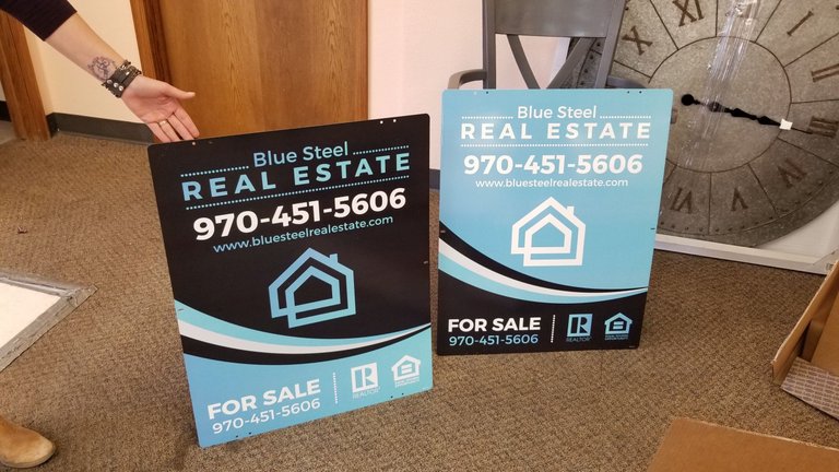
Here are our real estate signs, but the blue could change on these.
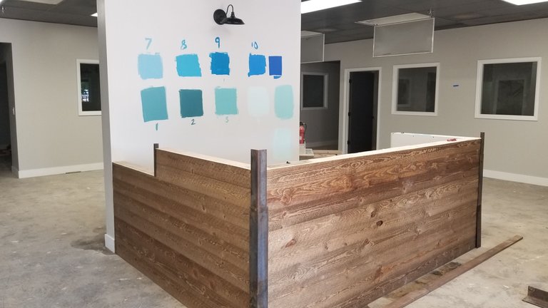
We have our reception desk mostly done.
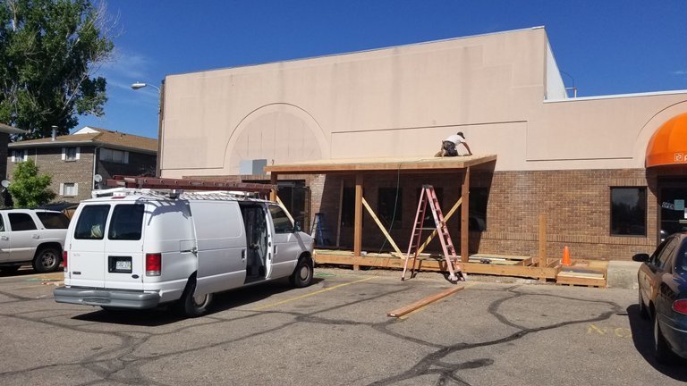
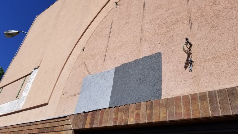
The outside is making progress as well.
We picked the colors we will paint the stucco.
We picked the floors (the one on the right)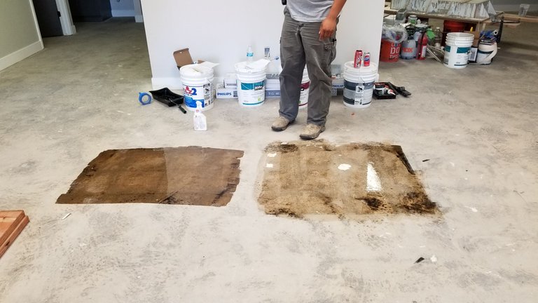 :
:
We are planning to move in June 1st, but there is still a lot of work to do! If anyone likes a blue please let me know. I know what I like, which is not the same as what my wife likes. I will wait to tell you to see what others think.
I'm late but I would do #4 paint so the office is lighter and you can do lot of blue accent stuff like paintings pictures etc. I would have before and after photos of your projects put up as well.
The sign on the left but with a white house I think.
I would stain the reception desk. Maybe a dark cherry color.
I would have picked the lighter stucco color.
I agree with your floor color.
The Darker the Blue, The Brighter Your Lighting Will Have to Be
Mint Green is always a safe choice. ;)
My wife, the tetrachromat says 7 or 4 would do well. :D
Thank you!
Light blue tones such as sky blue convey lightness and youthfulness. They underline our tender and sometimes dreamy side.
Medium shades of blue such as royal blue tend to radiate extravagance, while bright blue in a strong blue often lend "that certain something".
Dark shades of blue such as navy are particularly elegant, radiate great authority and trustworthiness - ideal for business.
Therefore, Mr. investfourmore, I would advise you to use a darker blue or even medium shades of blue.
Thank you for the info!
it should be 7th, And dont change the sign boards, they look perfect!
The 7th is good it is going to make it look fresh and attractive to every ray they eyes on it
Hope ya find the one you like.
Excellent post!
It is hard to choose but I like #9 or #10. I don't know I just love to look at the colors and I think it fits with the name Blue Steel. I hope our choices can help you and your wife to decide.
Being that this is an office building, lighter colors will look better. It'll make the room look more open, whereas the darker colors will make everything seem more dim and dull. 7 is probably your best option, but 8 would be fine if you have lots of lighting (from outside or inside).