Can you draw? Can you use Photoshop? or even Paint? And do you want 25 million starbits? 🤑🤑🤑

Rising Star is looking to overhaul its User Interface and overall player aesthetic experience, so we're putting it to you as a creative community to come up with some designs of how you'd like to see Rising Star look going forward. More brains, more ideas right?
Now, let's make this a little more interesting shall we? Call it an incentive, call it a prize, call it what you like, I call it 25 million Starbits (value at the time of writing: 225 Hive), to whichever design we decide to go with. On top of that the winning designer will get a special Rising Star NFT celebrating their contribution to the platform, these NFTs will be some of the most sought after in the game as they will only be issued to competition winners.
Now we have no way to gauge what the response to this post will be, we might get 2 submissions we might get 100, we might get 1000's or we might get none. So it's probably worth clarifying some points here.
This competition is intended, firstly, to reward the community for sticking with us through this seemingly endless crypto winter, and as a symbol of a new dawn approaching as the crypto market appears to be preparing for its next bull run. But also to help with onboarding new players and musicians moving into this crypto spring, so with that aim here's a few points on what were looking for.

I've had personal friends, both musicians and gamers look at the platform after I've hyped up the mechanics and you can almost see the interest drain out of them when they see it for the first time. Only one of the people I've showed it to, a part time gamer, started actually playing and they quit after a few missions. I'm sure many have experienced the same while trying to spread the word to family and friends. Its worth bearing this in mind when submitting a design as thats the goal we're working towards here.
It needs to be all of the things you would expect, eye catching but clean, simple and fun for new buskers, but also equal parts sophisticated for longer term players, and refined for any potential musicians or investors that may take a look at the project.
As far as parameters you can go as wild as you want, you can move stuff and make any aesthetic changes, but you cant create or remove any functions. Everything that currently exists must have its place. Although if you want to include a list of suggestions of new functions to go with your design they will be taken into consideration but not guaranteed if your design wins.
As nice as it would be if we do get some pixel perfect designs we will consider all applications with equal merit, we have imaginations, so you dont need to be a photoshop genius to submit your idea, functionality and aesthetics are both important, but ill take rough sketches on the back of cereal packet that make perfect sense over something that looks beautiful but is incomprehensible. If its enough for us to be able to get a decent understanding of whats in your head, thats enough to make an idea worth submitting.
Because we have no idea if we what the participation will be like, I have to stipulate that we aren't guaranteed to pick a winner, if we only get 1 submission we wont just go with that because its the only one. But I'm hoping the prizes are substantial enough that we get some serious submissions to then pick from. The idea is for us as a team to consider all entries and pick a favourite each, then those favourites will be put to a vote among the community. If there are enough entries to actually do this, all qualifying entries (so the ones we choose to put to community vote, which will max out at 5) get 5 million Starbits each, the winning design will get a further 20 million Starbits and a unique NFT for competition winners. This NFT will be created based on the success of this competition, for the purposes of rewarding competition winners if we do things like this again in the future.
There would also be a prize, or more like a finders fee I guess, for anyone who wins the competition from outside the Hive network. So share this with your creative friends who might want to win a bit of cash. If they win you get 20 million Starbits, and they get 25, which you can either sell for them and give them the cash, or the preferable option, get them on the hive network and playing #risingstargame ! We have plenty of account creation tokens to offer!
This competition is open ended and will remain open until we either get enough designs to be able to put to a vote, or if it ends up taking to long and we get a submission we all agree on. The prize will also remain the same throughout, 25 million Starbits, regardless of price fluctuations, whether it goes up or down. But just saying, its been moving up since November, no financial advice lol. And every month I will increase the prize by 5 million SB until we find a design we're happy with.
Submissions are to be made on the comment thread on this post or to me on Discord (link below) and you can submit as many different designs as you like, no limit. And you can submit them in any format you like, video, images with a legend, drawings with explanations, hell I'll even take it in as a watercolour. Like I say the more submissions the better, and as long as we can visualise what youre trying to put across, any format is fine.
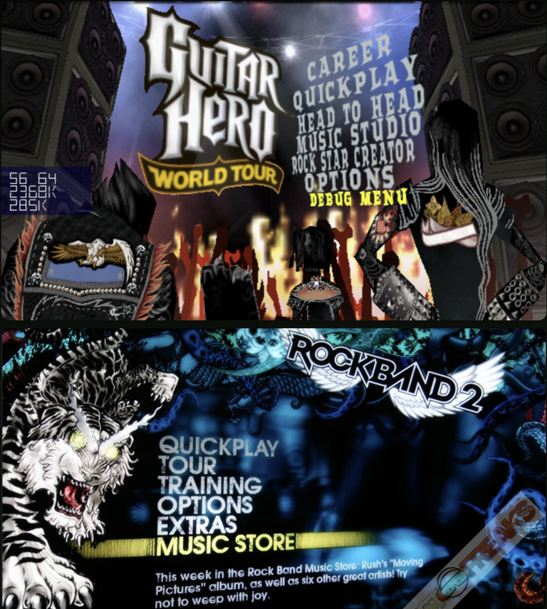
I had a chat with the man himself about the vision he had for how RS would look when he started this project, and he said he's always sort of tried to follow a similar theme to Guitar Hero.
So while you dont have to follow this in the slightest, Jux is going to be one of the judges and its his baby, if you wanna win, that's the man to please right there!
Just as a side note, he also mentioned if you need any of the imagery already in use, like logos, cards, etc. for your design, they can be supplied no problem.
That about sums it up I think, if you have any questions feel free to contact me directly on Discord, or leave a comment below! Happy designing! 🎨
Socials
My Discord - https://discord.gg/dhFPFdvn4m
Rising Star Discord - https://discord.gg/ccP6tsBqFD
Rising Star Game - https://www.risingstargame.com?referrer=bigjammin

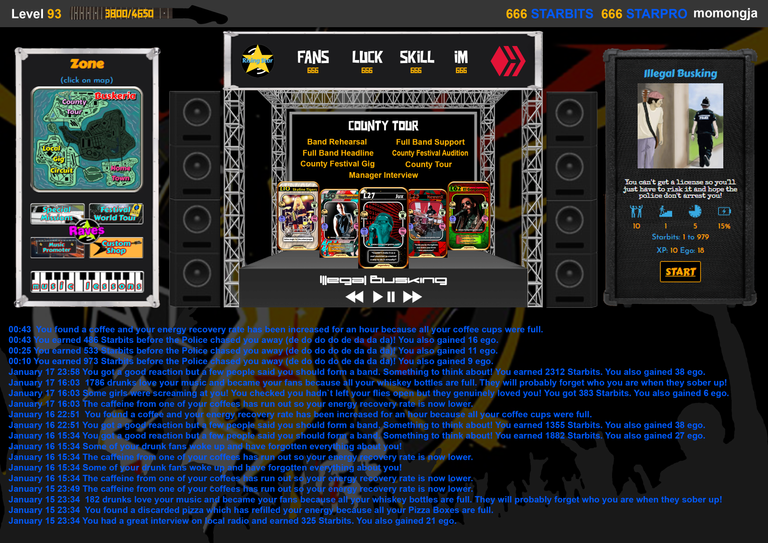
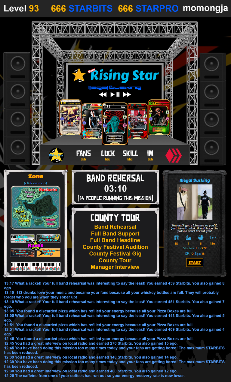
My Entry
Desktop View

Mobile View

Nice work man, bravo. Thats a solid entry, and for the first one too!👏
Appreciating the lower case i in "iM", I thought it was 1M for the longest time 😆
Ill catalogue your entry now, if you want to make any changes in the meantime feel free to do so and just send an update and ill swap it out 🙏
@risingstargame first entry 😄
Awesome start!
Very cool!!
what about card designs? im guessing these should stay the same, right? or are they also up for redesign (not that i think anyone gonna redesign them all lol)
That cards are awesome as they are. We won't want those redesigned thanks.
This is about making the interface modern, fun and intuitive.
The only things I want always in the game - the best images optimization as it could be for more fast downloading and less device resource consumption
in that game re-design project
my very past post about:
@gamemapmaker if you want the details https://peakd.com/hive-165469/@shenan/rising-star-proposition-of-the-game-images-optimization
Thank you for your witness vote!
Have a !BEER on me!
To Opt-Out of my witness beer program just comment STOP below
View or trade
BEER.BEERHey @shenan, here is a little bit of from @isnochys for you. Enjoy it!Learn how to earn FREE BEER each day by staking your
BEER.Thank you for your witness vote!
Have a !BEER on me!
To Opt-Out of my witness beer program just comment STOP below
My submission via figma to show some functionality aswell: https://www.figma.com/proto/yZg7JpjW8twbaSmPufoDMK/Rising-star?type=design&t=iJaXtgQGGjRodOPP-1&scaling=contain&page-id=0%3A1&node-id=1-4&mode=design
If I set everything correct there should be scroll functionality in the diary and if you click on the map you get to the mission select screen and are able to go back to the zone select via the back button.
To go in depth about the changes I made and why I made them:
Layout: I tried to make it more peaceful, intuitive and user friendly. The main focus is drawing attention to the missions and the rest is secondary. Cleaned up the screen by making the band cards hidden under the new Band icon in upper right corner, saving space.
I moved the rave "winning rave button" to the top as to make clear which rave you are in, indicated by the color of IGN, against the winning rave.
Diary scrolling: this decision was made to mitigate the problem RS has at the moment, which is the stretching of the background photo. I fixed this by making a scrollable set size textbox.
Mission select: as to save space and make the mission screen less cluttered, I decided to make the mission select integrated with the zone selection menu. This makes a user able to click a zone, which then offers a selection menu for that zone like we have now, but in one "screen". This saves up space and makes it easier in my opinion. To go back to the zone selection I have added a simple "go back to mission selection" button.
All in all I had alot of fun designing this and I hope I can inspire jux for the new design, or some easier functionalities for Rising Star.
Cheers!
This is a definite improvement and I like the fact you have simplified the layout.
I appreciate this is probably not your area of expertise but we also need to have much more modern looking graphics and a more dynamic experience as well.
Axie Infinity, for example, has quite a simple layout but looks a lot more inviting. Maybe you could find someone to help you with the graphics to update your submission? If you won you could always split the prize.
Good work!
Nice contest! @ty2nicerva is a great Graphic Designer, get in on this! :-)
😻😘😍
look forward to seeing it dude 😁
Great idea to reach out to the community, can’t wait to see what ideas come out, just wish I had a creative bone in my body!
Nice one a great idea!
Congratz for coming up with a pretty cool idea that could have an impact and awesome prizes.
I'll make sure to participate
This is an amazing idea and I cannot wait to see what the community comes up with. I do not have any artistic creativity in me, so while I will not be participating, I will be following along to see the creations.
Está bueno, hora de renovar pero que quieren nuevo cartas, plataforma, visión de la página.
Love this idea, I've personally been thinking about this since I started playing. Thx for putting up the substantial prize money @bigjammin
Now that there's an incentive me and others will hopefully come up with some possibilities. Just to clarify are you looking for 2 formats Mobile/PC as what displays on one doesn't necessarily work on the other?
At this early stage anything goes. We are looking for something that jumps out at us as a great design and then we can provide feedback regarding layout for specific devices later on.
Can we have a new channel for this in the RS discord so that those of us who aren't able to design can still make contributions and/or discuss what they would like to see?
We want to avoid getting into discussions about what people want at this time and concentrate on the look and feel only.
If, however, you want to make suggestions regarding the look and feel then please do so here as not everyone uses discord.
OK. I was thinking about look and feel I suppose but I was curious to get some discussion going with the musicians of the community rather than the pure gamers. Whether it is attractive to musicians to upload their music even if they don't play the game etc. Primarily stemming from my first thought when I read the post which was who are we trying to attrack? Bigjammin refers to "both musicians and gamers" and I got to wondering . . . 🙂
My view as that it's gamers first as we need to show musicians that there is an audience for their music. I already developed and ran Atom Collector Records for a few years and I came to the conclusion that a pure music focussed app has no chance against the likes of Spotify. Rising Star allows us to grow the audience first then attract the musicians. Once you start selling some of your records as NFTs it becomes clear that it is better than trying to make money on streaming services.
That in itself is great news.
My request to the designers then would be to make the fact that you can sell your music more obvious and a frequent reminder but whether or not that comes under look and feel I don't know.
I just LOVE the idea of musicians being able to sell their music here.
Could the design incorporate some of what the guy at Hive Fest was talking about or is that a completely different project? Just thinking outloud now as that most certainly was not just "look and feel".
Right now we just need to create a better way to present the features we already have. The less that has to actually be modified to create a big impact the better and I think it will be possible to make the game feel completely different by just changing graphics and the way things behave when you use them.
Sweet rewards! If only I was that talented lol
Interesting...
Noted some important things for me:
I already shared it to my friends, but I don't know whether they want to join 😂. !LOL
!ALIVE
!PIZZA I hope there'll be a good nice UI after this 👍. Thanks @bigjammin
lolztoken.com
I told her to get out of my fort.
Credit: lofone
$LOLZ on behalf of cursephantom
(1/10)
NEW: Join LOLZ's Daily Earn and Burn Contest and win $LOLZ@bigjammin, I sent you an
You Are Alive so I just staked 0.1 $ALIVE to your account on behalf of @ cursephantom. (1/20)@bigjammin!
The tip has been paid for by the We Are Alive Tribe
 through the earnings on @alive.chat, feel free to swing by our daily chat any time you want, plus you can win Hive Power (2x 50 HP) and Alive Power (2x 500 AP) delegations (4 weeks), and Ecency Points (4x 50 EP), in our chat every day.
Curated and voted 100% by Selection of the best articles about Games and eSports in Hive.
I have little idea about design, but it needs to work well on mobile as most people would play it like that. Currently some screens do not fit on my Android screen.
It could make more of the music theme with the use of fonts and decorations (e.g. instruments). I understand this is not easy, but those who play a lot of games should have ideas.
I hope this drums up some enthusiasm.
fair point i didnt think to mention that but yes, ideally with a mobile format. Thanks 🙏
The rewards earned on this comment will go directly to the people ( hiro.juegos ) sharing the post on LeoThreads,LikeTu,dBuzz.https://inleo.io/threads/hiro.juegos/re-hiro-juegos-2vmfvkcnt
Massive thanks to @bigjammin who is personally putting up this prize as he really believes in the game and we do not want to increase STARBITS inflation by supplying the STARBITS ourselves.
I always envisaged members of the community taking on things like this so Julie and I can concentrate on developing new features and the day to day running of the game.
Good luck if you are entering and I really look forward to seeing some amazing looking designs!
Cheers and rock on \m/
Jux.
Bit late to the party.. Awesome idea.
!PIZZA
i look forward to seeing the redesign i love rising star
Congratulations @bigjammin! You have completed the following achievement on the Hive blockchain And have been rewarded with New badge(s)
Your next target is to reach 1500 upvotes.
You can view your badges on your board and compare yourself to others in the Ranking
If you no longer want to receive notifications, reply to this comment with the word
STOPCheck out our last posts:
$PIZZA slices delivered:
cursephantom tipped bigjammin
(1/5) @ugochill tipped @bigjammin
y yo intentando darle ordenes a mi mente que cree algo para participar y esta me dice, usted no es dibujante me voy de vacaciones jajajjaaj
🤔