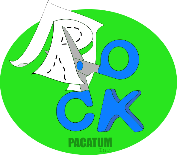
In my second logo I looked for something diferent of the draw number one, but yet simple if possible.
So I tryied to do something more visual , that could catch the eye in both, long and short sight, a logo that look good in small and in large dimentions, and I have done this.

Rock is represented by the word that was composed by the elements of logo, papel is flying giving a lightly 3D look to logo, and scissors link the elements in a very simple, elegant and clear draw. Try to look this logo in a very tiny view, he has a very good look in my opnion ;-)
The letter K was drawing by hand, cause I have not fonts here :T BUT can be re-done if necessary, as colors can be changed too .