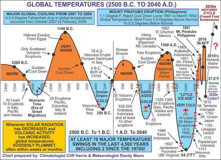
That's an interesting graph from circa 2009 and it is interesting to view the more updated version of it:

The article that goes with it on global temperatures is interesting to read too. The scaling on the chart appears to be a bit off because the peak temperature at 1100 B.C. shows higher than the peak recorded in 2016 yet the article states:
... land and ocean readings have rebounded to the highest levels in recorded history in 2016 with a temperature of 58.69 degrees Fahrenheit.
The chart shows a possible cooling trend in the 2020's but who knows. The key point I see from it it the jump in temperature in the 2030's from fossil fuel emissions and the fact that the scale is possibly inaccurate. The article states:
... However, Mankind’s activities of the burning of fossil fuels, massive deforestations, the replacing of grassy surfaces with asphalt and concrete, the “Urban Heat Island Effect,” are likely creating more harmful pollution. Yes, we believe we should be “going green” whenever and wherever possible.