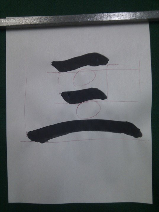
Character THREE (三) is a basic example of brush stroke balance. Relationship between lines length, width, orientation and spacing is what brings beauty to any work, regardless of kanji complexity.

Straight and even. While writing, it is necessary to pay attention to the balance of the lines of the character; otherwise, it will look ugly. Traditionally, calligraphers have stressed the evenness of the character’s makeup, the proper length of its vertical and horizontal strokes and the suitability of darkness and lightness.
Well-balanced. Characters or strokes should be well balanced. For the characters with few strokes, the strokes should be thicker, and strokes should coordinate with each other. For characters with more strokes, the strokes should be thinner, closer and well balanced.
-Chen Tingyou Chinese Calligraphy