S&P to Silver and vice versa
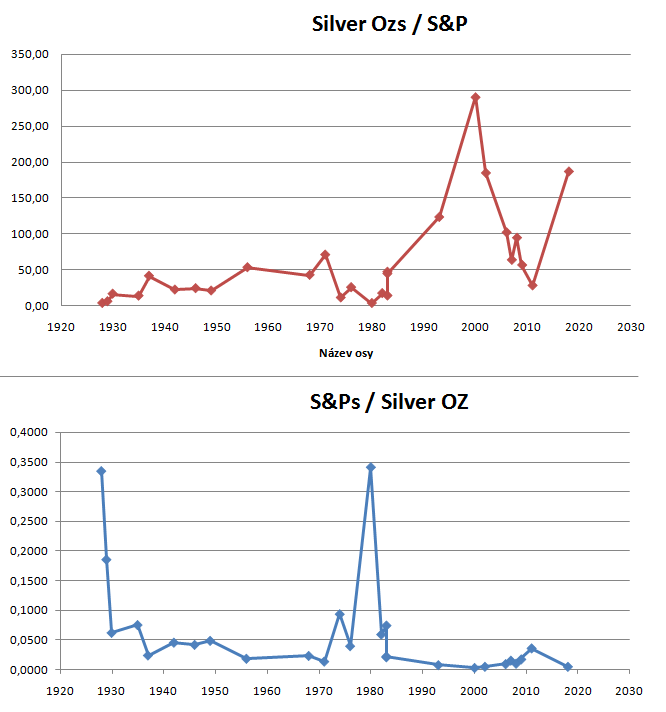
These graphs show the real value of one asset expressed by the value of the other asset. Dollars are not optimal for measuring value of assets because of the inflation and its continually decreasing value. I recommend checking you the same chart I have made except instead of silver I used gold ---->S&P to Gold.
I have tried to make these graphs as parallel as possible so you and I can compare it easily. Thanks to that you can see that when one line is at its highest the other one is at its lowest which makes total sense.
The lowest points are the BUY points and the highest are the SELL points even though I would recommend selling earlier rather than later ;-)).
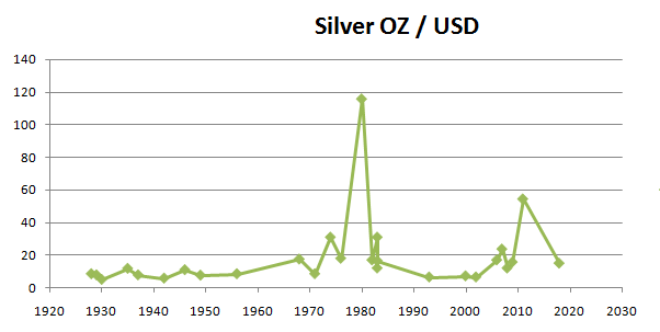
Silver to USD
Even in this graph of Silver measured in dollar you can see how undervalued it is. It costs less than in 1918 what you can't see here but the price in dollars was approx. 17$.
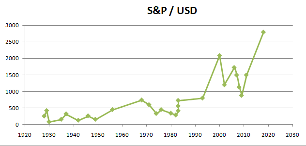
S&P to USD
Overvalued even in dollars and can't go like this for ever...
I am making these graphs because they tell much more than USD / (any asset) charts. Also when I am done with all graphs I'd like to make such as Silver and Gold to (BTC, oil, nasdaq, real estate,...) I think that we all will have a good idea of the best buy in options that are today avaible in the market.
For now I would say that Silver and Gold are the way to go but I would not hesitate throwing at least 10 - 20% to cryptocurrency where the profit potential is much higher which includes also higher risk.


