Sometimes I take commissions…
This two paintings are in a “special category” of commissions because I was approached by a friend that works as an interior designer and he needed art for the houses that he was working on at the time. He had to convince the clients against some very generic looking prints that wouldn’t have looked good with his interior design and hang some original paintings instead.
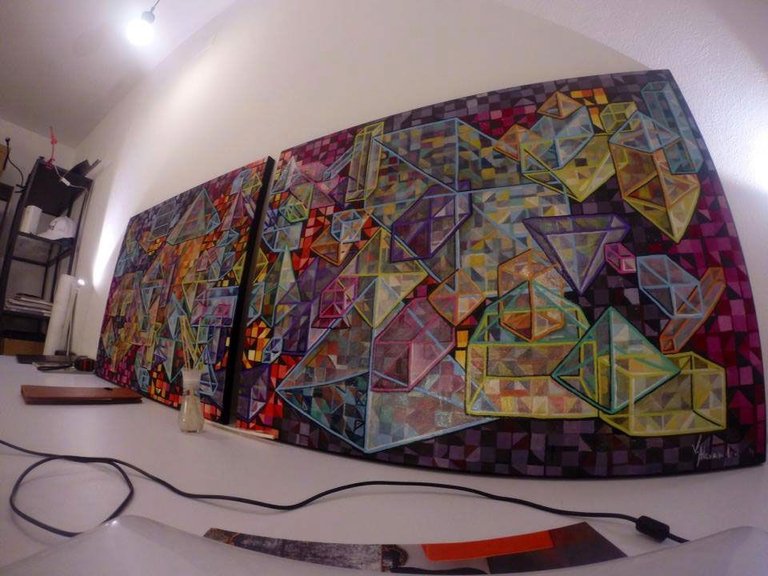
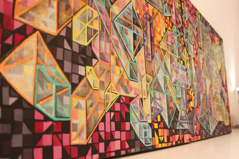
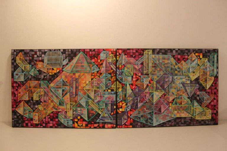
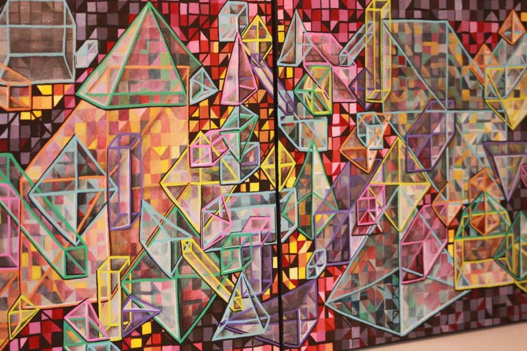
The first painting was done to replace the idea of a New York skyline oversized print, so I was asked to paint a large composition on two canvases very colorful and geometric for the office, because that would have fitted better in the context of the room.
This is what I came up with
I used acrylics and the whole composition was 90/200 cm on two canvases each measuring 90/100 cm
The second painting I had to do, consisted in splashes that gave the impression of lily flowers for the living room.
The name you see in the corner of the pictures is my friend's name Robert Trusca- if you want to see more of his designs projects here is his webpage : http://roberttrusca.com/interior-design-projects/commercial/bijuteria-stil-unirea/attachment/bijuteria-stil-unirea-interior-design-robert-trusca-1
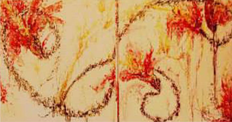
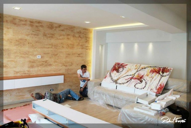
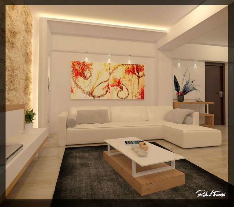
Even larger scale 100/200cm on two square canvases
Again I used acrylics but this time along with an impasto medium that made my paint very thick.
Instead of splashing with a brush I used large syringes and cannulas ( a bit creepy but that is what I used) :))
Unfortunately I do not have good photography of this painting where you can actually see the texture.
So this was my “special category” of commissions and I name it so because at first I was a bit thrown off by the project- it went against my way of choosing a subject and aesthetic of a painting. Even so, the moral of the story is that, it was a good exercise and it led me to try things that I wouldn’t normally choose to paint and discover new techniques.
In the end I was happy, my friend was happy and the clients were happy :P
Are you happy with this post?
Let me know in a comment
Upvote and Resteem are not mandatory only if you think is worth it :P

This work is licensed under a Creative Commons Attribution 4.0 International License.
Amazing showcase of two very different, but very important uses of spacial sense and white space to create different atmospheres and feels for these breathtaking pieces.
The layering in the first piece gives it so much dimension! and the dappling on the second creates such a unique and inviting texture.
Can't imagine the time and effort it takes to put these visions to campuses this large and still have them retain the feel of something small and personal.
Thank you so much for sharing your work, @alexandravart!
cannot wait to do large scale again :) thank you for appreciating always.
I love your comments you pay so much attention to my content, and always have some value to add. from now one upvote every time :)
d'aww, I'm just so happy I get to be able to share in appreciating all the art and writings here on Steem - when the artists put so much time and effort into creating their art, it just seems right to take some time and effort to put into a comment so they know how much you enjoyed and appreciated them adding their unique beauty to your life.
OH WOW * __ * i'd love to have your paintings on my walls~ wowow you have such a wonderful eye with colours and design <3 these are just gorgeous~ I love love love the first one but the second one is also beautiful <3
I love this post omg
upvotes and resteems
I have to do one again, like the second one because the photo does not do it justice, it had so much texture almost 3 cm in relief.
thank you for you exciting comment and appreciation :P <3
This is perfect, excellent, amazing, impressive, beautiful, searching the dictionary for more. They are absolutely amazing my friend. Always proud of you.
hugs hugs hugs
Hugs gladly received dear and given massive hugs 😊😊😊. Thanks cutie.
There is another art used at home that could be better than this
His name is Epoxy 3D
nice image :)) but I will feel my feet wet wen I get out of bed :P
HAHA
It's a romantic house
These are all excellent paintings I'm very very Impressed Great article UpVoted
thank you :)@tokoya
Abstrak @alexandravart
hi hi this time yes more abstract than my usual style :D
Love the geometric one. Reminds me of a retro video game!
thank you spend 3 weeks on that one the acrylic paint had to be put in multiple layers to give that digital aspect , glad you like it
:)
Oh my god!!! The first painting is SO COOL!!

thank you :) ooo no slothicorn, don fly to the moon without me :)))
YOU! are crazy talented and i thank you for sharing!
thank you for appreciating :P
Very happy with your post! This might be the first paintings in my many years I have actually desired to have in my home!
glad you like them, thank you <3
let me know than , if you decide to commission me , could do one custom to the interior you wanna decorate :P I accept to be payed in steem or other crypto
I can appreciate when people do commissions, because the art is then personal and one of a kind instead of just getting an IKEA art piece :) wonderful work.
thank you :)
I like commissions once in a while, it is a challenge to adapt to the clients wishes , it makes me step out of my comfort zone and I and up discovering new things
I get what you are saying, and on top of that then its the fear of the client not liking it because they have an image in their mind already on how it should look.
Not really:))) most clients have a very faded image of what they want, so is not as hard to surpass that expectation, because you discuss, maby you even sow a skatch , but the final result is always more than they have expected
See and that whole process is why commissions are so special in the first place because the person owning that work can tell the whole story of how it was created.