
Welcome to my daily analytical report about Steemit.
All the information presented in this report are based on the data collected from the blockchain until 2017-05-19 midnight UTC time. The goal of this report is to provide you with a clear view on what is happening daily on Steemit.
1. New users
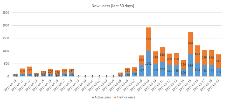
This chart shows the number of newly registered users on Steemit and how many of them became active. We see that a lot of accounts are registered, but never used.
Warning: this graphic is kind of dynamic! A user can register one day and become a few days later. Therefore, the number of active users on a specific date may change from day to day.
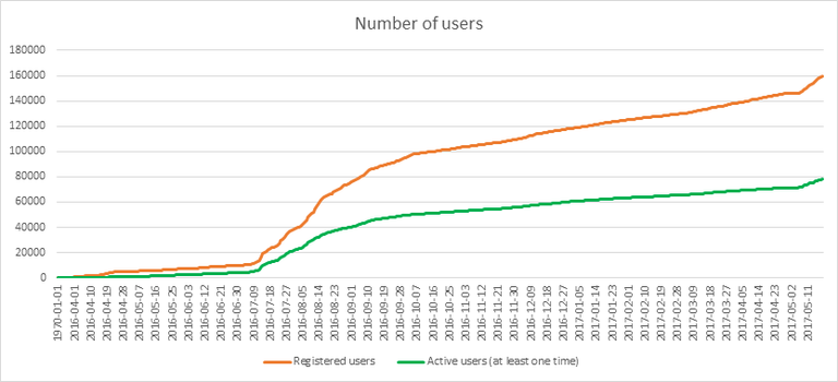
In this graph, the orange line shows the total number of registered accounts.
The green line shows how many of them have been active at least once (by active, I mean those who made at least one post, comment or upvote). They are included even if they become inactive later.
2. Post and comments
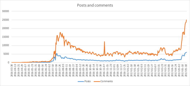
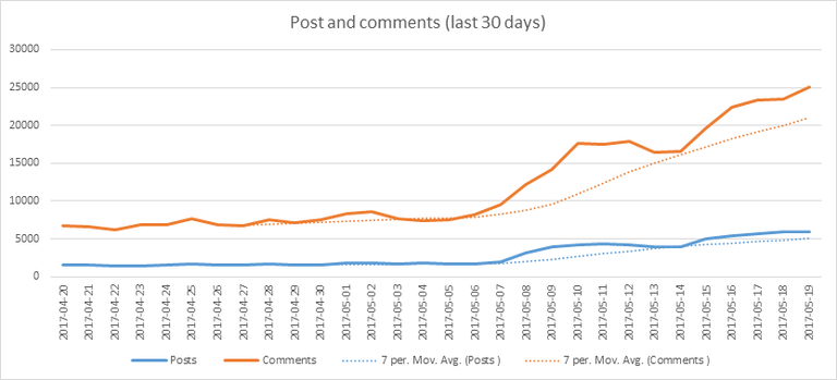
These graphs show the evolution of posts and comments for the whole blockchain lifetime and for the last 30 days.
3. Curation
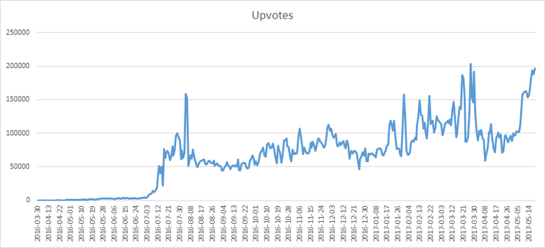
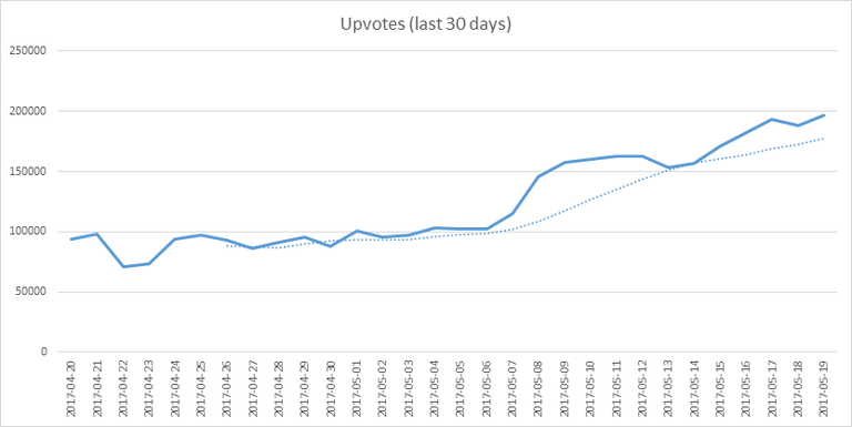
These graphs show the evolution of curation (upvotes) for the whole blockchain lifetime and for the last 30 days
4. Active users
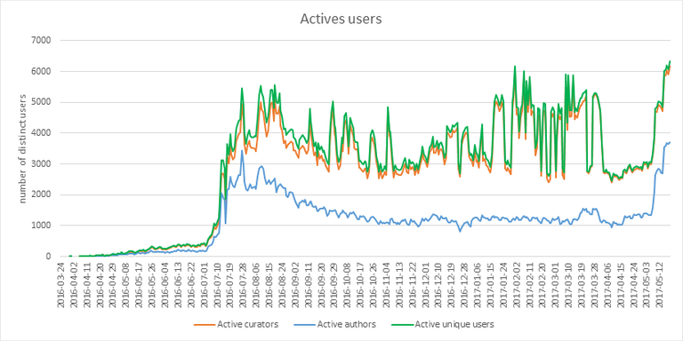
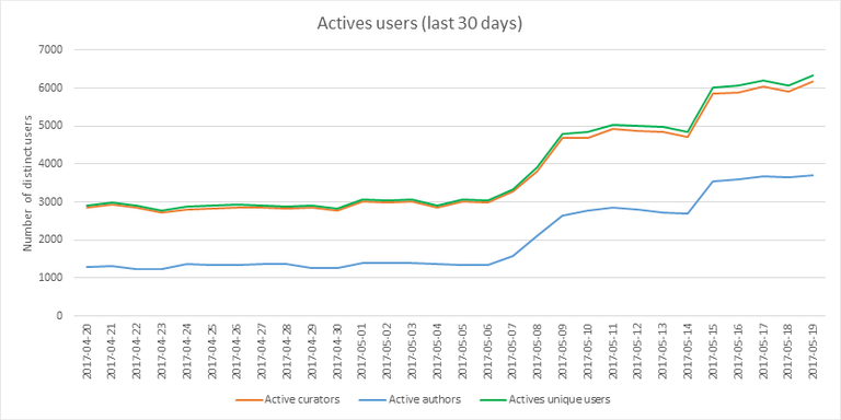
These graphs show the activity of users over time and in more details for the last 30 days.
5. Daily transactions
![]()
This graph shows the number of daily transactions. This give you an idea of the whole activity on the blockchain.
6. Categories
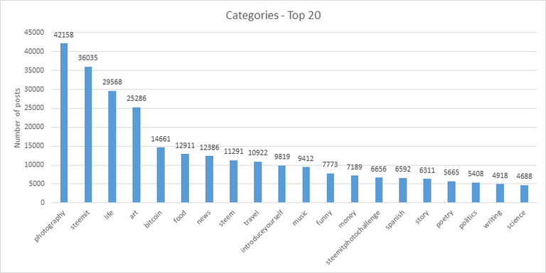
This graph shows the tag has been the most used for publishing posts for the whole blockchain lifetime.
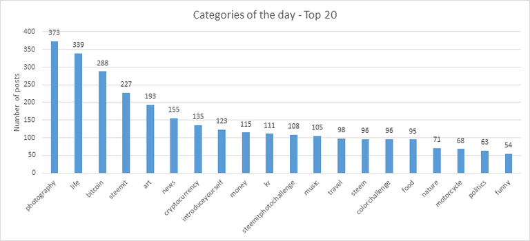
This graph shows the tag has been the most used for publishing posts last day.
7. Distribution
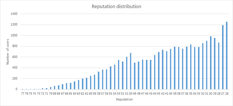
This graph shows the distribution of the reputation among users. Accounts with a reputation lower than 25 have been removed to keep the graph readable.
This graph shows the distribution of the voting power.
8. Payout evolution
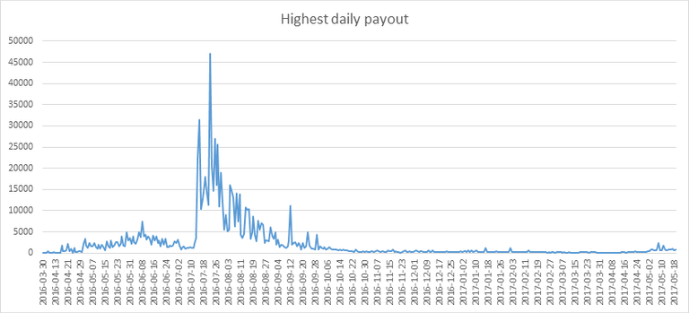
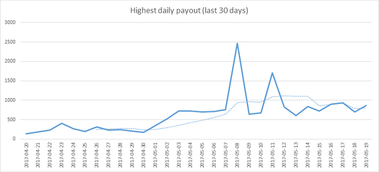
These graphs show the maximum reward paid on a post (or comment) for each day (whole blockchain life and last 30 days).
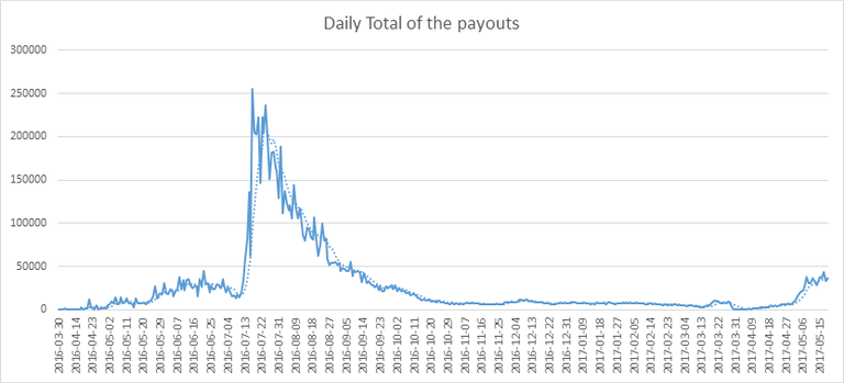
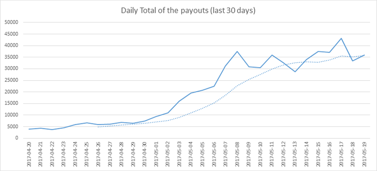
These graphs show the total of the distributed payout (posts and comments) for each day.
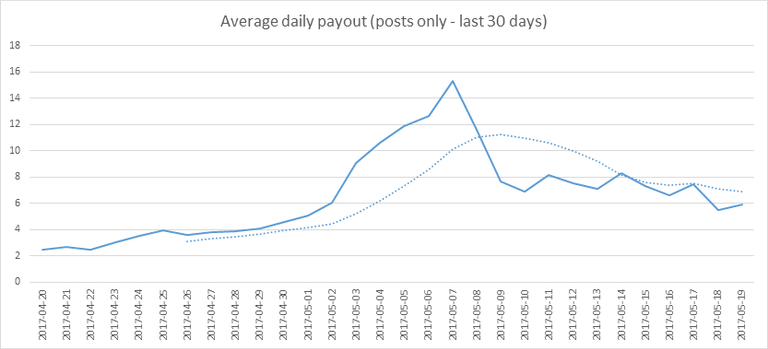
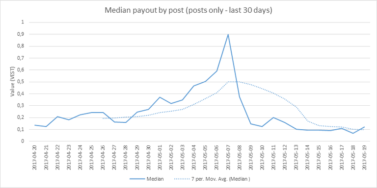
These graphs show the average and median payout per post for the last 30 days.
The last one indicates that if yesterday you got the latest value shown on this chart for your post, you should be happy because there are as much people that have earned more than you than people that have earned less than you.
I hope you find those stats useful. If you would like to see different stats, feel free to drop me a comment. Your feedback is more than welcome.
Thanks for reading.

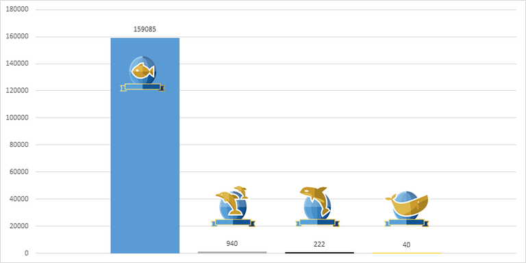
footer created with steemitboard - click any award to see my board of honor
Support me and my work as a witness by voting for me here! 
upvote or follow me or resteemYou like this post, do not forget to 
Absolutely love seeing your statistics posts! I find them to be very informative and presented very well.
Upvoted and re-steemed!
Have a fantastic weekend!
Steem on,
Mike
Thanks a lot for your support!
Have a good week-end too.
I think the title should be 5. 19 :)
Fixed! Thanks for notifying ;)
Thanks for this, really helpful to me in getting an understanding of this community. When you're new Steemit is a bit overwhelming and these graphs clearly show the numbers and what people are doing here. Thanks again!
Glad to help. Thanks for your feedback!
Do you know how many TOTAL users there are currently? Or is that same as active? I've been trying to figure that out.
What do you mean, total accounts created? You can see that on steemd.com
Curation and upvote breakout!
I love this post numbers and stats are one of favorite things! Thanks for sharing @arcange
Thanks you =)
Thanks. Superly detailed, yet simple stats.
Thank you for your positive feedback! =)