
Welcome to my daily analytical report about Steemit.
All the information presented in this report are based on the data collected from the blockchain until 2017-05-26 midnight UTC time. The goal of this report is to provide you with a clear view on what is happening daily on Steemit.
1. New users
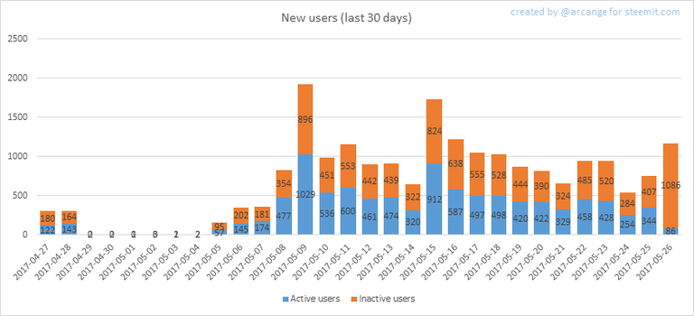
This chart shows the number of newly registered users on Steemit and how many of them became active. We see that a lot of accounts are registered, but never used.
Warning: this graphic is kind of dynamic! A user can register one day and become a few days later. Therefore, the number of active users on a specific date may change from day to day.
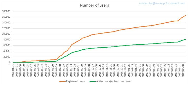
In this graph, the orange line shows the total number of registered accounts.
The green line shows how many of them have been active at least once (by active, I mean those who made at least one post, comment or upvote). They are included even if they become inactive later.
2. Post and comments
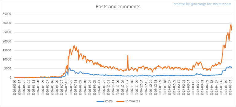
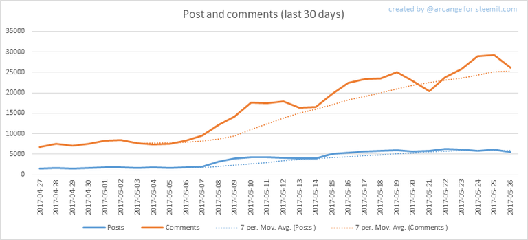
These graphs show the evolution of posts and comments for the whole blockchain lifetime and for the last 30 days.
3. Curation
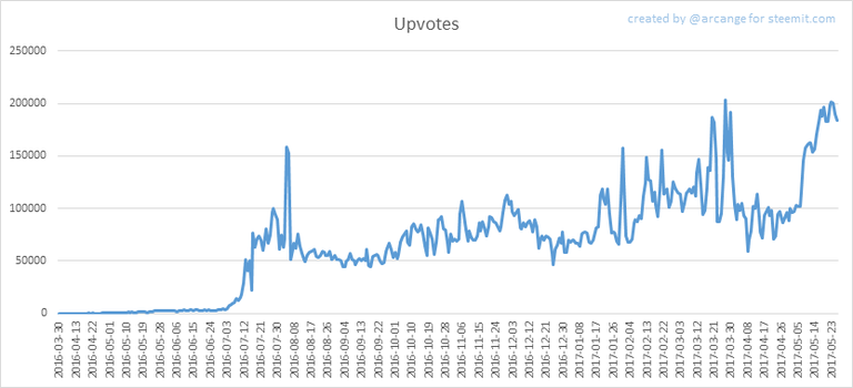
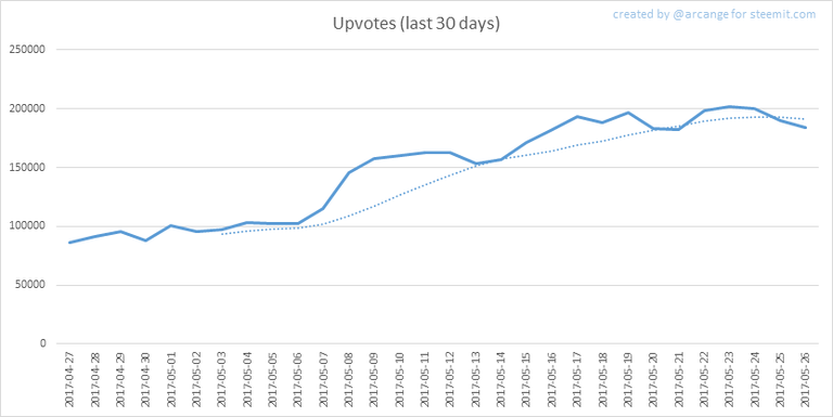
These graphs show the evolution of curation (upvotes) for the whole blockchain lifetime and for the last 30 days
4. Active users
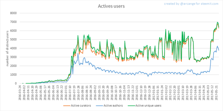
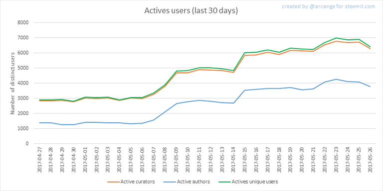
These graphs show the activity of users over time and in more details for the last 30 days.
5. Daily transactions
![]()
This graph shows the number of daily transactions. This give you an idea of the whole activity on the blockchain.
6. Categories
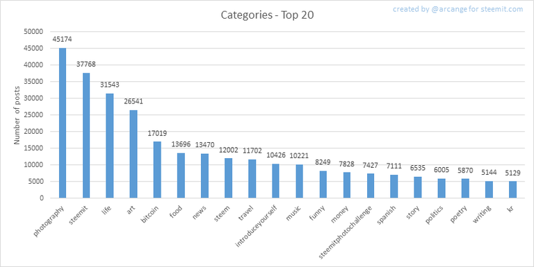
This graph shows the tag has been the most used for publishing posts for the whole blockchain lifetime.
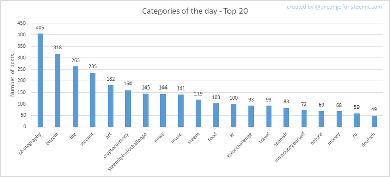
This graph shows the tag has been the most used for publishing posts last day.
7. Distribution
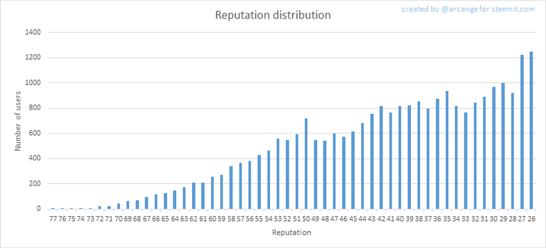
This graph shows the distribution of the reputation among users. Accounts with a reputation lower than 25 have been removed to keep the graph readable.
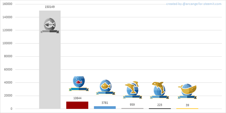
This graph shows the distribution of the voting power (it now includes the new "Inactive" and "Red Fish" levels - check @steemitboard blog for more info about this).
8. Payout evolution
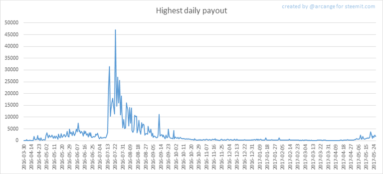
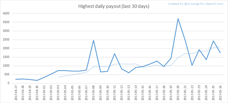
These graphs show the maximum reward paid on a post (or comment) for each day (whole blockchain life and last 30 days).
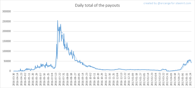
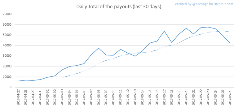
These graphs show the total of the distributed payout (posts and comments) for each day.
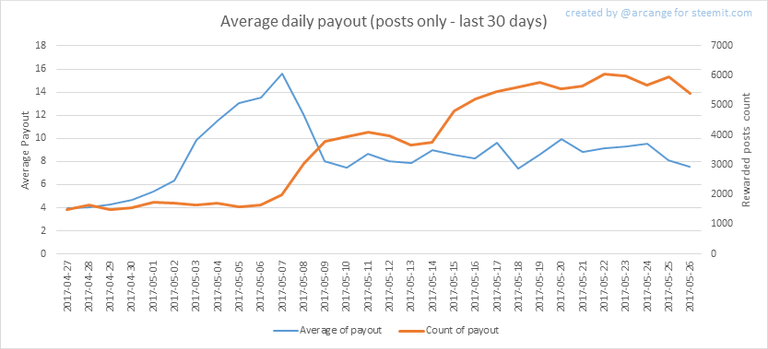
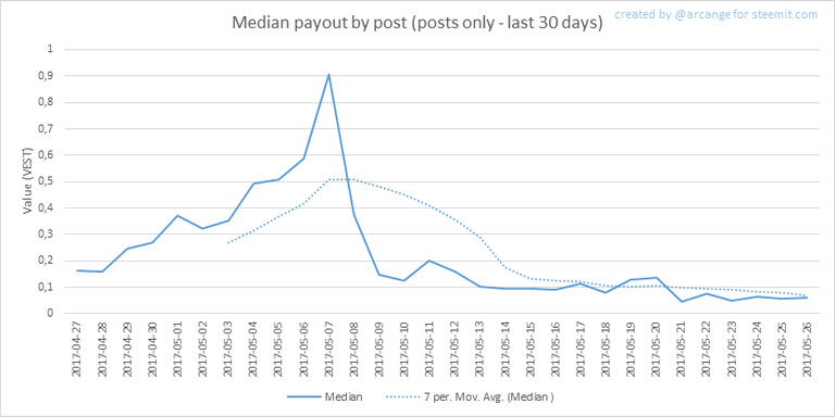
These graphs show the average and median payout per post for the last 30 days.
The last one indicates that if yesterday you got the latest value shown on this chart for your post, you should be happy because there are as much people that have earned more than you than people that have earned less than you.
I hope you find those stats useful. If you would like to see different stats, feel free to drop me a comment. Your feedback is more than welcome.
Thanks for reading.

footer created with steemitboard - click any award to see my board of honor
Support me and my work as a witness by voting for me here! 
upvote or follow me or resteemYou like this post, do not forget to 
Wow, yesterday had a TON of signups, but almost none of those became active accounts. So strange. Great job with this, I love these posts and watching the trends unfold each day.
Thanks!
Great article. Thanks for putting all the info in one place. Followed you and looking forward to reading more of your reports. Keep up the great work!
You should reply to OP and not to me :)
My Bad! Still just a little minnow learning how to swim! Thanks for the advice, haha
Sure thing. Just wanted to make sure arcange saw the nice message you left!
The inactive created accounts could be explained by our current sign up process that takes few days.
Interesting... :)
Many new registrations on May 26!
Great post. I joined in May so I have to ask - what happened in April? A lot of the graphs show a u-shaped dip where activity/transactions were flat in April before the May explosion.
photography still thebest !!!
I wish I had gotten in a year ago...
@pocketechange
Sweet! thanks for sharing these stats
Good idea in adding the 'red' fish. Puts things into better perspective.