
Welcome to my daily analytical report about Steemit.
All the information presented in this report are based on the data collected from the blockchain until 2017-07-18 midnight UTC time. The goal of this report is to provide you with a clear view on what is happening daily on Steemit.
1. New users
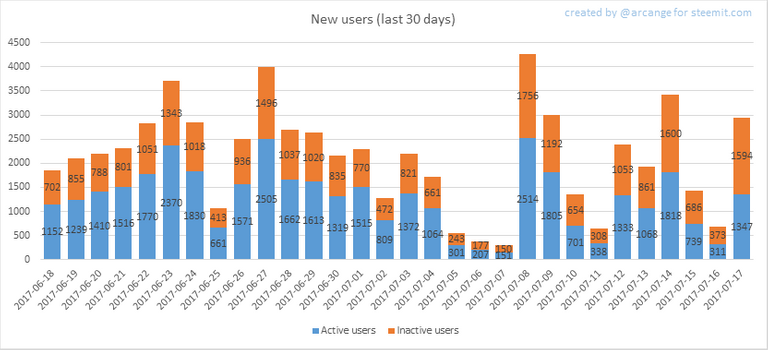
This chart shows the number of newly registered users on Steemit and how many of them became active. We see that a lot of accounts are registered, but never used.
Warning: this graphic is kind of dynamic! A user can register one day and become active a few days later. Therefore, the number of active users on a specific date may change from day to day.
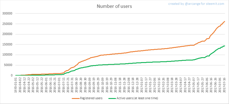
In this graph, the orange line shows the total number of registered accounts.
The green line shows how many of them have been active at least once (by active, I mean those who made at least one post, comment Or upvote). They are included even if they become inactive later.
2. Post And comments
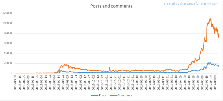
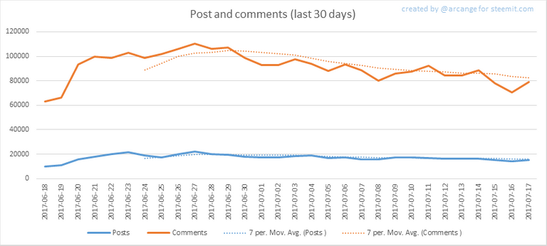
These graphs show the evolution of posts and comments for the whole blockchain lifetime and for the last 30 days.
3. Curation
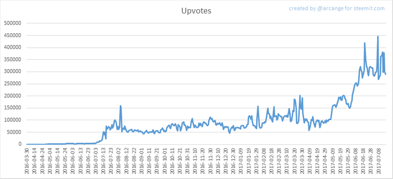
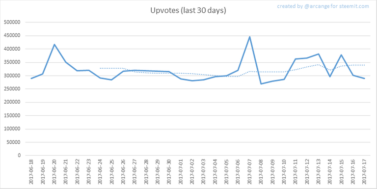
These graphs show the evolution of curation (upvotes) for the whole blockchain lifetime and for the last 30 days
4. Active users
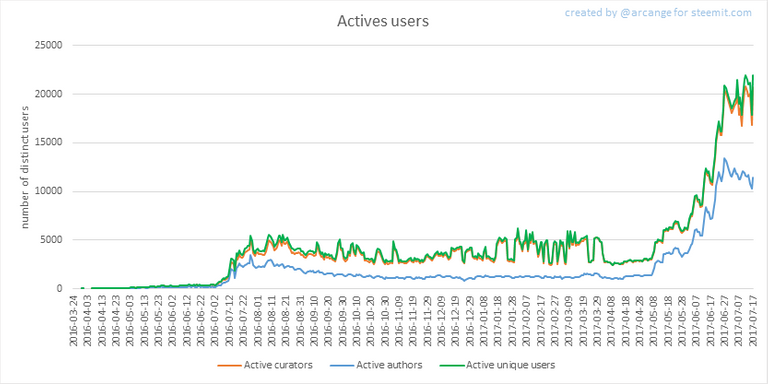
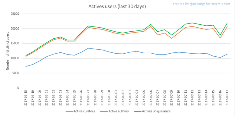
These graphs show the activity of users over time and in more details for the last 30 days.
5. Daily transactions
![]()
This graph shows the number of daily transactions. This give you an idea of the whole activity on the blockchain.
6. Categories
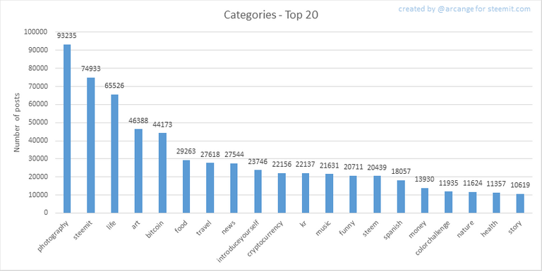
This graph shows the tag has been the most used for publishing posts for the whole blockchain lifetime.
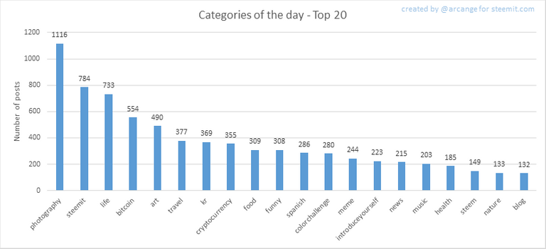
This graph shows the tag has been the most used for publishing posts last day.
7. Distribution
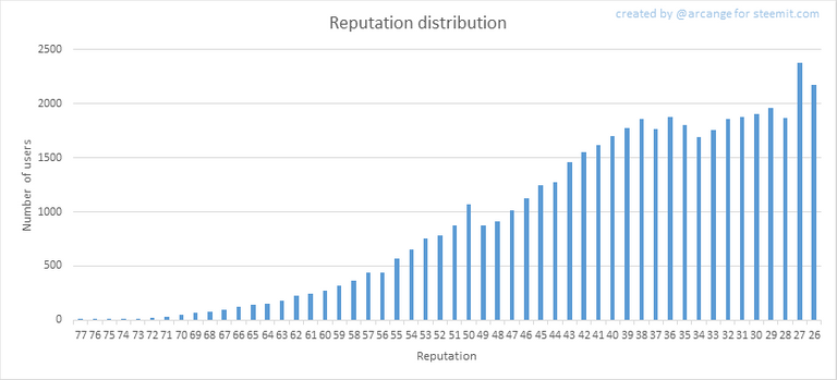
This graph shows the distribution of the reputation among users. Accounts with a reputation lower than 25 have been removed to keep the graph readable.
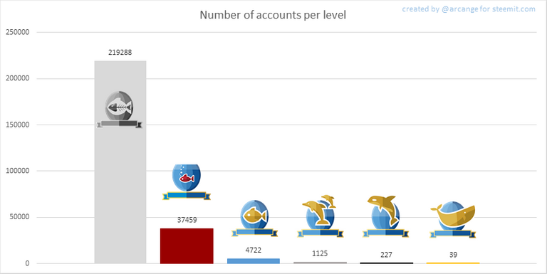
This graph shows the number of users according to their voting power (it now includes the new "Inactive" and "Red Fish" levels - check @steemitboard blog for more info about this).
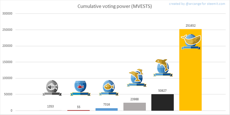
This graph shows cumulative distribution of the voting power. It enables to see the total voting power of each level.
8. Payout evolution
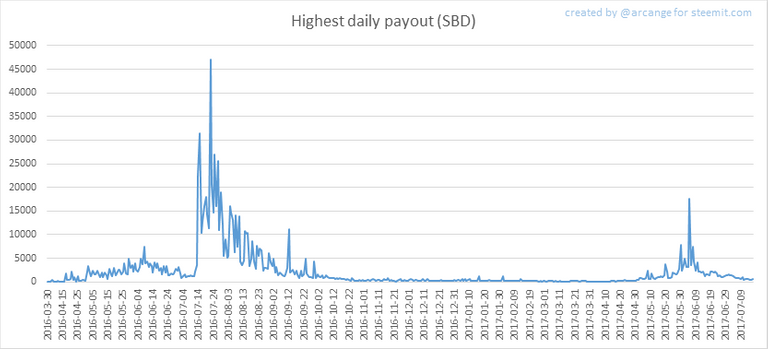
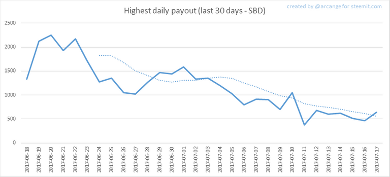
These graphs show the maximum reward paid on a post (or comment) for each day (whole blockchain life and last 30 days).
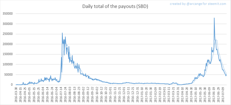
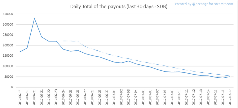
These graphs show the total of the distributed payout (posts and comments) for each day.
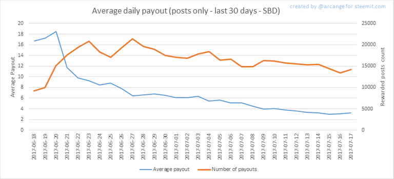

These graphs show the average and median payout per post for the last 30 days.
The last one indicates that if yesterday you got the latest value shown on this chart for your post, you should be happy because there are as much people that have earned more than you than people that have earned less than you.
I hope you find those stats useful. If you would like to see different stats, feel free to drop me a comment. Your feedback is more than welcome.
Thanks for reading.

footer created with steemitboard - click any award to see my board of honor
Support me And my work as a witness by voting for me here!

You Like this post, do not forget to upvote Or follow me Or resteem
Do I read it correctly that around 11k active daily users manage to produce around 18k posts and 80k comments every day?
I wonder what is the distribution of the number of posts and comments a typical active user leaves each day. Perhaps you could consider such a chart for your next issue.
Thanks a lot for this great information. There seems to be a relationship of post activity with how high the price of Steem is which actually makes a lot of sense.
Love getting these everyday, Stats checkin :)
Voted! Keep it up man👍🏻
your statistics are really amazing and show a lot of interesting data. I really like to read through them :) But I'm still wondering about the median payout per Post. It seems like just a few benefit and all others get nothing according to this chart...Hey @arcange,
I find it interesting that even with the double bump up of users, the number of articles seems to be a steady easy climb. However, upvotes have also gone up with the increase of users.
From this information, either a lot of the new users are simply upvoting/resteeming because they don't know how the system works or they might all be bots.
a lot of interesting stats, haven't seen those before. Thanks for sharing!
Interesting data :0) havent seen this before.
Voted
@arcange Thank You for sharing this info! We all greatly appreciate the charts you've provided in this blog. I'm happy to have been account number 125,000 or so lol somewhere around that range. I honestly think we'll have 5million active users by 2020, what do you think @dantheman ?
Thanks for the summary
Thanks for sharing your interesting finding with us. Looking forward to more such statistics in future.
Is there a link to live user stats for Steemit ?
Do you pull the data from API?
Wow great work @arcange! Let me resteem you because these are the statistics I have been so curious about! Thanks
Thanks you =) (sorry being late to reply)
I love that chart with number of users!
found a good stuff keep sharing :) and upvoted and follow :)
Daily STEEM & SBD Price Report !Congratulations @arcange ! You've been featured in my
Thank you for your post! Upvoted as always :)
Very nice analysis! Voted, nice stuff
Interesting to see that the number of posts correlates strongly with the token price or with crypto market cap in general!
thanks for this great information
Again found a good stuff keep sharing