
Welcome to my daily analytical report about Steemit.
All the information presented in this report are based on the data collected from the blockchain until 2017-07-28 midnight UTC time. The goal of this report is to provide you with a clear view on what is happening daily on Steemit.
1. New users
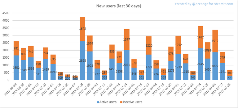
This chart shows the number of newly registered users on Steemit and how many of them became active. We see that a lot of accounts are registered, but never used.
Warning: this graphic is kind of dynamic! A user can register one day and become active a few days later. Therefore, the number of active users on a specific date may change from day to day.
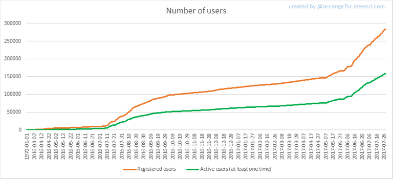
In this graph, the orange line shows the total number of registered accounts.
The green line shows how many of them have been active at least once (by active users, I mean those who made at least one post, comment or upvote). They are included even if they become inactive later.
2. Active users
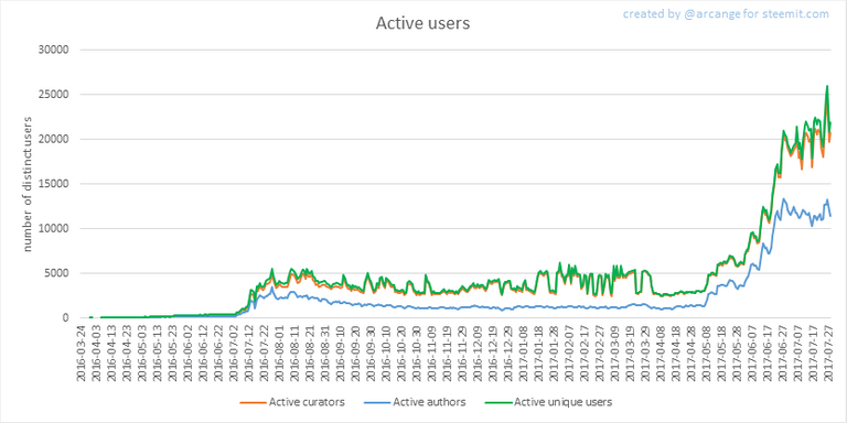
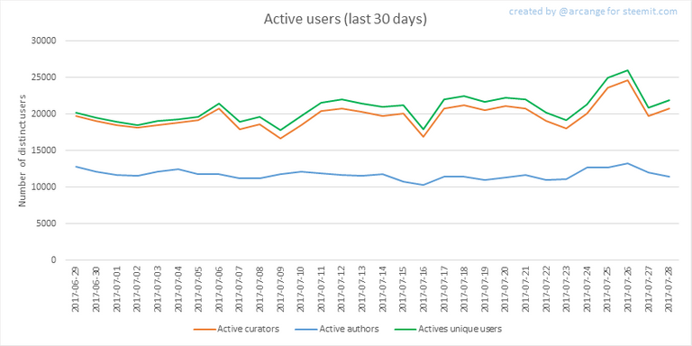
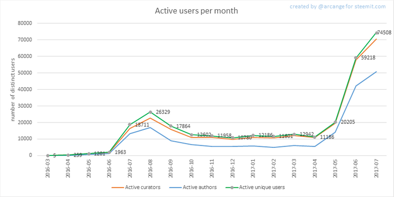
These graphs show the activity of users over time and in more details for the last 30 days. They use the same definition for active user as stated above.
The last graph is a monthly summary of the active users. It allows you to compare Steemit's values to those one usualy published by other social networks.
3. Posts And comments
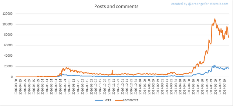
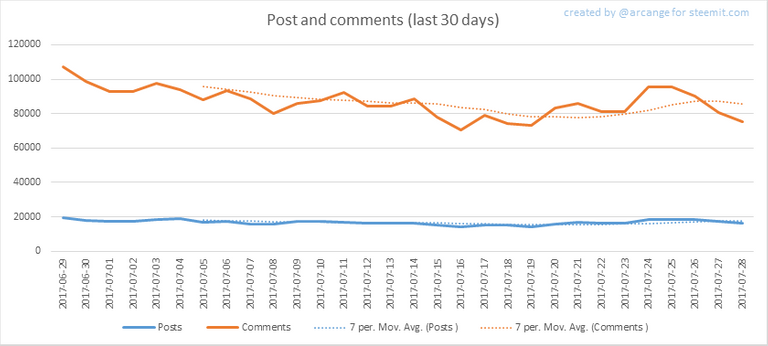
These graphs show the evolution of posts and comments for the whole blockchain lifetime and for the last 30 days.
4. Curation
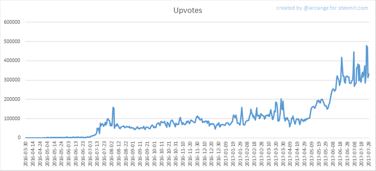
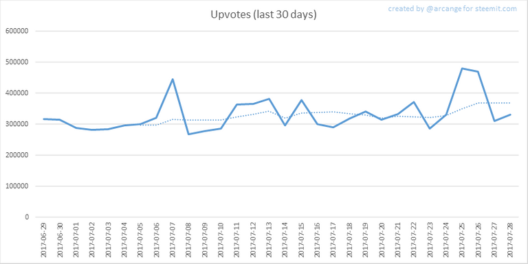
These graphs show the evolution of curation (upvotes) for the whole blockchain lifetime and for the last 30 days.
5. Daily transactions
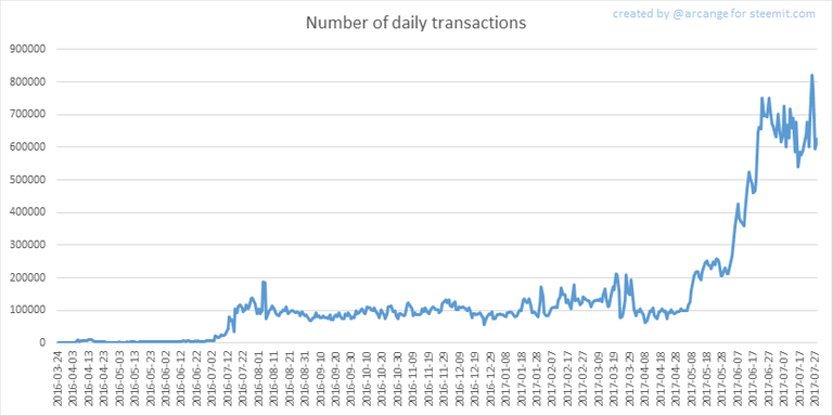
This graph shows the number of daily transactions. This give you an idea of the whole activity on the blockchain.
6. Categories
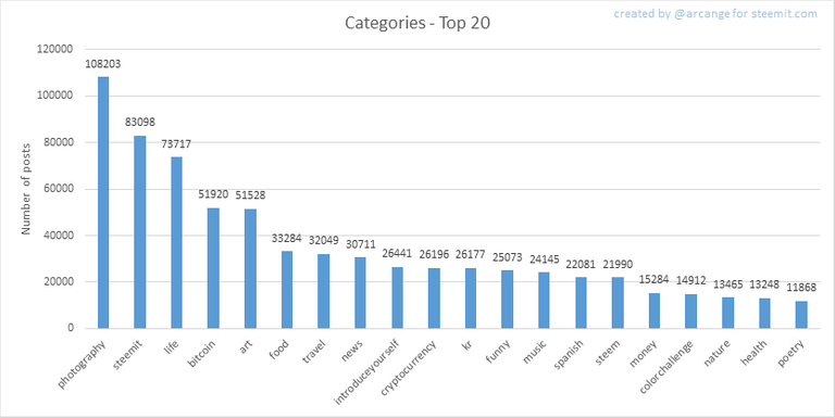
This graph shows the tag has been the most used for publishing posts for the whole blockchain lifetime.
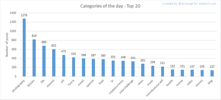
This graph shows the tag has been the most used for publishing posts last day.
7. Distribution
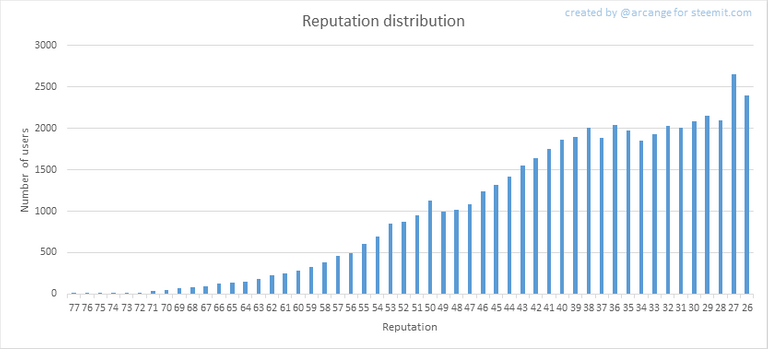
This graph shows the distribution of the reputation among users. Accounts with a reputation lower than 25 have been removed to keep the graph readable.
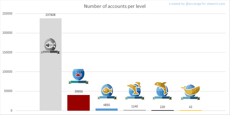
This graph shows the number of users according to their voting power (it now includes the new "Inactive" and "Red Fish" levels - check @steemitboard blog for more info about this).
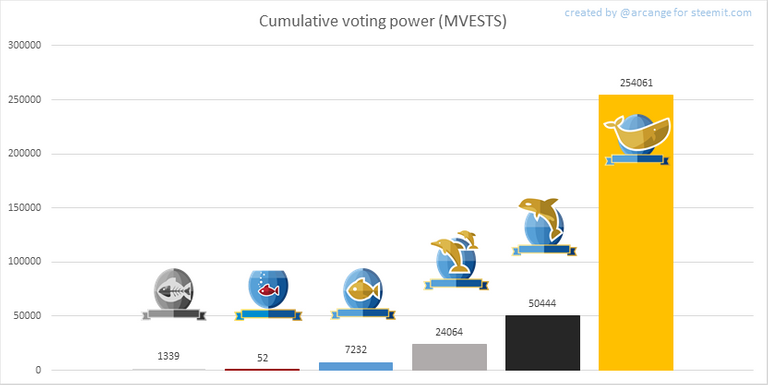
This graph shows cumulative distribution of the voting power. It enables to see the total voting power of each level.
8. Payout evolution
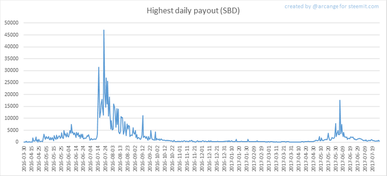
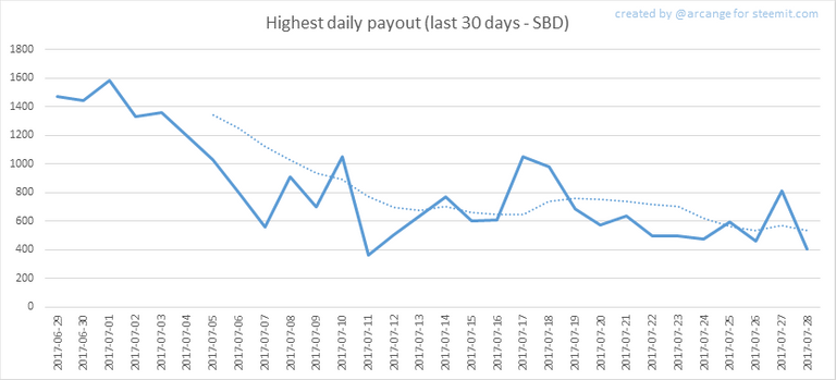
These graphs show the maximum reward paid on a post (or comment) for each day (whole blockchain life and last 30 days).
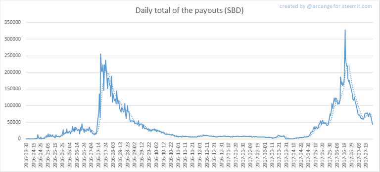
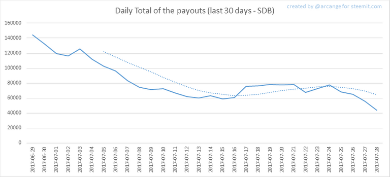
These graphs show the total of the distributed payout (posts and comments) for each day.
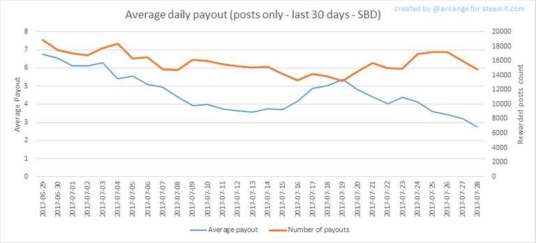
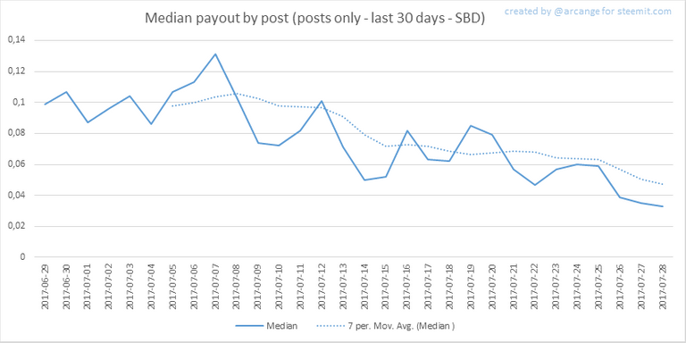
These graphs show the average and median payout per post for the last 30 days.
The last one indicates that if yesterday you got the latest value shown on this chart for your post, you should be happy because there are as much people that have earned more than you than people that have earned less than you.
I hope you find those stats useful. If you would like to see different stats, feel free to drop me a comment. Your feedback is more than welcome.
Thanks for reading.

footer created with steemitboard - click any award to see my board of honor
Support me and my work as a witness by voting for me here!

You Like this post, do not forget to upvote or follow me or resteem
There are a lot of posts with stats but this is the best I've seen so far, will follow to see more.
Suggestion, your payout evolution would look better in a logarithmic layout. Could do it for all or just that one with a bolded warning
@fiveboringgames can we upvote our own comment.
some people frown on it and may flag you for it, personally i do it so my comments get more visibility. There is talk that there will be some penalty applied in the next fork.
Some people abuse it and post lots of generic comments, upvote and not even read or upvote the main post. I like to think I can not be accused of that
ok thanks for info
Hey @arcange, thanks for the updates. Wanted to ask you why does an account loose estimated value of almost $9sbd in 2 days? It's bothering me, I'd appreciate your input. Cheers 👍
It's because of the price of STEEM. The estimated value depends on the price of STEEM! :]
Ohh.. . Thanks alot for the the feedback. 👍
May I make a friendly suggestion?
The post is already very valuable as it gives us the raw data in a very friendly package.
How about adding a little insight at the end.
Example: In the last few days, fewer new users have joined in and the general activity has been on the slow side as well. The SBD reward downtrend can be explained with the value of the STEEM having gone down from 1.50+ a week ago to around 1.10 as of today.
RESTEEMED.
I'm going to vote for you as a witness now :]Very nice @arcange. Much appreciated... Upvoted and
Thanks for your stastical data. It is helpful. Thanks for upvoting me too.
Thanks for your upvote Krytonika. May God bless you.
I'm wondering if a dolphin is 5000 sp? 😀
Thank you for the latest information
is u tell me the any link who my voted or followed is online now
Everything is online here, whom you voted, followed, talked to, and what you talk to everything can be seen by anyone here. Including your wallet balances can be seen by other. Only thing private is your key and passwords.
Nice report!
Nice chart and good statistic! How do you diferenciate the active users?
Steemhas a bright futurebased on this charts!
Nice
Unless I missed it I see no disturbing trends .
It is very interesting to analyze these statistics. Thank you for sharing it
@arcange - Very interesting but kind of alarming posts - when really analyzed it's easily read that STEEMIT is in serious need of a change of distribution of power to allow more minnows to capitalize so that they will stay once registered, stay active, and keep our community thriving!! I urge all STEEMERS to really look at these numbers and rethink how they post, vote, comment, etc - Less personal gain and more gain for the greatest good - the future of STEEMIT - The Minnow Pool!! @minnowsupport - #supportminnows