
Welcome to the daily analytical report about Steemit.
All the information presented in this report are based on the data collected from the blockchain until 2018-01-27 midnight UTC time. The goal of this report is to provide you with a clear view on what is happening daily on Steemit.
1. New users
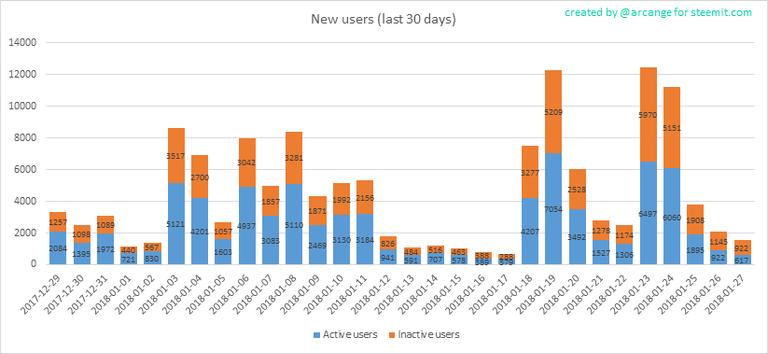
This chart shows the number of newly registered users on Steemit and how many of them became active. We see that a lot of accounts are registered, but never used.
Warning: this graphic is kind of dynamic! A user can register one day and become active a few days later. Therefore, the number of active users on a specific date may change from day to day.
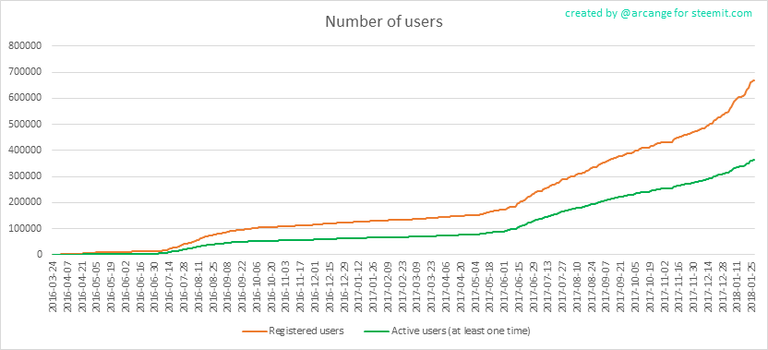
In this graph, the orange line shows the total number of registered accounts.
The green line shows how many of them have been active at least once (by active users, I mean those who made at least one post, comment or upvote). They are included even if they become inactive later.
2. Active users
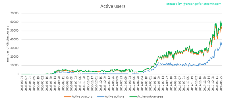
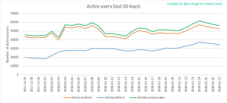
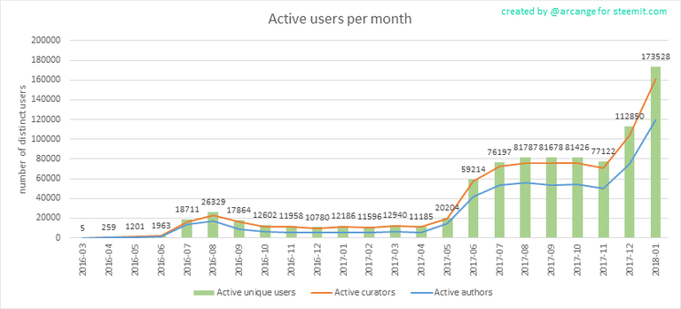
These graphs show the activity of users over time and in more details for the last 30 days. They use the same definition for active user as stated above.
The last graph is a monthly summary of the active users. It allows you to compare Steemit's values to those one usualy published by other social networks.
3. Posts And comments
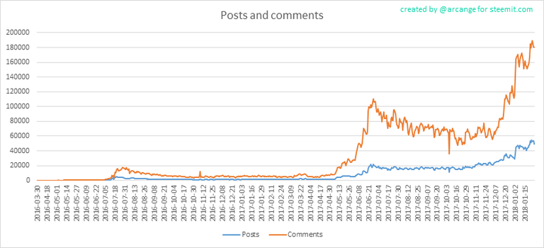
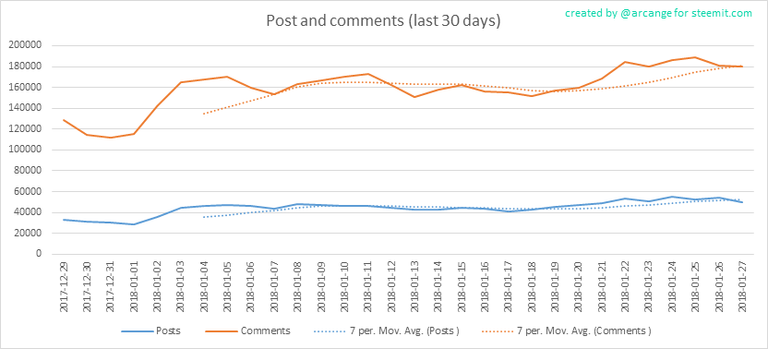
These graphs show the evolution of posts and comments for the whole blockchain lifetime and for the last 30 days.
4. Curation
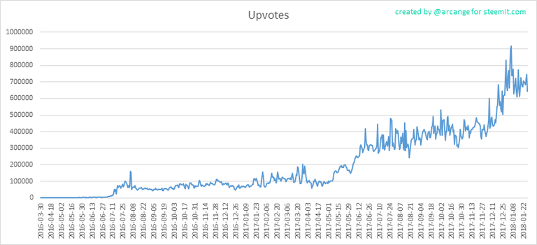
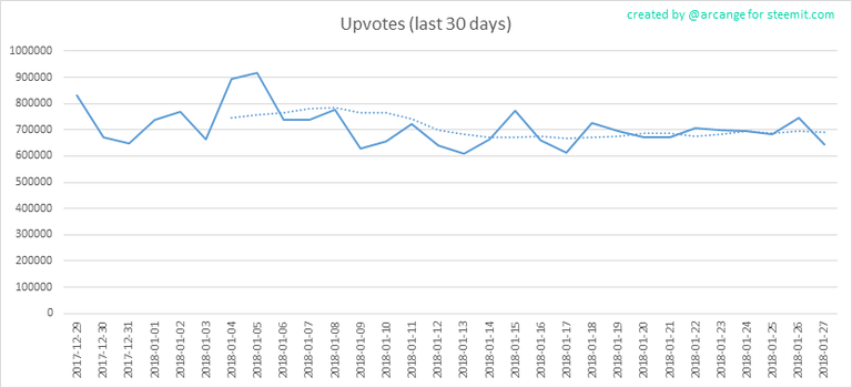
These graphs show the evolution of curation (upvotes) for the whole blockchain lifetime and for the last 30 days.
5. Daily transactions
![]()
This graph shows the number of daily transactions. This give you an idea of the whole activity on the blockchain.
6. Categories
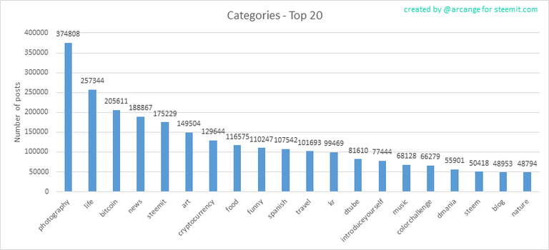
This graph shows the tag has been the most used for publishing posts for the whole blockchain lifetime.
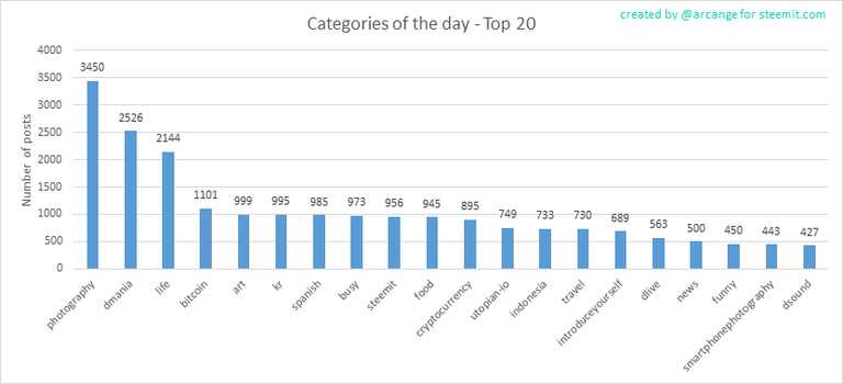
This graph shows the tag has been the most used for publishing posts last day.
7. Distribution
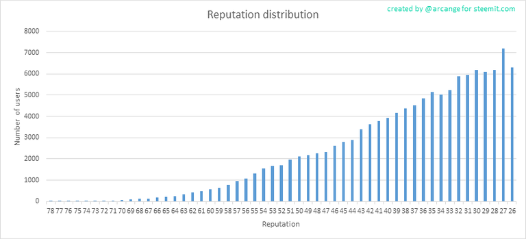
This graph shows the distribution of the reputation among users. Accounts with a reputation lower than 25 have been removed to keep the graph readable.
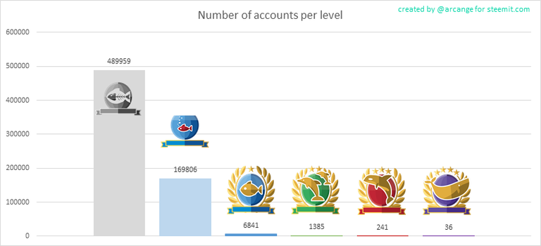
This graph shows the number of users according to their voting power (it now includes the new "Inactive" and "Red Fish" levels - check @steemitboard blog for more info about this).
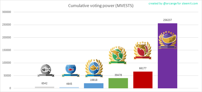
This graph shows cumulative distribution of the voting power. It enables to see the total voting power of each level.
8. Payout evolution
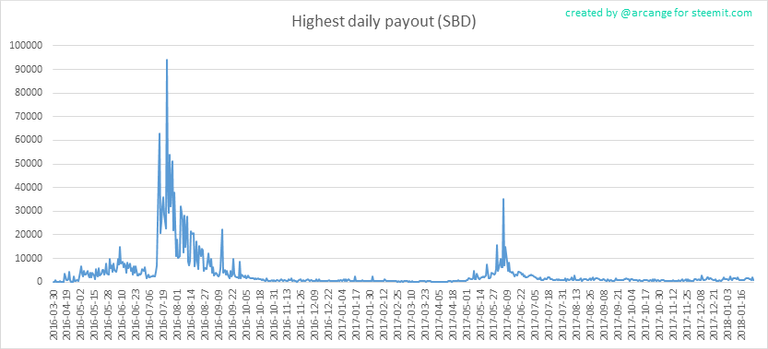
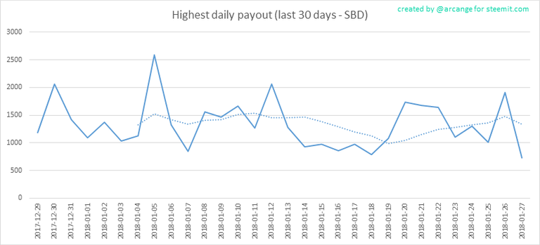
These graphs show the maximum reward paid on a post (or comment) for each day (whole blockchain life and last 30 days).
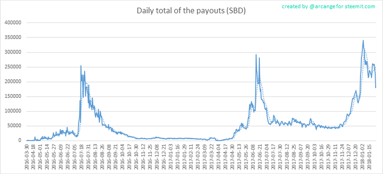
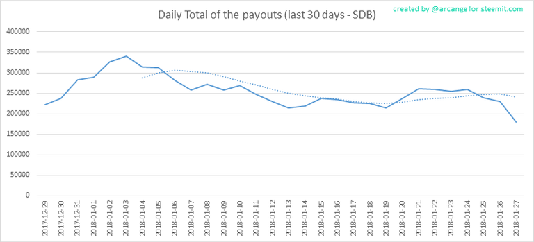
These graphs show the total of the distributed payout (posts and comments) for each day.
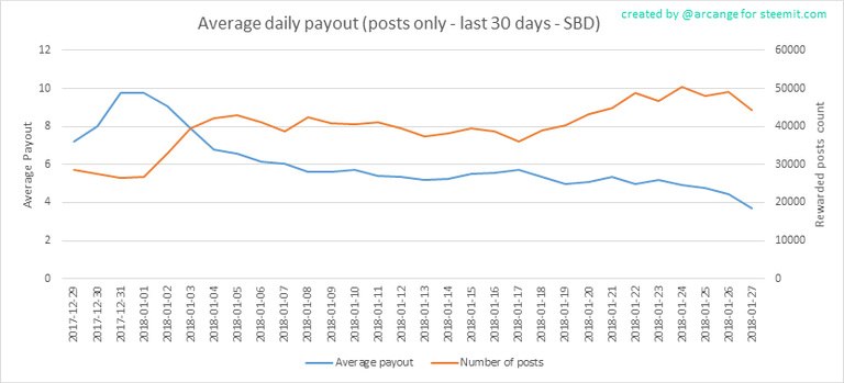

These graphs show the average and median payout per post for the last 30 days.
The last one indicates that if yesterday you got the latest value shown on this chart for your post, you should be happy because there are as much people that have earned more than you than people that have earned less than you.
I hope you find those stats useful. If you would like to see different stats, feel free to drop me a comment. Your feedback is more than welcome.
Thanks for reading.


footer created with steemitboard - click any award to see my board of honor
Support me and my work as a witness by voting for me here!

You Like this post, do not forget to upvote or follow me or resteem
These stats showing Steemit growth are very encouraging for us, humble Steemians trying to help and dreaming of a millions large Steemit community! Thank you once again!
Thanks for a helpful post @etcmike
Steem on
Arslan
@arcange, great info and charts in this post, it helps one get an understanding of how the Steem platform has grown and user interactions... I found it quite insight full and gives me a good indication of some trends with Steemit, for example as the number of users increases, the average payout decreases... this leads me to belive that the whales will continue to get the highest payouts, while new users and minows payouts will continue to shrink as more people join Steemit. This will lead to a lower retention rate if the new users and minnow don't feel they are getting rewarded here.
Great source of information !
Thanks a lot: they really were useful. I didn't know until today that the all-time #1 category was "photography". I could've sworn it was "steem."
In the last two months, the growth rate has increased significantly.
What would be really usefull (for an old man with weak eyes) is if the graphs could pop up in a new tab full sized. All I get at the moment is a fuzzy blur (and that's with my glasses on! hehehe)
You simply have to left click the image then choose "open image in a new tab"
Yeah sorry. I thought of doing just that right after I posted my comment. Doh! hehe
@arcangr nice post your one daily post is just like a crypto newspaper i really like your explaination it's really simple and very informative thanks for update
Steam on,
shahzaib Munawar.
Thanks you.
Thanks for the info! This is a great resource. Do you think that as more users are attracted to Steemit that the payouts will decrease in size and value?
The statistic is encouraging to me to never loose hope and gives me an open mind to work hard, be creative. I have not yet had my payout done, still learning more of this whole system and how it functions!