The curation chart, the daily user chart, and the daily transaction chart remind me of a chart I was looking at on Google Trends the other day.
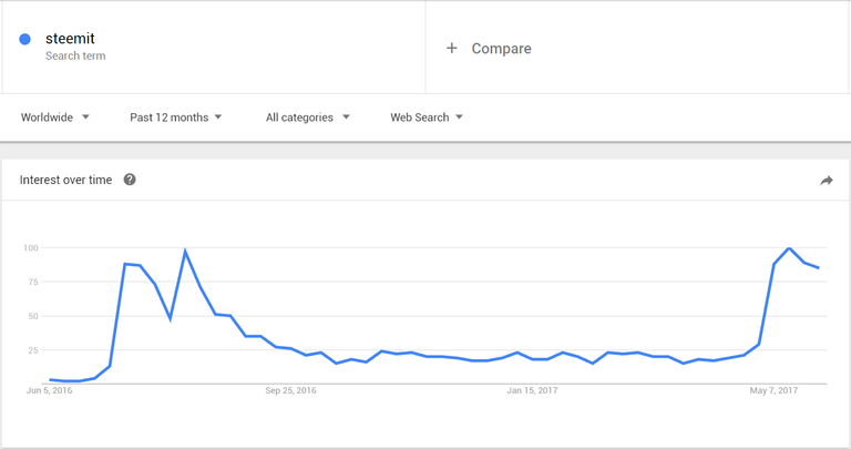
What do you attribute to the abrupt rise in the month of May?
The curation chart, the daily user chart, and the daily transaction chart remind me of a chart I was looking at on Google Trends the other day.
What do you attribute to the abrupt rise in the month of May?