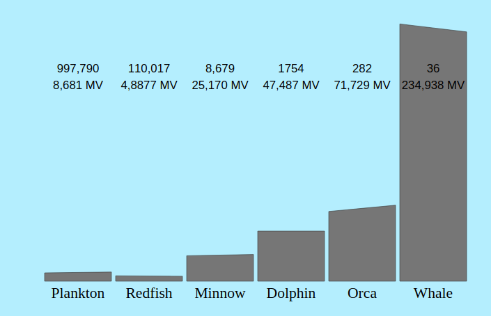
Sorry, I got impatient. I stole your data, which I love BTW, and made my own graph which I put here
You might like what I did. The graph shows influence by level. The left side of the post shows the value on 06-22. The right line of the bar graph shows data on 2018-08-25. Apparently one of the Whales became an Orca.

The top of each bar shows how the figure changed through time. PS: I made the graph is in SVG. Thanks again for the great report.