An entry for the "Musical Retro Wo-Owl"
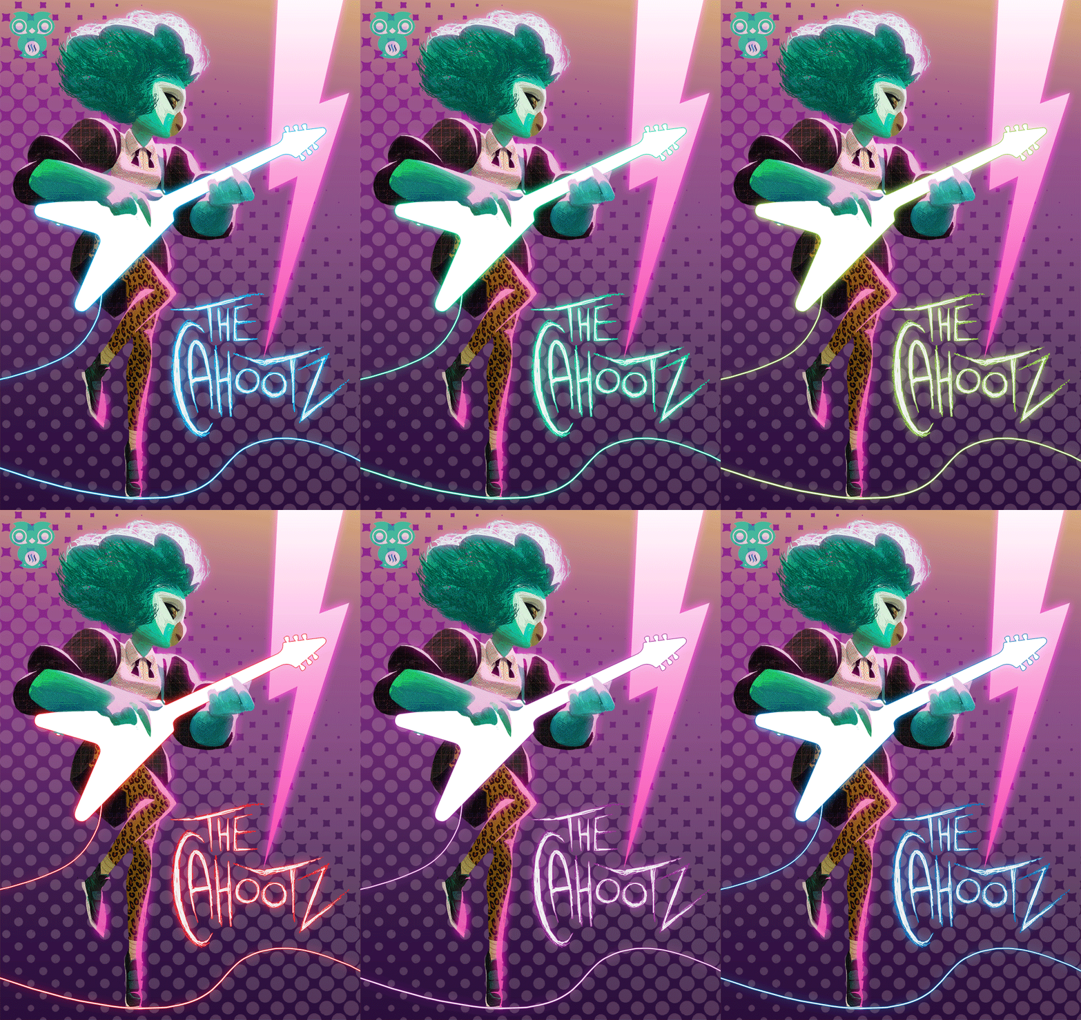
The final image:
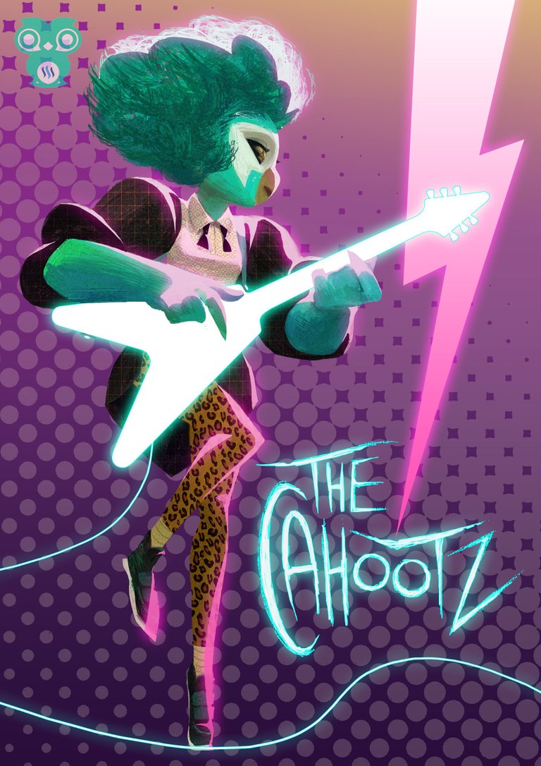
My inspiration comes from the 80s music scene which was synonym with contrasting and high saturation colors. The decade saw the emergence of post-punk (Joy Division, The Smiths), gothic (The Cure), glam, psychedelic and new wave rock, along with techno, electro and pop music. Replacing the dying disco scene in the early 80s (Thanks internet! XD). But currently I've been listening to Mystery Jets and The Voidz. New bands that plays the kind of music from that era and for me personally they are worth checking out if you are into the 80s musics.
For this character design, I imagined a female owl vocalist for an 80s all-girls band. Maybe she's on the front cover of the band's album, or a poster. The name of her band is The Cahootz, because hoots. For owls. Yeah. :d
The Process:
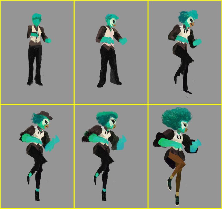
I started on a medium grey canvas in Photoshop. For designing, grey is used to make sure you can check your value readily while painting. This way your design will be comprised of both dark and light tones, and will be much easier to fix the middle tone if they are too blended together.
As usual, I randomly painted a silhouette to find a suitable pose. Once I got it, I just transformed, liquified and repainted some parts to get better body gesture out of the initial form.
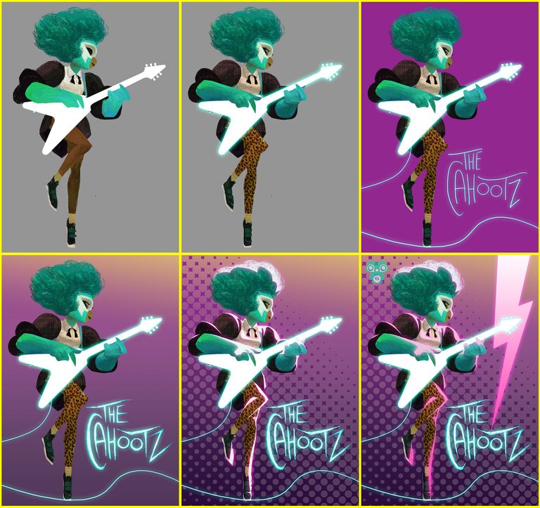
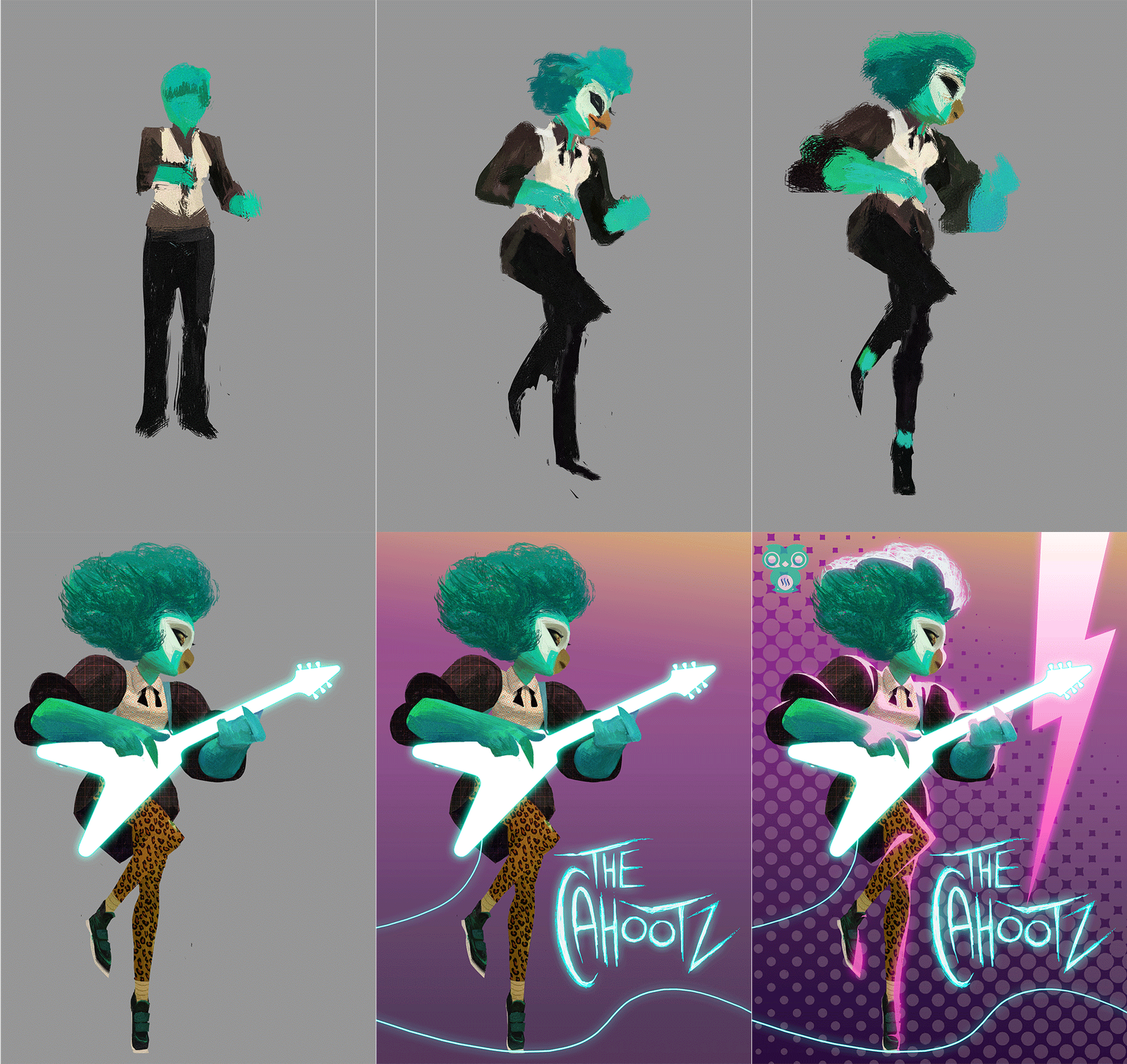
I gave her a big hairdo, and a guitar. I traced a real guitar with minor adjustments and turned it into a glowing silhouette. I also laid some textures on her, prominently on her pants with leopard pattern. I used contrasting almost white rimlight on the left sides of her body. Then I painted the wire and "The Cahootz" sign on the same layer with the guitar, set to outer glow in the blending options.
For the background, I was still using the three main color ranges I've had in mind from the start; purple/magenta, turquoise/ cyan, and orange/ yellow. I masked the background with halftone pattern to push the retro mood even further. And finally a basic lightning shape across the right side of the painting.
So that's it for today's post, guys. Thank you for your support. See you around!
-Afique
Logo designed by @cartoonistpandan and banner by @orenisme!
Awesome bro..tapi apo lambek bona submit eh? Dah ngam dah ni haa..buleh monang ni..
Balik kampung, bro.. macam2 hal plak. Hahah..
Haha..kok camtu tak buleh buek apo la..kito dulu an mano yang lobeh ponting..papo pun tebaik dah bro..mood macam kartun jem pun ado haa..keep it up!
Tmaseh bro terus support. Smoga sukses selalu 😊
Stylo Milo , nice neon guitar !
Thanks, @wanaf! 😄
Best nie !
Thanks @miorrizuan! :)
@originalworks