Preamble
As I said in my introduction post I'll be using my blog to document some research and development in and around Steem.
First attempt
My first thought in terms of development was to create a simple react app that would be the start of a dashboard of sorts, with lots of flashy graphics/graphs and animations. I had great aspirations.
and then...
It seems the NPM package for the JavaScript library is still pointing to the old server and does not currently work.
Scaling it down
After a few hours playing around with things trying to get it to work, I decided to scale things back to basics. Perhaps I'm the only one who things this, but the default (and the night mode for that matter) themes on Steemit are a little....let's say lackluster, so I decided to start plugging away at it to improve the look and feel.
Please note that this is an extremely early crack at it and I'm posting this just to see if anyone else likes the effort or has suggestions.
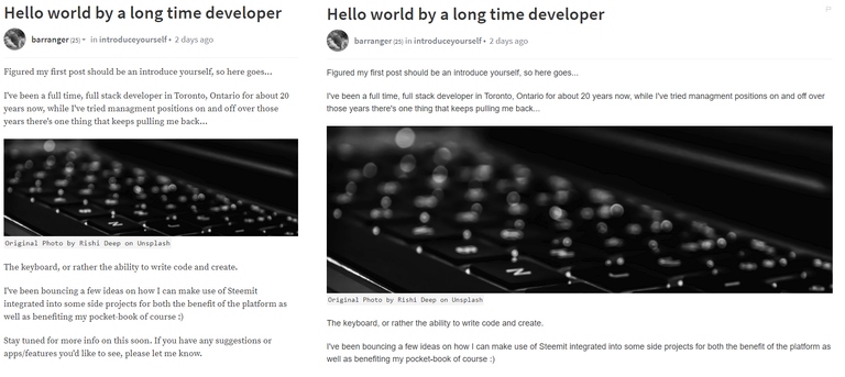
Using the Chrome extension stylebot, I've made the following tweaks:
- Changed the width of the article header, article body, and comments from 800px to 1100px
- Changed the font for article headers
- Changed the font for article body
It's pretty easy to set this up for yourself, and even though it's almost embarrassingly basic, I think it improves readability fairly well.
How to set it up for yourself
- First thing you'll need to do is install stylebot
- Go to steemit.com
- Right-click on the page and select Stylebot > Style element (it doesn't matter which element you selected)
- Click the "Edit CSS" button at the bottom of the right popout window.
- Copy & Paste the css code below.
article.PostFull,
div.PostFull__header,
div.Post_comments__content,
div.PostFull__body {
    max-width: 1100px;
}

.PostFull__header > h1 {
    font-family: "Roboto Condensed", Roboto, "Open Sans", sans-serif;
    font-weight: 100;
    font-size: 48px;
}

.Markdown {
    font-family: "Open Sans", sans-serif;
    font-weight: 400;
    font-size: 18px;
    line-height: 29.25px;
}
Finally
If you happen to like it, have any questions, or better yet suggestions, please leave a comment bellow.
@originalworks