Hello Steemit community,
I've been on steemit for a couple of months now and I noticed that the user experience is a bit off.
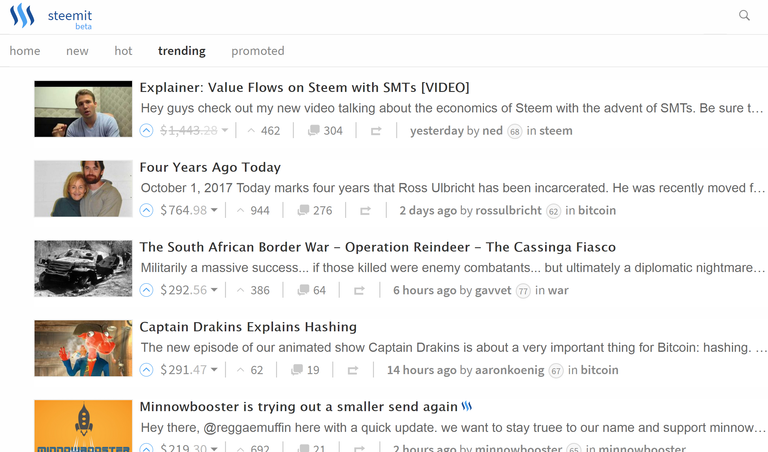
When navigating the newsfeed and reading an interesting post title, one has to click on the post to open and read more. taking into consideration the attention span of the user, I believe that most of the times one would ignore a good title to avoid the hassle of clicking on the post and opening it up. do you agree that the newsfeed layout should be modified? I think that if the posts will have big images and the title on the bottom similar to what Facebook has it would change the experience for the better and posts will get more engagement without having to click and open the post each time.
whoever agrees with this and feels the same way please share your thoughts in the comments below.
I'd love to read your comments and feedback.
Thanks
Sort: Trending

