Thank you. Seeing that chart of Bitcoin and how much the supply curve flattens out was pretty neat to see laid out like that. I can't wait till the supply curve of steem looks similar to that. :)
You are viewing a single comment's thread from:
Thank you. Seeing that chart of Bitcoin and how much the supply curve flattens out was pretty neat to see laid out like that. I can't wait till the supply curve of steem looks similar to that. :)
Steem supply chart
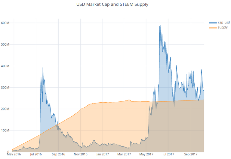
The supply curve looks already a bit similar...
Source: https://steemdata.com/charts
That's why I'm holding on to all I can!