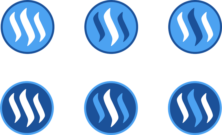
It's time we had a STEEM coin symbol!

I was working on a presentation slide when I realised that I couldn't find a coin symbol for STEEM. So I started playing around in InkScape. What do you guys think?
I also played around with a few variations of the inverse coin symbol. Vote for the best design!

Which symbol do you like best? Vote below!
After a suggestion from user @pinartemiz (upvote his/her comment below), I am posting a comment with each variation of the coin symbol. If it works, this will function as a voting mechanism to easily see which variation the community likes best.
Source Inkscape files are available for download at bitspace.no
http://bitspace.no/wp-content/uploads/2016/07/steem_coin_logo-1.zip
Fix - STEEM coin no longer transparent.
Note: After narrowing down the design, i will update the source file zip with the new designs
Please give your feedback in the comments below!
Update:
Based on feedback from user @summon (upvote below), I've experimented with decreasing the size of the steemit logo within the coin. For now, I include the two most popular colour variations.

I posted the four sizes in new comments. Please comment and/or vote for your preferred size!
After narrowing down to a good size, I will do what @liberosist suggests and adjust the thickness of the border.
I made a couple of variations on the light one as well, in case someone likes it (comment and/or vote)

I like other more! Getting first place because of one whale seems not objective that's why I downvoted (not because I don't like it also)
Overreaction?
If you notice, I have chosen two most popular to include at the top, one based on voting power and one based on number of votes...
The colors of the logo are obviously different but there's something about this that just works. It looks solid which is good for a coin metaphor.
Wow! It's nice colorful post
Hi Spectral! do you mind if I use this design in one of my posts?
I shall credit you of course!
Please do! The designs belong to the STEEM-community. Thank you for credit! :)
Note that it may be prudent to wait for the final design.
True that, what I intend to use it for may be...big lol
What time does the voting end?
Not sure, but there may be some more feedback to bake into the design, like logo size and border thickness (see new comments)
Hello @spectral ! Please check my post I created a gif animation of two of the designs :)
https://steemit.com/steem/@ninjace/steem-coin-logo-animation
This one looks good too.
Great job! I'm using this one!
Good Job Man!!!!
killer!
Stirling work Spectral!
I might have missed this in the comments below but is it available as a transparent PNG file for promotional use elsewhere? I'd love to see the three stripes transparent so I can drop it on my WordPress site. Let me know if that's ok.
Well done!
Do you mean something like this? I would still wait for the final design, and I can apply the same variation to that.
Good job man! :))
flagged because already posted here from @anon.news
Appreciate it!
The balls on that guy to take my desgin and post it in the same thread a few hours later... lol :P
it's brilliant
Hi, I made a gif animation with this one. Check out my post here:

https://steemit.com/steem/@ninjace/steem-coin-logo-animation
This one standout better.
I like this one the most. (。◕‿◕。)
Me too. Although there is one gold one, (quite below in terms of position) that has a very good "quality" feel.
I like it
Nice! Clean and elegant. My favorite thus far.
I vote for this one.
It's gotta be this surely. It's consistent with the website logo.
My favourite too. It stands out the best and is instantly identifiable as the Steemit logo. not that the others aren't, but it's the colour scheme that makes it the standout for me.
Simplicity wins and it's the closest one to the logo.
I like this one, it's simple and clean.
If you could post each logo (options) as separate comments here, we can just vote the ones we like. =D and comment right under it further if have specific remarks. or is that not a good way of using the comment-vote mechanic?
Thank you, that is an interesting suggestion, I will get started on that. Unless someone comes up with a good reason not to, I will go ahead and do it.
Yay! I see it actually picked up quite well. Nice job! =)
Posting some I quickly made, let me If you think I should tweak or cleanup any
Nice to see someone else is also working on a STEEM coin design.
I did a similar post a few days ago, and will place some updated versions soon of the coins I have designed:
Raising the PR impact of Steemit; by designing a Steem and Steem Dollar Coin.
https://steemit.com/steem/@mauricemikkers/raising-the-pr-impact-of-steemit-by-designing-a-steem-and-steem-dollar-coin
Hope to get some more support on this part! @ned is steemit making efforts to make their own design or is this something the community may take te lead on?
This look super sharp and LOVE the choice of color for it too, though it doesn't have the blue colours of the original design on it, it works for me! Namaste :)
Thanks curently working on some finalisations of this one and on some other designs. After that I will move up to designing a Steem Dollar coin.
OK, happy to trade some STEEM for one of these beauties. Beautiful.
Thanks I'm currently working again no the design's - hope to have more time tomorrow and this weekend to share the results.
Simple is the best.
Damn, that looks good.
thank you ;)
And, imagine, this is on a white background... gold is always a "killer combo" when placed over a black background...
Next time we better mint it in either silver and gold.
I want real.
new improved size...

nice concept!
Posting some I quickly made, let me If you think I should tweak or cleanup any
Hey @spectral, nice work. It's awesome to see people engaged. I made some tweaks to it, tell me what you think about this: https://steemit.com/steem/@yuhhans/my-approach-on-the-new-steem-coin-design-following-post-by-spectral
Superb.
Looks good ... when next to BC ... I like the simplicity, but should be a little more eye catchy when presented alone.
I choose this one. Bold colour for BOLD spirit
try to decrease the size of the inner icon a bit more .. just slighty would do a trick IMO
I like the idea. Initially it was abit smaller like you suggest, but I increased the size slightly... I will first see which colour palette the community prefers, then proceed to try and perfect the design.
Good job.
Yes! This is exactly what I was thinking. It'll look classier then. Also, try reduce the border width.
Here are designs for STEEM POWER and STEEM DOLLAR symbols:
https://ipfs.pics/ipfs/QmfJgHwwT41f3awT5BSuu5KqNzQDRr2x68Z7o5SFX1zD42
https://steemit.com/steem/@deepsynergy/introducing-steem-power-and-steem-dollar-symbols
This is really cool!
I really like the "mineral" look of it with the STEEMIT design... though I wouldn't make the actual blue colours translucent and would definitely add up the little designs on the side and on the tridimensional thickness side as well, just like the post by @mauricemikkers up above. Thanks for the work and sharing, namaste :)
Great job. Also can you see my works:
More: https://steemit.com/steem/@acidsun/banners-for-steemit-community
Could you do some CryptosCloset.com style ones? How much would you charge?
25 Steem Dollars per banner
4th logo is pleasant and catchy to eye
This is some good work. They are all good. I am a fan of the last one that is in the lower right the most. If I was to choose the next one it would be the one to the left of that. For me I prefer darker backgrounds and that one looks good.
Thanks for the work.
Wow, I really like this type of graphic design! It's so clean and simple, keep it up!
Crazy reward for such few votes. The whales must dig these designs!
...And i do too! Nice job, dude.
Of the inverse versions, I like the middle one in the top row.
steemit symbol .. lol
my concept

I Really like the square concept!

Square STEEM Coin Symbol
Love it! I'm most into the top left one. The lighter blue background feels more youthful (and less corporate).
I also tried creating a quick animated version of the symbol built in SVG & CSS. https://steemit.com/css/@pkattera/a-concept-logo-animation-for-steemit
The motion reflects the dynamic community, uplifted by rising steam.
My favourite
you need to add the letter S, like Superman :))
I think the symbol should change depending on the network, its blue now but it should get green, then yellow, orange and red when the network or steemit website "heats" up.
This one is the best

[STEEMIT]
Awesome man, Steemit art has been on the rise!
https://steemit.com/art/@benjiberigan/steem-ocean-steemits-first-3-d-fan-art
Don't know mm

These are really great Personally I like #1 its nice and simple but whichever is chosen is great. Thanks for all the designs!!
The large one, fresh and simple. Nice job.
I've made a few posts but this is fantastic. Well done. I wan to see the $ in posts replaced with your coin.... Just fantastic.
Hello @spectral ! Please check out my post, I created gif animation with two of the designs :) https://steemit.com/steem/@ninjace/steem-coin-logo-animation
Great idea. You are truly a genius!
Posting some I quickly made, let me If you think I should tweak or cleanup any
Great content.