As you've read in my recent posts, the first decentralized STEEM payment gateway is nearly completed.
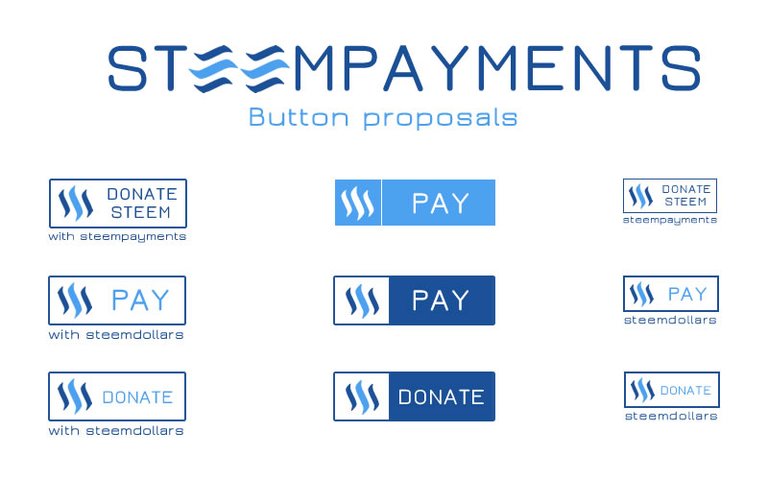
I've created some button to integrate in webpages and shopping carts.
Can i have some feedback please?
Note that all my upvote rewards are going into setting up enough public nodes, for your information :)

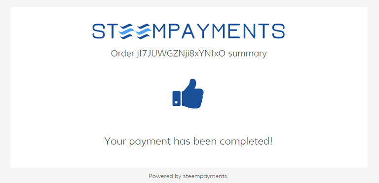
And some more teasers


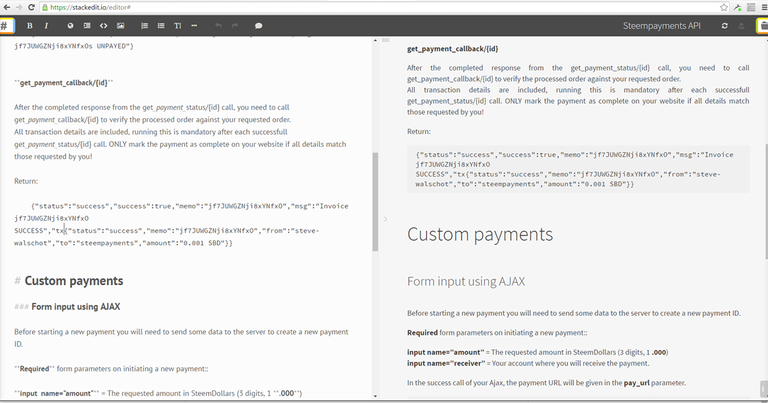
And of course a lovely documented API description

Thank you!
STEEMPAYMENTS should be functional within 2 days from now, so keep eyes on my posts!
Great idea
just as a fast sketch - more to come soon! Stay tuned :)
Nice!!! I'll most likely simply different button types, i like those as well!
Good job man, we appreciate it, im sure we will use it a lot.
I would like to see a SBD casino, or any other steemit token casino :D That would have been great to try playing it, im sure i would lose a lot of money there ;D
hahaha this is the future right here.
I'm loving this @cass! Thanks for it!
nice.. steemit logo with the circle..iam like it...the logo becomes better
Nice and clean, I like it!
I've always loved what you do! I like the middle row of buttons.
Thanks. They do stand out more. I expected more feedback from the community, but i guess it's timezone related :)
We all work as a team to better the community right guys? Right @steve-walschot! Without feedback ideas are bulletproof. I'm really loving what #steemit is offering!
I agree @iseektruth
that is right! it is best answer.
I think steem wil be ecosystem.
wellcome to "steeminomics"
Looking forward to this! These are the kind of services needed for altcoins to go mainstream!
Good work Steve. Good contributions from the authors too! Nice everyone.
This could be a great and very useful tool. Both to attract customers and to enable websites to actually carry out the transactions with Steem. Congrats and keep up the good work!
this is so awesome will push the whole thing to a new level - Love it
I prefer the middle column, but as a man of mystery, I also prefer variety. More than variety, I prefer customization via JS options object or even just CSS.
More power to you!
I created a coin logo, which I think could also be used incorporated with the button idea too, if you'd think that would work?
Couple alternatives here too
https://steemit.com/steemit/@jay-kopinski/steemit-concept-logo-design
good work man, wonderful design I really like it :)
Thanks! What's your opinion on the buttons?
I believe bottons with round corner will be better, and the logo should be a little be smaller (1 or 2 px no more)
While I agree with the rounded corners, as far as design trends go, al the big players are moving towards flatter, squarer elements (just check ou google chrome's latest styling of their tabs)
For better or worse, that's the current "in" style.
you can add also pay with steem , you have only steem dollars
Does it integrate with Shopify in any way?
Plugins will become available later on.
Can this integrate with wordpress for 3rd party blog interaction?
Very informative thanks
nice content upvoted
Looks very nice :-)
I like thes buttons the most (first column):
I think that the buttons in second column look a bit too simplistic. I like simplicity but in this case, they look a bit too "raw". Buttons in third column look a bit small.
Really nice work!! :-)
Thanks for the feedback @logic
No problem. Those teasers look cool too :-)
The font and the lines seem too thin (for the buttons).
Ok, i'll keep it in mind for the final version
I'd be interested in trying this out once it is functional . Do keep us up to date. Thanks
Thanks!
Whale where you are? my steam power is very low :(
can't wait to access this.... keep up the good job... let the steem live forever....
Steem on!
Very cool man. I just posted something in regards to the newly added "ratings" as well. https://steemit.com/steemit/@christiaan/new-reputation-brackets-and-tag-buttons-steemit-just-keeps-on-improving-on-a-constant-basis-well-done-guys
If i may, can you also add a transaction history tab? Aside from the current history transactions shown, i converted steemdollars to steem but it doesnt show in History
Other than that, good job so far. keep it up!!!!!!!!!!!!!
wordpress plugins too? :)
Hell yeah! WOO is first in line
Just had a go at it. Works like a charm.
Kudos Steve!
Cool, I think that I was maybe the first to upvote this post.
$$$$$$$$
Remmember that "Chocoquinas" is waiting to introduce SteemPayment
Will be "Chocoquinas" the first Brand???Nice Work @steve-walschot
Possibly yes, "chocoquinas" already contacted me
bravo :)
This is really great to see you got my upvote
I love the idea of donation.
Thanks for doing this, Steve! Great work! Upvoted :)
Great work man !
Looking forward to it!
GUYS I JUST MADE A CUSTOMIZED SHIRT and HOODIES for STEEMIT community.
https://steemit.com/steemit/@burgalu/custom-steemit-tees-hoodies-tank-top-v-neck-sweatshirt-long-sleeve-baby-onesies-etc
How many steems do you need to be a whale? I have a fair number. Have an upvote.
I love this direction #steemit is moving! Upvotes towards the progress of steemit. I see this looking very different from how it is today.
sweet
this is my lucky day. that is what i have been waiting for. Great job.
As both a product manager working in payments and a steem fan, I'm super keen to see this! My thoughts:
Anything with "steempayments" in it, or something else wordy has the benefit of being easier trade marked. The simple "Pay" buttons, even with the logo have very low chance of getting a trade mark (you generally will not get a trade mark on a common word or a word describing the action/activity of the product).
Does Steem have a brand guideline or style guide? I ask as I note you are using the light aqua blue for the some of the text, which is what Steemit uses as a sub-text (ie the beta in steemit beta). The call to action is infact paying, its not something that should look like a sub text.
Other musings.. you should do a small screen breakpoint mobile version too. Thankfully steem has a logo thats already reasonably mobile friendly.
Finally, in terms of brand heirarchy- where do Steem, Steemit, Steem Payments, Steemd sit and relate to each other? This may already be done, but before expanding out to sub brands we really should all get on the same page regarding "branded house" vs "house of brands" as this is unclear to me, even as an existing user.
Great work! Hope to seeing more awesome features added.
#Steemit Rocks!
wonderful design I really like, im sure we will use it a lot.
Great idea, very informative thanks
Can I use this in my e-commerce platform? I plan to integrate Steem into it.
wow si nice