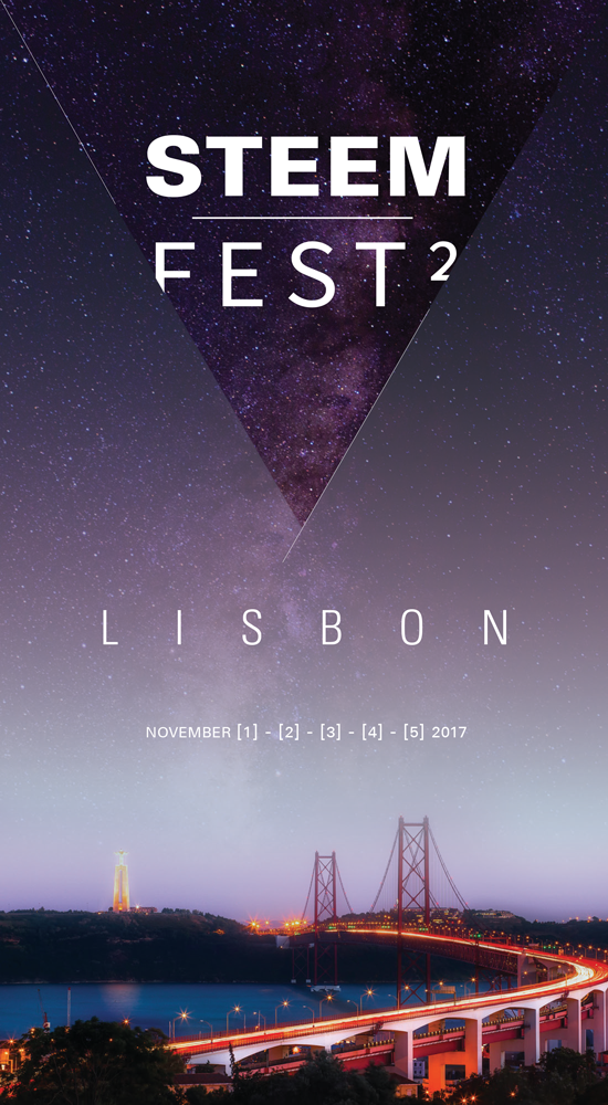
I have been working on a STEEMFEST poster for the past few days. I decided to go for a non-traditional size because, well, we are a non-traditional platform! I am also not a fan of stereotypical A-X sizes. I believe it constrains the designer's vision.
I might shrink the height down in the future if it is more suitable for promotional purposes. Sorry, no mockups either due to the unconventional size. Additional information might be added later as well. Enjoy


This is sharp!
Thanks a bunch for the beautiful work. It has an air of professionalism in it, classy. Is it possible to rise the words "STEEM Fest 2" a little higher? Mind you, your choice of leaving it this way is bringing me to be intrigued by the words and gets me to look at it twice. Good work.
All for one and one for all! Namaste :)
Yeah, that's the point. To create a bit of "uneasiness" and mystery. Usually people are drawn to "flaws" so this might catch the eye for someone to look closer and then check the triangle.
well said
Really nice buddy. The most important stuff - triangles!!
thank you man
.. what YOU talking about ?? - ))
i need more inFORMat'iON ?? - ))
yeah strong .. yeah trinity .. yeah the 'HumaN exp(erie)nce ??? - )))
.. what've YOU got ?? - ))
YOU ether PUNKS .. wow !@! - ))
LOVELOVELOVE )))
greb'Z )
ha ha .. YOU reSTEEMed ?? - ))
... a tri-ANGEL .. flying in that TOO - ))))))))
ha ha )))
I like it!
thank you
Modern. Reminds me of " KOSMOS". (outer space)
And STEEM FEST 2 - New PLANET Earth! Development and success! To all of us!
such wow. much epilepsy.
This design is splendid, I love it.
thank you
Look very good, good job. However try make the fest to be fully visible . You can reduce the size in order to have a better fit and all skies should have a bright shine . Good job
why make it fully visible? the point is to have that effect :)
Effect is very good however in my own view point, the tiny dots of stars will add to the effects.
But its still very good though.
Sure, I'LL try it later
welcome, more success and keep uo the good job
Wow! That's a hell of a poster. I would love to see it printed! =D
Printed and on a street wall in Cyprus maybe?! @kyriacos
:D maybe!
Simple and elegant!
thank you
Looooookin good? A Vegas one soon? 🤔😂
why not?!
2018... hmmm something to think about :)
Clean and sexy! :)
thank you
Wicked! Looks neat!
good work man!
thank you.
super!!
thank you
I'm a designer too. I like your style.
thank you
It's a good idea!.. upvoted it and i'm following you!
Check my account and upvoting my post and follow me. Help me, please!
By: your friend @antoniomontilva
thank you
Such high quality work! If this isn't your profession then it should be :D
thank you
Wow.... I thought you are a philosopher... I envy your talents...!!
lol. not a philosopher. I just like to read and write as well.
Wow...!! I want to use your writing as a textbook to English learners in Korea. Anyway, thank you for your writing!!
oh wow. thank you man.
you are too kind.
This is just AWESOME! Hollywood style 😎😎😎
thank you @mariandavp
:)
Very nice! I love the subtle look and the blend of "Fest 2". I has an outer space feel that makes you curious about what it is and definitely gets your attention. Great job :)
Yeap, I was going for the "moon territory and beyond" message
thank you
UNIVERSE .. L(OO)KING .. "IN" - ))
W(is)(do)M .. right ?? - ))
... the apPLICATION of inTELL-i-GENCE - ))
ha ha )))
LOVELOVELOVE )))
greb'Z )
The poster attracts attention.
hopefully
amazing! love modern designs done well!
thank you
put my money where my mouth is :D
<3
:)
I love it
thank you
This is an awesome idea... I may follow your lead and post a poster design as well! Great work @kyriacos!
yeap, let's get this party started
very sleek design!
thank you
This autumn.....
An online community...
A beautiful town...
Meet for the second time.
1st of Nov.
is this a steemfest haiku?
Nah, it's like "trailer" voice-over :))
Looking good, man!
I like it. Can't wait to see it live in the hotel lobby.
if it gets chosen. I am sure many people will come up with their own versions
Very nice, great talent!
thank you
Love the design! Are these available for sale anywhere?
no. just concept design for now. I can give you the .pdf file if you want and print it yourself
That would be incredible! Really like what you've done here :)
Nice! I'm not sure about the format
What about [1] [2] [3] [4] [5] November 2017?
well, I am European :)
Than why use an American dating system? ;)
because it doesn't make sense to me :D. plus most people in Steemfest will be European. (i think)
But but.. :D Europeans write dates like this DD/MM/YYYY! You write it MM/DD/YYYY or what am I not getting? LOL
We still express it with month being pronounced first. Well, at least to my country :)
Sure, too bad, because now you are saying, I have another idea. How about the font getting slightly bigger?
[1]
[2]
[3]
[4]
[5]
Like a sort of count down / upcounting?
Loving the unconventional size, great design and typeface, especially on Lisbon.
thank you. they are all the same typeface
Looks lovely, good job :D
☂ ⓐⓒⓘⓓ ⓖⓞⓓ ⓒⓐⓣ™
so much acid in your comments. overwhelming.
Apply acid to every area! The burn is strong in this one! ^_^
☂ ⓐⓒⓘⓓ ⓖⓞⓓ ⓒⓐⓣ™
lol
Good job done bro
thank you man
Plz follow me
did'nt like the hidden text at first but it grew on me, i love that envelope like cut away look, super sharp - i think the date area needs work as the 1,2,3,4,5 don't really for me mentally after the number 2... maybe it's because i see the november 1 but then the rest of the numbers do nothing for me. less is more, maybe [1st > 5th] i dunno. i'm being super picky.
are you american? maybe that's why
sorry?
Nice poster! I find the F and the 2 of Fest2 a bit annoying, but I realise the point is to grab the attention. :D I have a suggestion. Maybe they could be whole letters and the parts that are outside of the triangle could be faded, like the rest of the sky and the stars?
nah, i like it more on the annoying side...like coming over from the background. it also balances out because of the size of "2" in relationship with "F"
I wish I could go to Lisbon for this. This poster is awesome
thank you
It looks beautiful, almost like it cost a lot of money to make. Not many people are actually ABLE to make things that look as good as this. I would say, you should probably move the spacing of the words a bit higher, as the F is mostly cut off and it makes the 2 look like a broken letter C, otherwise, 5 stars all around
yes, the point is to be cut of from the effect of the triangle that emerges from "deep space" effect :)
Good post..I like this.
thank you
Thanks you again...
Looking good! My only concern is that there's little consistency between this and the usual Steemit logo/font/branding
yeap. Last STEEMFEST used similar typeface and arrangement. Didn't want to deviate much from that.
I love how you did steem fest square instead of a regular two.
Nice! I only find a hard time recognising that this has to do with steem.. missing the logo. Maybe gut to put it behind steemfest in Some kind of watermark?
Yeap, we could do that. Like in the very top. Logo is not really important though.
cool!
thank you man
good color combination and very focusing must say designing serve purpose well.
Thank you
I hope steem up to $10, at least
soon
really love the design. you are a man with skills !
thank you man
Love it! Really great work @kyriacos! :)
I'm considering attending!
you should
@kyriacos I like the design, but I don't think cropping the text of the headline is a good idea. That part of the banner should be prominent and immediately understandable. People may only get a split second glance at the poster as they walk by or drive past, and you want them thinking "Steem Fest!" not "Huh?"
The stereotypical sizes only exist because they are requirements for different mediums. For example, if you want to use the design on a billboard you should use a specific artboard size, 3048mm x 762mm (25% of full size) with minimum 300dpi for photoshop.
Popup banners and other mediums will have their own dimensional requirements.
It looks like you used a bitmap image (the photo backdrop) so the resolution of your original image will define the largest medium you can print to without loosing quality. That said there are some tricks you can employ to minimise definition loss on resize. Google "Fractal Interpolation with GIMP" if you are interested in a free solution.
I understand your points. I have been a designer for almost 2 decades. My point with the title was to create something that gets the attention. a visual play. almost create a nuisance. I am not a hardcore designer. always going for the artistic part as well.
as far as the pixel quality. if that poster was chosen I would definitely pick another high resolution picture. this one was just for sampling.