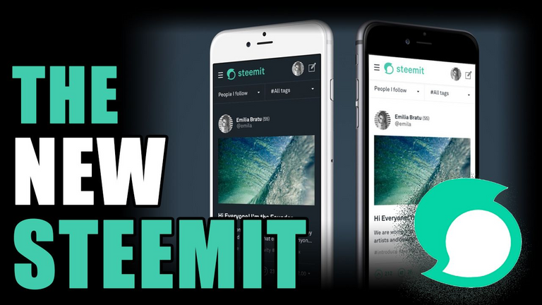
Finally steemit.com has a new logo and it looks cool.
The green colour especially is a welcome change to the blogging platform steemit.com.
However the logo of steem cryptocurrency remains the same.
It is a good change made by the steemit team as now the new users can easily differentiate between steem and steemit.com.


Everything Has Changed
Not so sure how I feel about this new mint green Steemit update? They say a change is as good as a holiday, and the more I look at it, the more it's growing on me. Honestly I did prefer the more vibrate blue of the previous colour scheme, I felt it had more of a pop as well as stood out much more.
Then there is the new logo, the previous was very much a mirror image of the Steem currency. The new direction was to move away from Steem in branding and to clarify the distinction between Steem and Steemit as separate entities. So the previous logo will remain that of Steem.


نعم جميل جدا هذا التصميم الحديث!
شكرا للمشاركة :)
كل الدعم من
arab steems :)
نحن مجموعة عربية صغيرة قيد النمو على ستييمت
اذا احببت الانضمام و التواصل, استخدم الرابط التالي
https://discord.gg/g98z2Ya
img credz: pixabay.com
Nice, you got a 39.0% @cryptomancer upgoat, thanks to @abdellkarim
Want a boost? Minnowbooster's got your back!
To call @OriginalWorks, simply reply to any post with @originalworks or !originalworks in your message!
thhanks
great post.pls daily reply on my posts
repley this poste bro and thnks i reply your best poste
nice like it very much
welcom thanks
thank you :)
welcom bro
thank you abdelkaim
welcom bro @amirduhair