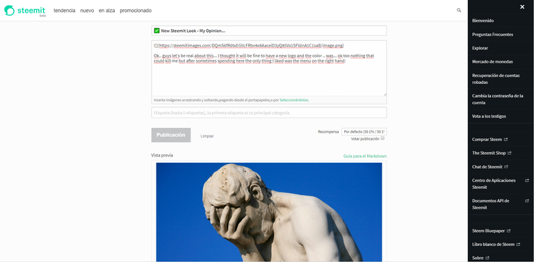
Ok.. guys let's be real about this... I thought it will be fine to have a new logo and the color .. was... ok too nothing that could kill me but after sometimes spending here the only thing I liked was the menu on the right hand:

Then... I feel the color could be the main problem... it is a very nice color but if you use it all around it is a very bright color, I don't know if I'm very used to darker colors for this kind of usage but here...

There are is too much brightness... and my soul is darker :P
Finally.. again the.. button... come on guys!! this design does not fit the Steemit style...

It will be awesome if Steemit makes a logo contest or a whole brand concept constest, I'm pretty sure there are some hungry designers around here that will enter and make something outstanding!
🎃Have a good day everyone! 🎃

I asked myself why didnt they make a contest for a new logo.. this is so strange.. but we get used to it..
We need a logo contest.. I'm sure all people will be happy about this!
I was so confused today when I saw it! I actually like the buttons but I do not like the logo!
yeah those are kind of bad...
I am agree with you @carlosd15 the new design is awful but at least is faster! jejeje ah the buttom horrible!!! for say the less! hehe
faster is good! I can live with the design right now...lol
I'm glad you brought up all these points up, i definitely agree. I think the teal is too bright, and overused as well. also its sad that the logo no longer has a secondary color... it no longer associates with "Steem" as the previous logo.
The logo is kinda like to flames right now.. but looks more like Elvis :)
Im using night mode :) Best thing ever for night owls.
good idea bro! thanks!
Congratulations @carlosd15! You have completed some achievement on Steemit and have been rewarded with new badge(s) :
Click on any badge to view your own Board of Honor on SteemitBoard.
For more information about SteemitBoard, click here
If you no longer want to receive notifications, reply to this comment with the word
STOP