Disclaimer
This blog post is strictly for inspirational purposes I do not have any affiliation with the developers nor designers of the steemit platform. I'm just a designer looking to give back to the community and gather your thoughts.
Backstory
So I just joined the steemit community today and so far It's been amazing to see how everyone interacts with each other. While browsing the website and reading posts I noticed how the tags weren't organized properly and how the user dashboard was straight up distasteful to say the least. Now I know this is a beta version so before you all start bashing me in the comments I just want to say that I saw a problem and I thought I could fix it by coming up with my own design.
About the Design
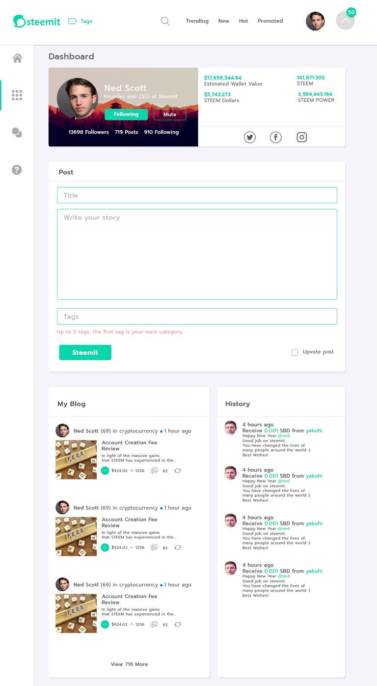
I just decided to work on the dashboard for today just to test out the design and gain your thoughts on it. I know there is a lot of more work that could've been done but I just wanted to get this to you guys as quick as possible to feast your eyes on.
Tags
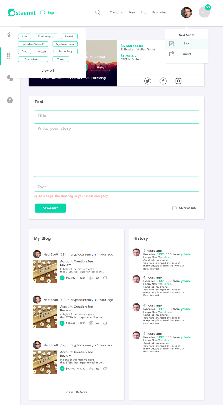
The first thing I decided to adjust was the tags list by breaking it down into a short menu that lists the popular tags. I chose green for most of the design because I think it helps to convey the content more and also because its the color of the logo 🙂 .
Navbar
Pretty much everything on the navigation is the same except for two things, the tag link and the upvote counter. I thought it would be cool to add an icon to the right with a badge that displays the total upvotes for the day.
Dashboard
It's clear that most of the design is mainly focused on the dashboard. So as you can see the dashboard is a major overhaul from the current one that consists:
- Redesigned profile card with added social media icons and background image. I also added basic wallet information to the card so users can easily see their earnings.
- New Post editor with changed button that says steemit instead of post. I think the new button helps to bring out the brand and offer a catchy phrase whenever you post something. Now instead of posting, you just steemit.
- Redesigned blog card and history card
Final Thoughts
That pretty much wraps up the whole idea behind the design hope you guys like it. I just thought this was a fun and interesting concept to share with the steemit community. If you like these concepts please let me know your thoughts in the comments and what could've been improved upon. I'll do homepage redesign if this posts gets enough upvotes.


I'm excited to see the developers make changes to the UI. I think that's what could put the site over the top.
Yup me too
Great work @ dang20 although I'm not a developer myself, I agree and think the tags could be better organized in a way to make it more user friendly for new users. I also sincerely like the fact that you're trying to help make steemit a better community with your programming skills. Keep up the good work and you will find much success amongst this community!
Thanks a lot man I appreciate it. I have more things in the works so stay tuned. I also gave you a follow
Congratulations @dang20! You have completed some achievement on Steemit and have been rewarded with new badge(s) :
Click on any badge to view your own Board of Honor on SteemitBoard.
For more information about SteemitBoard, click here
If you no longer want to receive notifications, reply to this comment with the word
STOP