Nice post. It's helpful to see the data. While only ~2% of votes are by paid bots, I'd guess the percent of voting power from paid bots is much higher.
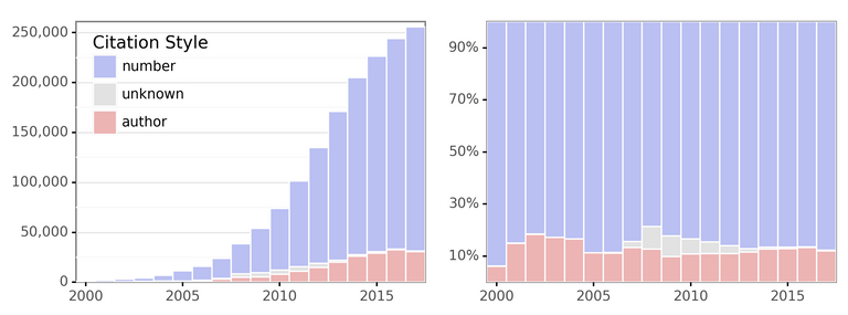
Not sure I love the multiple y-axes in each plot... it's easy to mistake to the votes and paid votes as being on the same scale. I'd recommend plots like these (from my recent blog post):

On the left you've got raw counts (in your case the two categories would be paid votes & unpaid votes). On the right you've got normalized votes. You'd probably want to zoom in the y-axis, given that such a low number of votes are paid.
An alternative would be a faceted plot, where the paid and total plots were vertically aligned but separate.
Keep up the great #datascience!
After a little more thought, I think the best visualization would be two vertically-aligned plots with the same x-axis of date. The top plot would be total number of votes per day. The bottom plot would be percent of votes by paid bots (y-axis zoomed to only the dynamic range). This would capture all the information above without any confusion.
Is the full daily/weekly data you created available?